Sharon Radisch
As a result of the Covid-19 emergency, New York based photographer Sharon Radisch, created a series of still life sculptures that she had found around her house or neighborhood. The artist is known for her clean aesthetic and muted color palette, with photographic work that spans fashion, still lives, travel, and interior design.
|
|
|
Radisch uses a white background with a sculpture centered which she makes out of various different objects. She stated during the pandemic “During my quarantine—almost 6 weeks now—I have been exploring my work and what it means to create during this time with limited resources”. Like she said she had "limited resources" and could not create her typical photography with models, she only had her home, so as a result she saw this as an alternative.
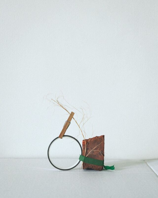
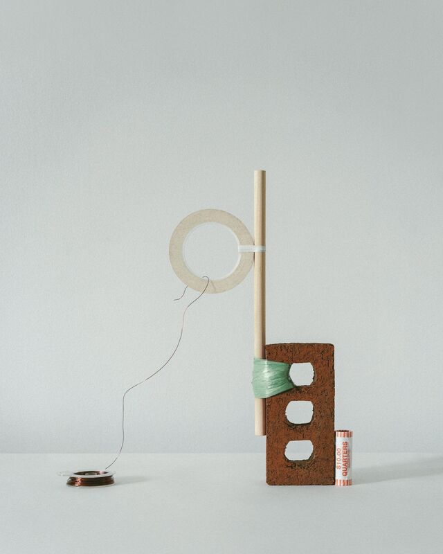
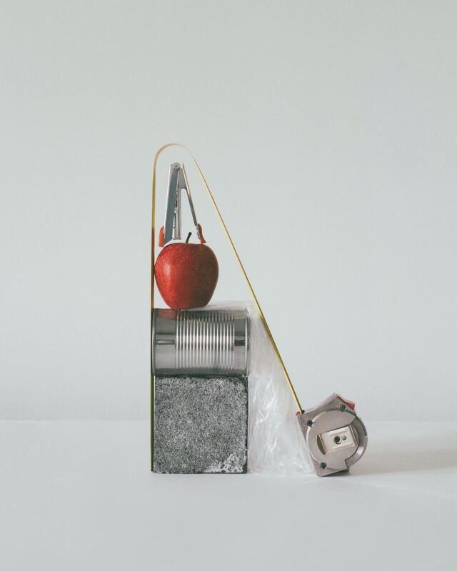
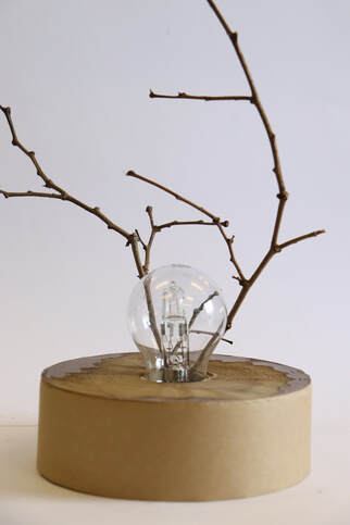
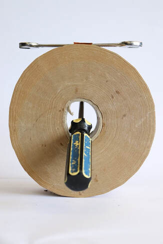
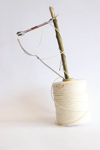
Lockdown sculpture
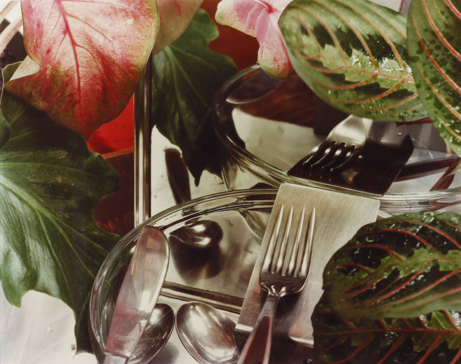
With this subtopic of Lock-down sculptures, our inspiration was Sharon Radisch, we built a sculpture made from items typically found at home or in the neighborhood, for example: hammers, light bulbs, string and twigs. The reasoning we used a white background was to bring focus to the sculpture, this helped liven the photograph, as well as there was lots of sunlight.
|
The photo shoot: |
|
My 3 favourite
|
WWW: these 3 photographs were my favourite mainly because of how i only used 3-4 objects in each one. I also really like how clear i took the photographs and how unique each one is. In addition i think i did well to mirror Sharon Radisch's work and style, and i love how i utilsed the string to Incorporate the fork in the photo. EBI: i could've used a more vibrant colours in the sculptures when assembling together. |
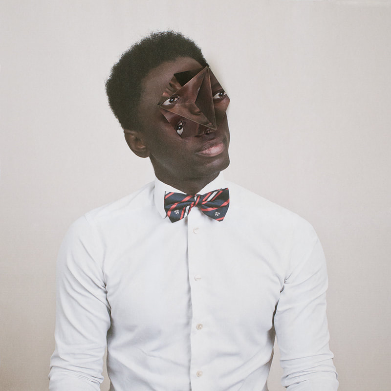
Jan groover
Jan Groover is an american based photographer (1943 - 2011) and was one of the best still life photographers. The artist is best-known for her ability to transform everyday implements and suburban street scenes into unusually beautiful experimentation of space and illusion.
|
|
|
She created her most famous kitchen still life in 1978 - 1979.Using a large-format camera, she transformed colanders, knives, spatulas and baking pans into objects of beauty that still hold a visual interest that transcends their common use. Her seductively modern colour palette of greens, pewter, bronze and brown tonalities permeates the space dissected by kitchen paraphernalia.
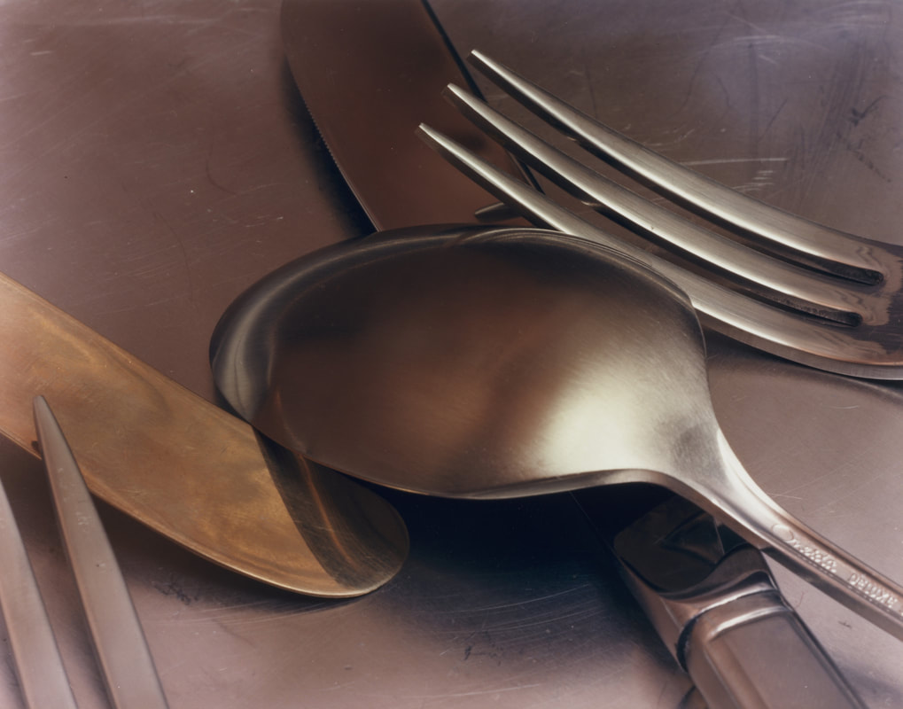
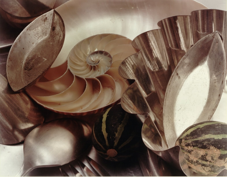
Kitchen still home response
For the kitchen still subtopic, we placed a number of clean/dirty dishes in a sink, after that we took pictures of close ups and far away photographs to reflect on Jan Groovers work. i then moved the objects around to create different perspectives and structures of still life.
|
The photo shoot: |
|
My 3 favourite
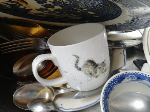
WWW: i really like this close up, because the plate "shields" the rest of the objects, it also has some yellowish reflections which i think add to the aesthetic. The cup is the center of focus and it is also nicely focused and i think the whole image was taken at a good angle even though it was a challenge to find something like this.
EBI: I could possibly add more water splashed around to add some nice effects, so it is more obvious this picture was taken in a sink. |
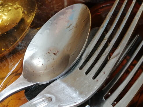
WWW: I think that it was a good idea to reduce the activity of some of my photographs, what i mean is ; less commotion and distraction, and reduce the focus to a couple objects. I think that this highly mirrors Groover's work especially with the colouring of the yellowish bowl. Also i like how the spoon and forks are laid in the bowl and you can see distorted cutlery and plates behind the bowl, it makes the viewer concentrate and appreciate the silverware more.
EBI: I could add some leaves or flowers to increase the similarity or Groover's work |
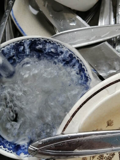
WWW: I really love how I used a relatively slow shutter speed as the water flowing
isn't in perfect focus, but it made this really mesmerising pattern.
It also changes and mixes the colour of the cup slightly on the edges which i much like.
But what stood out most was how this photograph mirrors Jan Groover's work but
also evokes my uniqueness as a photographer. I took her style and printed it
into something different
EBI: I could isolate the cup more to create a wider focus of the cup
Andre Kertesz
André Kertész was a Hungarian photographer, who was born in 1894, he emerged as one of the most influential practitioners of the medium. In the early years of his career, his then-unorthodox camera angles and style prevented his work from gaining wider recognition.
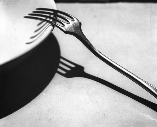
Simple subject matter such as a fork resting against the rim of a bowl placed on a table allows Kertész to focus on the formal composition of the photograph. Kertész elevates the photograph above a simple record of kitchen utensils into a poetic statement by emphasising the beauty in the fork’s simple geometry and form.he famously remarked, “I just walk around, observing the subject from various angles until the picture elements arrange themselves into a composition that pleases my eye.”
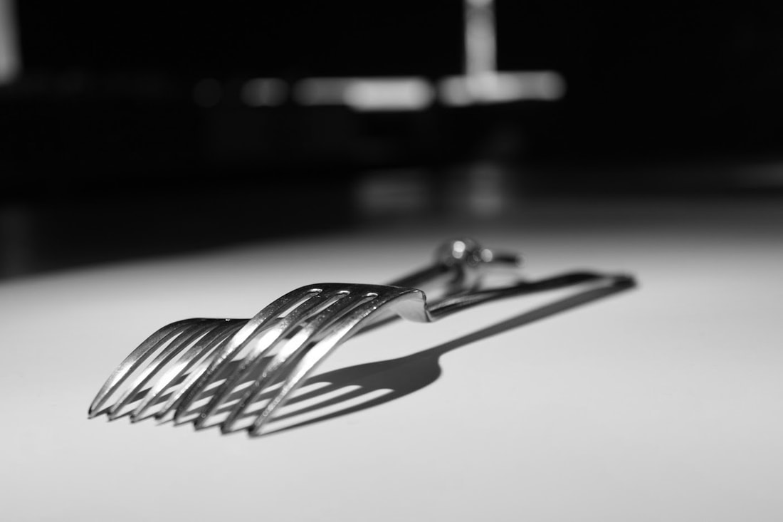
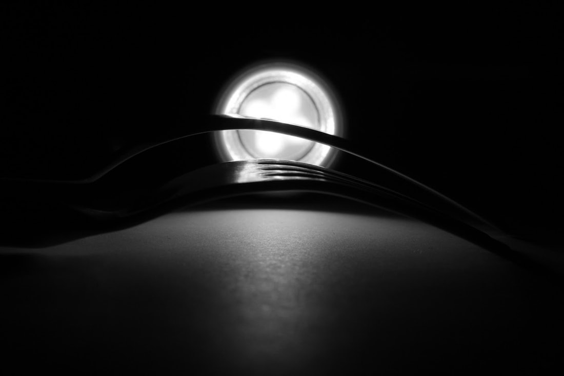
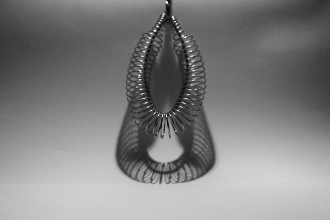
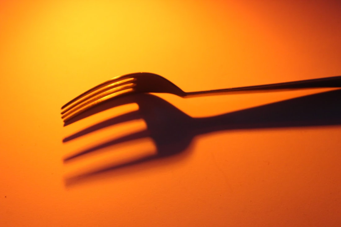
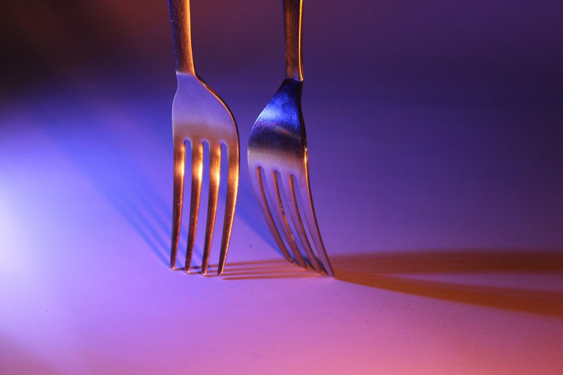
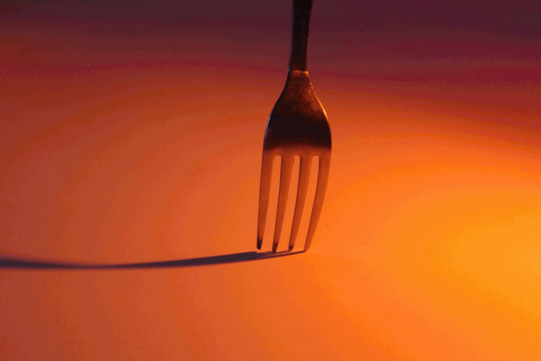
Form over function
In this subtopic, we took one or more forks and used a torch to create a sharp shadow on a white background. Then we moved the torch around to create different shapes and we also swapped the positions of the forks to do the same. After that we used our SLR cameras to capture our favourite images. And finally, i used the black and white adjustment of Photoshop reflect a similar style of Andre Kertesz.
|
The photo shoot: |
|
My 3 favourite
|
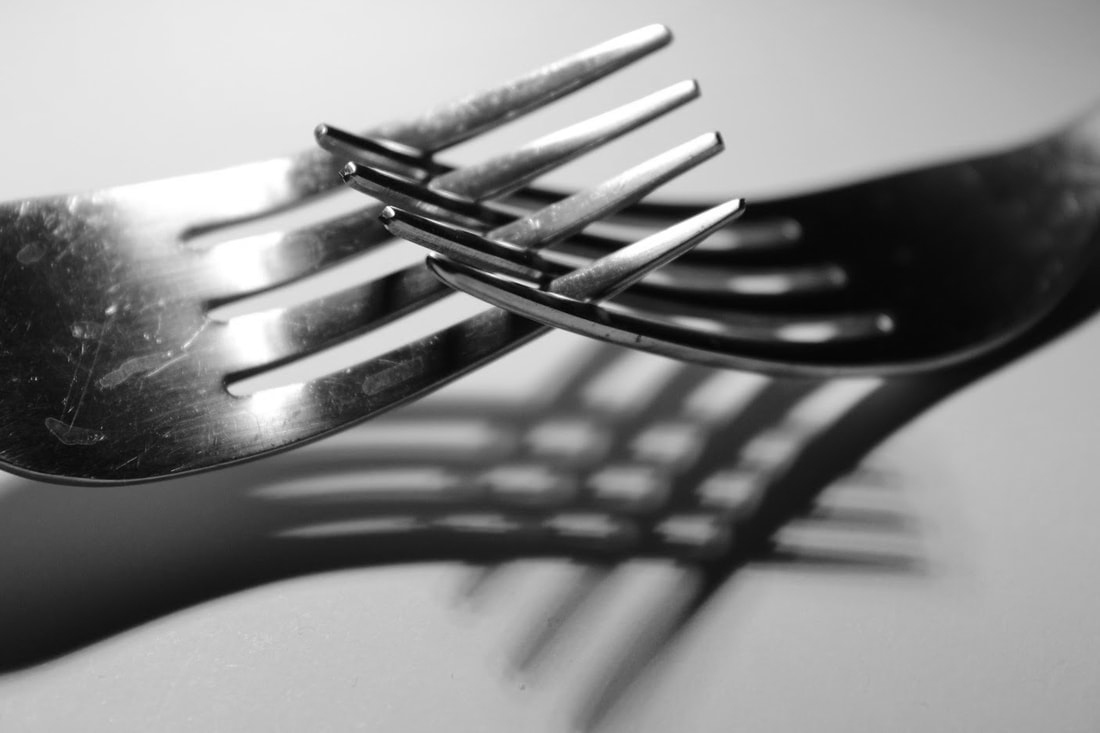
WWW: i really like the contrast between the focused silverware and the unfocused background. Also the shadows are really clear, and the shine from the torch makes the image stand out. Even though i included a torch i think it works well in the image creating really nice shadows and a contrast with the dark surroundings. I also made them black and white to closely resemble the style of Andre Kertesz. EBI: I could've included more silverware to add more interesting shadows and shapes |
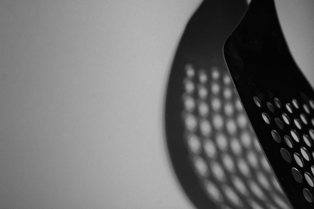
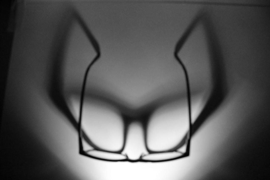
Form over function 2nd response
For the second response of form over function, we used different shapes and objects to create more complicated shadows and patterns. I still used the adjustment black and white to create a photograph closer to Andre Kertesz.
|
The photo shoot: |
|
My 3 favourite
WWW: I really like how i used the glasses shape to create a stretched effect, it really makes the focus of the shot the shadow. I also really enjoy the interesting patters on the whisk which as well as the glasses brings focus to the shadow. I think that Andre Kertesz was trying to achieve something that was so simple yet "pleased the eye". This was something i felt i had achieved with today's images taken. EBI: Some shots are not 100% in focus, i could've played around with the aperture to bring a sharper effect. |
|
Form over function 3rd response
+ gifs
In the third response of form over function we used coloured lights and gifs to widen and transform Andre Kertesz's style of photography. Using colours made the shot look as if it had a theme or a story line behind it.
|
The photo shoot: |
|
My 3 favourite
|
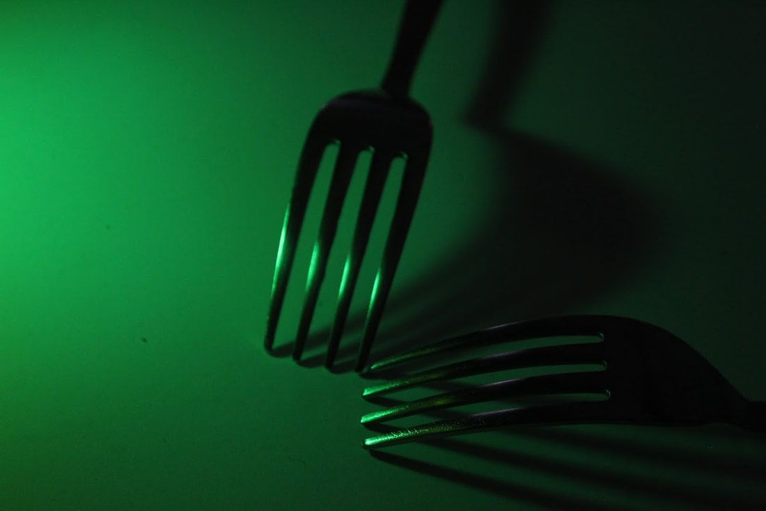
WWW: i really loved how these images turned out because the colours bring an effect and an emotion to the picture, i also decided to only use forks because their simplicity matches Kertesz's ideas but colours gave a change to his technique. The blue and pink evokes a happy sense, while the red brings a devilish feeling and finally the dark green makes me feel sad as the forks are lying down. Overall i think this is a very effective shoot and i executed it well. EBI: i could've experimented more with different shapes and shadow patterns |
Turning form over function into gifs
|
The gif is constructed of these images: I used photo shop to make this gif here's how: |
|
To do this i went onto Photoshop and created layers with each of the images, the i went to Window > Timeline and selected create frame animation. from there i put all the layers into the timeline and had a 0.2 second gap in between each image resulting in:
|
WWW: I like the colours used and how the fork stays stationary but the shadow moves around. I think i executed a simple yet effective idea well EBI: i could've used a tripod so that the camera was stationary to make the gif more smooth |
|
David Hockey
David Hockney is an English painter, draftsman, printmaker, stage designer, and photographer. As an important contributor to the pop art movement of the 1960s, he is considered one of the most influential British artists of the 20th century.
|
|
|
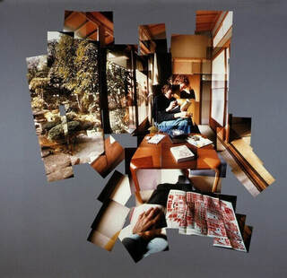
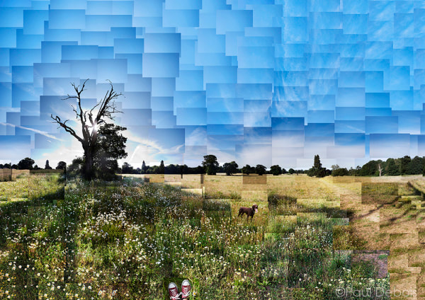
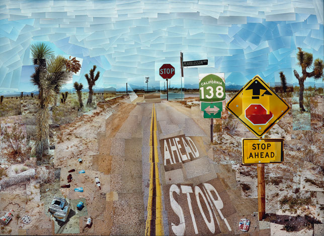
In the early 1980's, English painter David Hockney began creating intricate photo collages that he called “joiners”. His earlier collages consisted of grid-like compositions made up of polaroid photographs. David Hockney is connected to the Pop Art art movement. This movement was interested in responding to Popular Culture. Hockney created photo joiners that consisted of photographs taken of the same object from different perspectives. The images were then collaged together to recreate the place, person or object even though the overall appearance may look distorted. This work connects with the Cubist movement, one of Hockney's major aims.
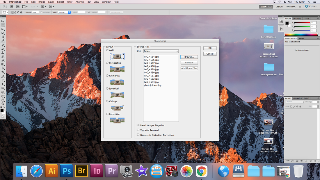
Photo joining
|
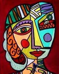
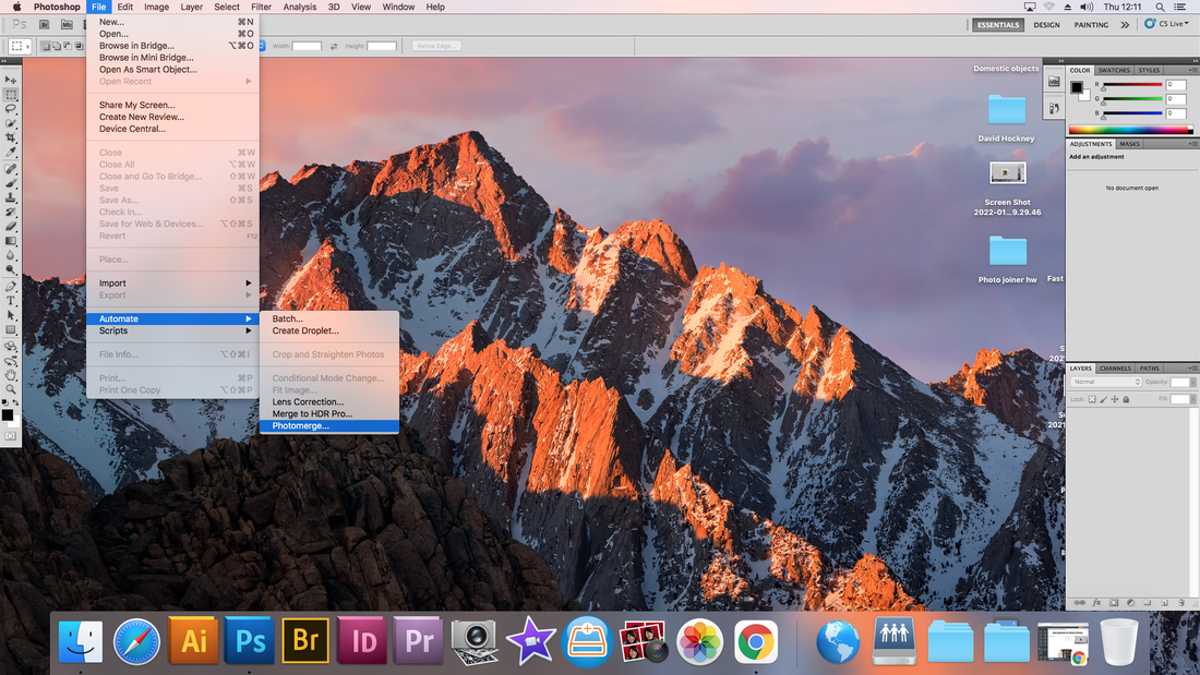
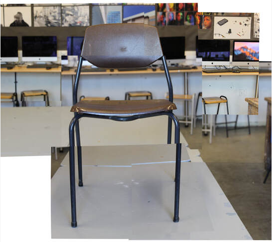
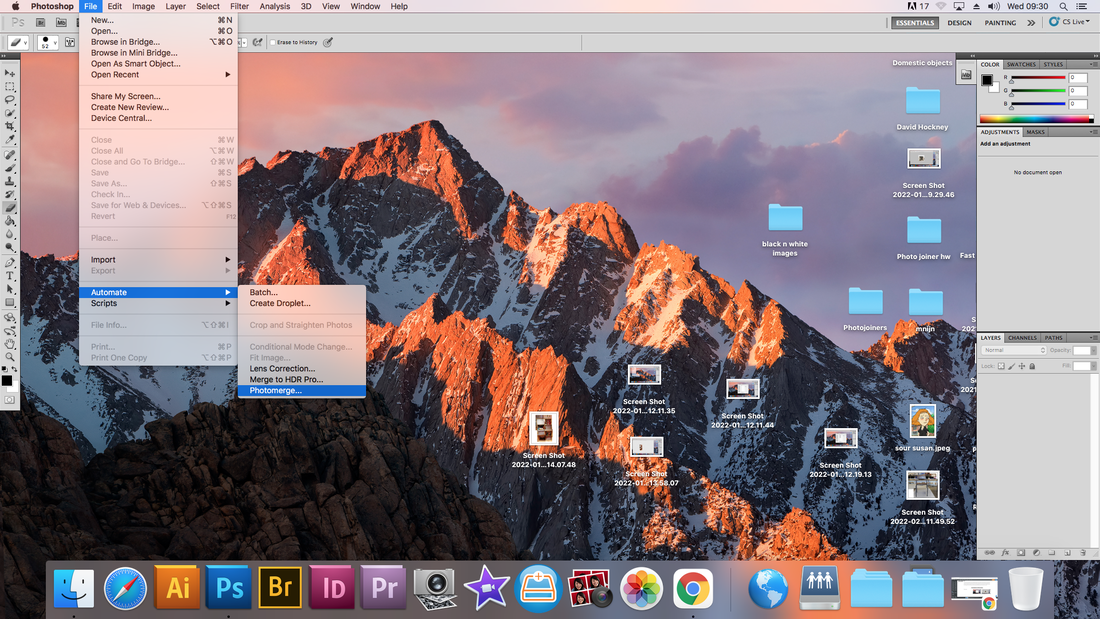
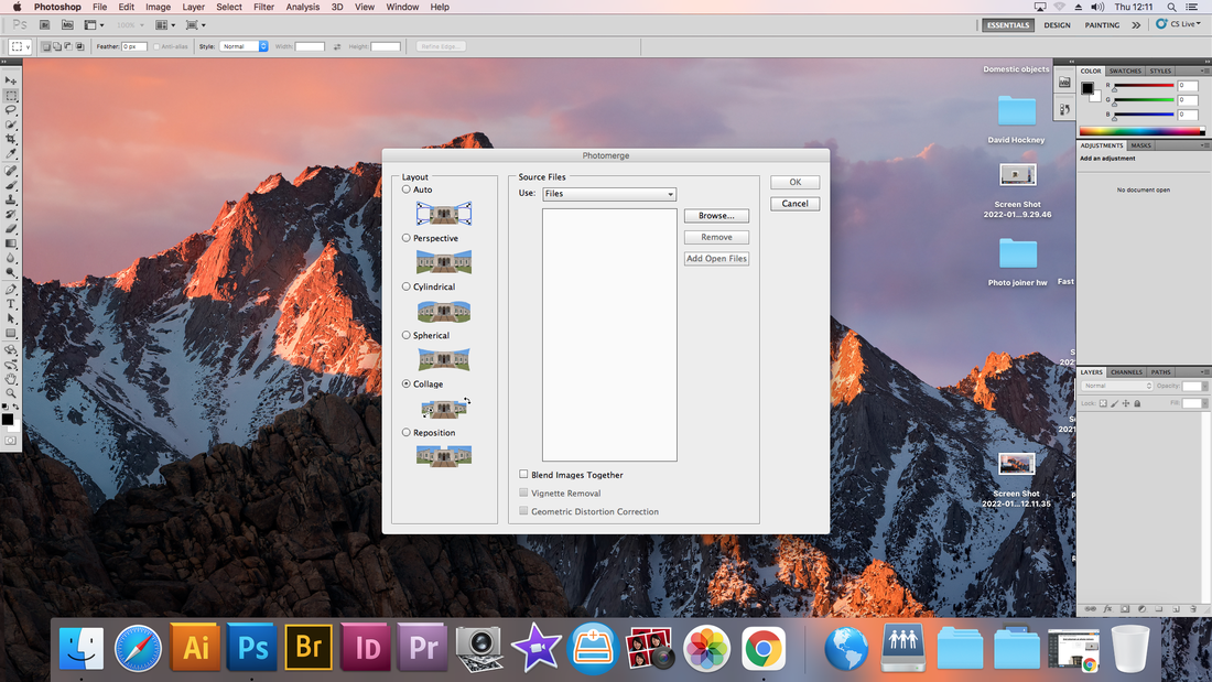
In this lesson we were given multiple images of one object, then we were asked to join/merge them together. This is called photo joining. We used Photoshop's photo-merge, clicked file, automate, photo merge. Selected collage with no blend mode unchecked and chose the photos we took of the chair. Then we assembled our images together, to construct a chair. The idea of photo-merge is based off of the cubist theory created by Picasso. Here is an example of his work:
|
|
Process :
|

|
|
|
WWW: The chair looks like a real chair with the seat looking normal, and the back-rest. The background fits quite well together. I found merging some of the layers made it easier to see which parts of the chair left you needed to place together. EBI: The chair legs were slightly lower because they appear too long, also there is a gap in the background that i could've filled in with another piece of the table. |
2nd Response
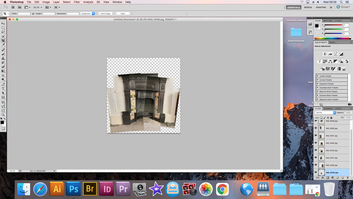
In the second attempt we used the same method as we did the first. Files>Automate>Photo-merge>collage>deselect blend images>select images from the folder>construct your images>flatten and resize image.
|
The process:
|
|

|
|
|
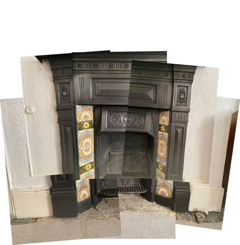
WWW: I think that the structure of this fireplace is very different especially the patterns across the side, also it functions very well with the photo joining subject of photography and Picasso's cubist theory. You can clearly see that this image is a fireplace and i really tried placing all the images correctly and i am happy with how they merged. EBI: I could've added more to this image by including more of the top of the fireplace to reveal more depth in the image. Some parts are not very well assembled too such as the sides of the fireplace. |
Home Response at photo joiners
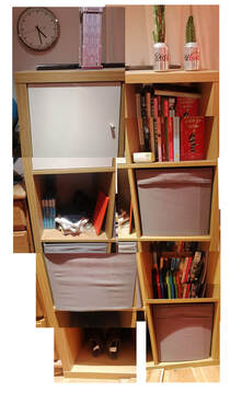
WWW: There was a lot to actually merge together in this image which was a challenge but it seemed to work. The structure of the shelf looks stable too.
EBI: I should try making it more smooth between the middle and removing the white line toward the bottom of the picture |
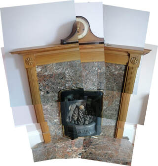
WWW: I love how this whole image turned out, the marble was a nice texture to choose because it looks good and was easy to merge, everything looks very symmetrical which i like and the fireplace is very well put together.
EBI: The clock was more rounded, i should've taken a picture that was closer to the clock to do this |
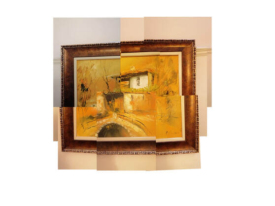
WWW: The painting looks almost identical to this photo i made. I chose a good
object to break down as it was easy, but looks really nice. The frame is a square and the
art looks like the house its meant to be.
EBI: The shades and colours in the top left were the same as the rest
of the picture. I could do this by taking the picture at similar angles so
that i don't need to resize them in Photoshop.
3rd Response
Files>Automate>Photo-merge>collage>deselect blend images>select images from the folder>construct your images>flatten and resize image.
|
The process: |

|

|
|
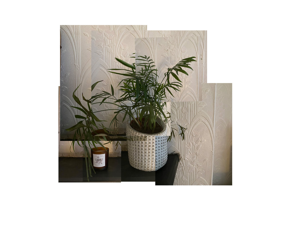
WWW: I think that the plant pot itself and the table are well merged. Also i think this piece is very unique because its unordered aspects contrasted with the orderly aspects, symbolising the chaotic world we live in contrasting with the natural world. EBI: The wall could be be better merged, for example be a clearer patterning. |
4th Response
Files>Automate>Photo-merge>collage>deselect blend images>select images from the folder>construct your images>flatten and resize image.
|
The process: |

|
|
|
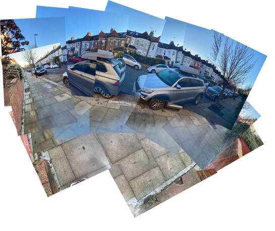
WWW: I love the vibrant colours and how you can see many angles in the same picture of the street, for example you can see both ends and all the houses curve round the whole image. The houses at the top look very well blended and most of the cars. Good pictures were taken to help improve the effect of photo-merging. I think that this photograph really mirrors Hockney's work. EBI: The pavement was in its usual pattern, I could've rubbed out where i didn't need parts of a picture to make it less box-like. |
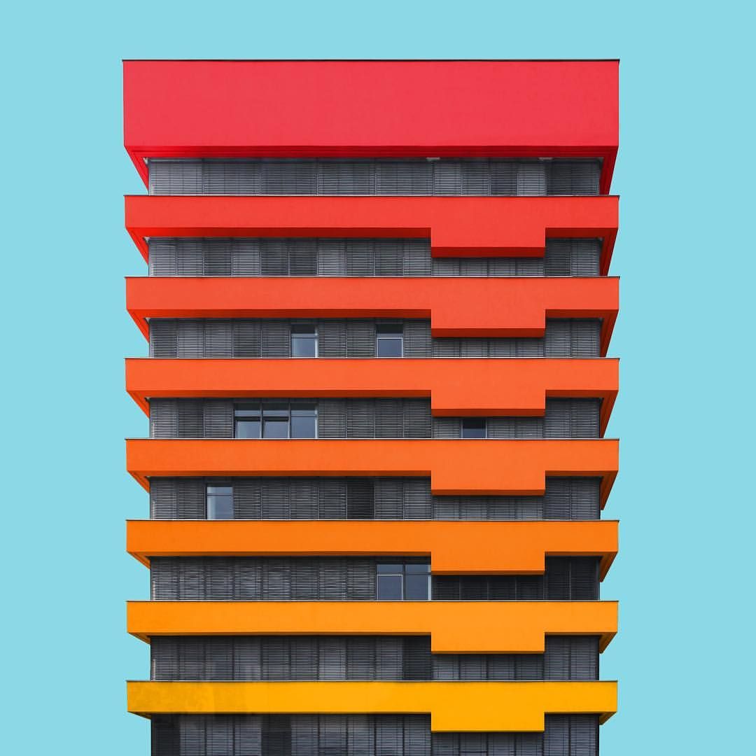
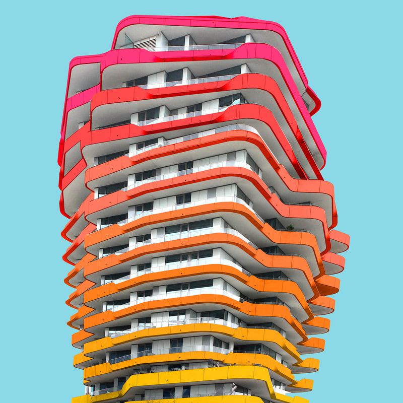
Paul Eis
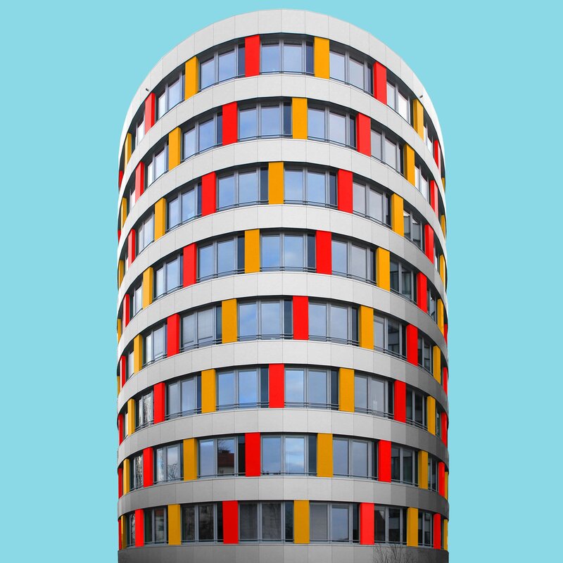
Born in Berlin in 1998, he has always been passionate about architecture and now that he is about to become an architect himself, Paul Eis continues to be convinced of the beauty of the many modern buildings in his city, like others in Germany and Austria. So, he decided to add a spot of colour to the architecture.
|
|
|
Paul Eis mainly wanted to still capture and contain the realism in his work but create and add more colour and vibrancy. He stated "I colour the buildings to show how colour can turn simple architecture into interesting buildings. My project is not meant to be a recommendation about how to construct buildings, but it should encourage people to think more about using colour in architecture." In order to make the building look more central, he removes the environment and the sky and replaces them with a plain flat light blue that makes the building more monumental and helps direct the focus of the observer.
Simplification of architecture
In the topic simplification of architecture we took a simple building, and removed its detail only using the core colours of the picture. To do this we selected File>open>chosen image>Polygonal lasso tool. Then we highlighted the chosen parts we wanted to simplify, you can see what this means in the process. After that, select Filter>blur>average. Finally i worked my way round each shape to conclude to:
|
Process: |
|
|
Before:
|
After:
|

|
|
|
WWW: The two images are the same shape so they have a smooth transition in the gif. Also, i used the lasso tool well, making sure any small spots were blended. EBI: I could have incorporated more shadows on the left side of the image. |
2nd Response
In the 2nd Response we changed the method used. We went to : File > open > my chosen image. then used the lasso tool again to select certain parts. After that, we selected Edit > fill > colour. Next we selected the colours we wanted, and did this for each section of the architecture.
|
The process: |
|
|
Before:
|
After:
|
|
|
|
WWW: I've payed a lot of attention to the small details which made the overall look much better, I also tinted the windows green which made the shot look as if the colour was reflecting from the wall. In addition, i removed some unnecessary objects like the lamp post, some leaves and reflections in some windows. EBI: I could've used a wider variety of colours and possibly a gradient like Paul Eis occasionally uses. |
|
Pinterest Ideas
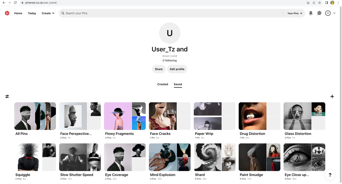
In this Pinterest board I tried to both take the idea of "fragments" both quite literally and metaphorically. Throughout the Pinterest board you can already spot that in all my ideas some sort of face or facial feature is used. I already knew I really liked using eyes in Photography because of the symbolism that they hold and beauty within. I felt i wanted to destroy that beauty to create "fragments". I think that in each idea there is some sort of broken feature or damage within the model. Finally, i felt that using black and white images would be more powerful to utilise because it connects some sort of death or blandness with the picture. In conclusion the distortion of reality is what i targeted when given this assignment.
Roni Horn
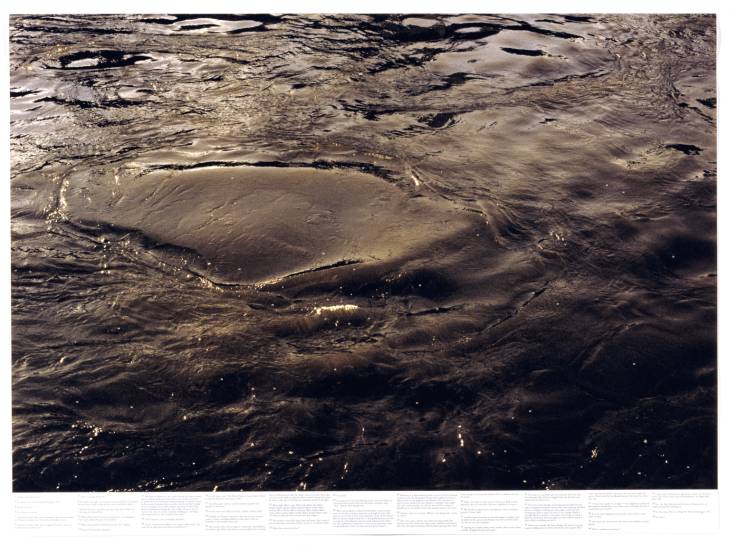
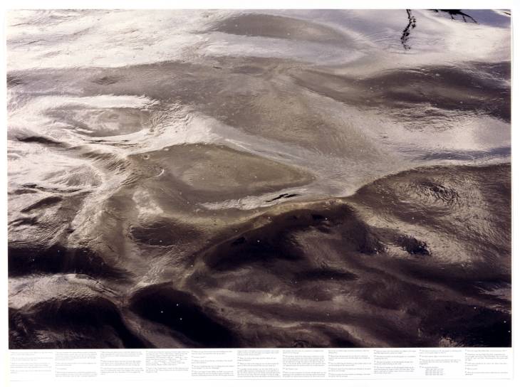
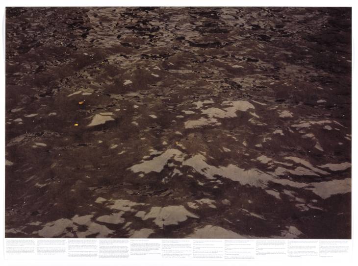
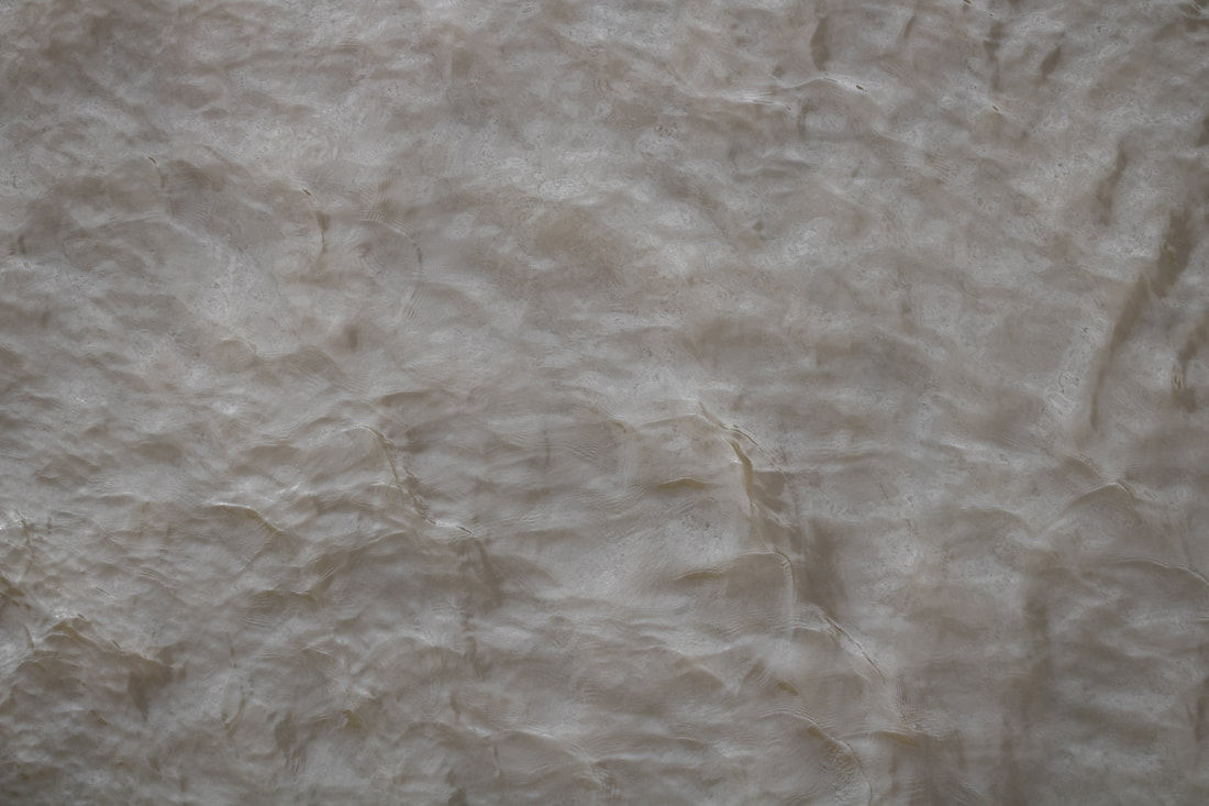
"What do you know about water? Only that it's everywhere differently." -Roni Horn. In 2000 Roni Horn published Another Water, an examination of the water of the River Thames through extensively footnoted photographs. Horn uses a wide contrast between exposure and shadows to create as if the water is more active. It also creates the illusion that the water is alive and not frozen in a picture.
|
|
|
Here I think that still water is portrayed very simply but extremely well because as he says - in a very straightforward for - water is captured in all different shapes and sizes. I definitely understand his concept on these pieces. I also think that fast shutter speed is a very good choice for this work to intently capture the movement and flow of the water. These pictures release a calming atmosphere and sooth me as I view them.
Still Water
In this Photo shoot, I traveled to the Black Sea, River Thames and various puddles to capture these images. I really liked the variety of colours they portrayed. I specifically like how there is no focus to each image but a certain pattern you can enjoy on the surface, but also look down to the ground or eventually solid colour. Finally, i used a 75mm - 300mm lens to capture smaller pattern of water. And i mainly got the images from an angle above.
|
The Photo shoot: |
|
The final three:
|
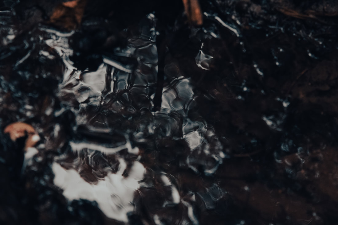
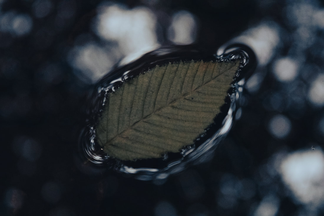
WWW: For this response, I tried to include more texture within the water. As Horn claimed his work was based around the natural movement and elegance of water. I think that i really captured his idea with the image to the left. You can clearly see the bumpy texture of the water. I also love the grimy brown of the water, i shot this shot in the River Thames using fast shutter speed at around 1/800. For the image above I decided to take a more abstract view of water movement. I placed a couple piles of rocks beneath a stream which was running quite fast. I used 1/800 shutter speed again to carefully demonstrate how the water engulfs each rock. The water looks as if its cracking like an ice cube. Finally, the last image with the leaf I had taken because I felt as if there was something i needed to focus on. The out of focus background perfectly contrasts with the in focus leaf. My favourite aspect of this image is the round flow that the water has made around the leaf. The water is about to break into the surface of the leaf.
EBI: Experiment with slower shutter speed to create different effects with the water. It could create more impressive images. Also, I could lights to create interesting patterns across the surface of the water to draw the viewer with various effects. |
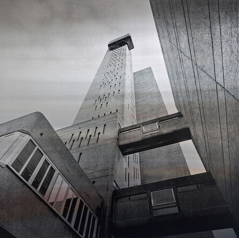
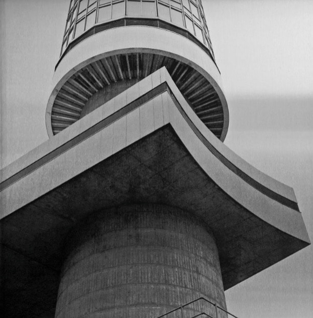
Simon Phipps
Simon Phipps is a photographer and the creator of the New Brutalism collection of photography on Tumblr, Instagram and Twitter. He is a graduate in sculpture from The Royal College of Art. He grew up in Milton Keynes where his parents were architects involved in the design of the city. This could possibly be the reason for the Brutalism collection. Simon Phipps is a renowned photographer of post-war modernist architecture and the author of three books.
|

|
|
In the Brutalism collection I highly enjoy the lower angle as we look up and analyse the wide detail in the somewhat unusual architecture. Once again, this Photographer kept a very similar theme throughout each picture. They look like old photographs taken from war time and strike into the sky with black and white colouring. I think that Phipps uses black and white to evoke clarity but complexity within the architecture of the buildings.
Architecture - Brutalism
I decided to choose this response because my Photography has a tendency to be based around Photoshop and nature and people. Essentially i don't take too many photos of architecture. This summer I was in central London quite a lot with friends and decided to take my camera whenever i was out so that i could get a variety of buildings that live in London. This included old, modern and unique structures. I hope that my final three will be pictures of architecture with mixed designs. I aim to also use similar black and white effects just like Phipps to more so resemble his work and Brutalism collection.
|
The Photo shoot: |
|
The final three:
WWW: I really think that the black and white i used was very effective in mimicking the type of black and white that Phipps used. It has a slight brown tint which is what i was aiming for. Furthermore, I think that the intricate detail of each building is extremely engaging for the viewer. I especially love the curved structures above this text. I also love the huge contrast in exposure and shadow. This makes my response more enjoyable and entertaining. It is on the darker side of Photography however it adds a sense of mystery. And finally, one of my favourite aspects to these pieces is the darker colour of the sky as if on the brink of night even though these images were taken at around the afternoon. I did this so that i could get some nice reflections with light and sever and drastic changes of light intensity on the surface of each structure. Each detail can be clearly seen with an intense shadow by its side.
EBI: I can use Photoshop to up the grain, essentially making the quality of the image more vintage and closer to something that Phipps could have made. I tried to focus more on quality than quantity but i could have spent a bit more time outside taking shots of these buildings. Finally, I could travel somewhere more rural and take some images but in the same style to develop this piece in my own style. |

|
Terror in the Eye - Pinterest board
For this response I decided to take a look at my Pinterest board and adopt one of those ideas. I really love the use of eyes because i enjoy the mesmerizing iris in each person. Oddly, I decided when editing to destroy my favourite part. This links to the idea of fragments - to remove something and leave the remains of the object. I felt that by removing the eye or adding someone else within the eye -screaming or hands - can add an intense atmosphere of fear. We can see the pain behind a person. I attempted to take images of several people so that i could use different eye shapes and colours.
|
The Photo shoot: |
|
The final three:

|

WWW: For the Photograph above, I decided to add some sort of colour to add variety with the other two shots. The red a blue nicely contrasts each other. I made the red bleed into my models eye to create some sort of pain that we can view. Something I think is very utilised is the reflection of the room they are in. It questions the viewer about their location in a way. We are instantly met with a fearful atmosphere when admiring these images. I think that each symbol in the eye can indicate the different forms of pain and grief each individual may be going through. The hands animating down presents a sense of hopelessness here. They also really convince the reader that hands are being dragged across the inside of the eye. For image to the left, I decided to illuminate the man screaming from inside to create this feeling of being trapped within your own reality. For all images I very successfully removed the iris of the eye to create some sort of distress. Finally, the white i use for eye was used to create this sense of death. As if the man is a robot constantly moving forward with a certain set of rules. It's a zombie like image.
EBI: When using overlays to apply the images of hands and faces, sometimes it cut out the top of the eyelashes. I could avoid this by duplicating the layer and cutting out very thoroughly the eyelashes and pasting on the top layer so the realism of the piece is kept. |
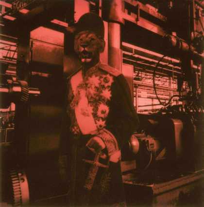
Maurice Broomfield: Industrial Sublime
What the exhibition was about--
There were a handful of Photographers, however one that stood out to me and had the most photography presented at the exhibition was Maurice Broomfield. Maurice Broomfield's dramatic photographs captured factories and their workers in an era of rapid transition, depicting the remnants of the industrial revolution alongside emerging technologies. Broomfield was an English photographer whose images of post-war British industry were credited with capturing the optimistic spirit of the time.
How the work was curated--
The Photographer had his work layed out in an unorganised matter. There was an information sheet with audio playing if you wanted to have a listen. The information sheets were very informative and I felt i understood Broomfield as a Photographer with the clear and concise explanations. The Photographer had his work layed out across one long room. There was a couple paragraphs of text on the wall about Broomfield's overall ideas as a Photographer. We moved around freely as we viewed and red each impressive image and point of Broomfield. Finally, I could recognise some techniques used in his Photography that I have previously used, which inspired me to create more wider and impressive ideas with them.
Some examples of his work--

|

|

|

|
The three highlights of the exhibition--
1) I really enjoyed each individual story behind each picture that the Photographer had written about, for example "|This image captures the contrast between the swirl of the wire and emerging sparks from manufacturing balanced by the still shapes of the machine and operator, they made 'a perfect industrial ballet' said Broomfield".
2)I love it when the Photographer simply uses Black and white images to portray possibly the blankness or dullness of something. We get the feeling that heavy industrial work like this must be extremely tiring. Broomfield fond this work fascinating. However, from time to time, he used colour which I thought was a bit unusual but mostly with the female workers, to possibly express and more gentle type of work.
3)I find his excitement of other peoples work also very influential and inspiring. I imagine all the different environments he has had to travel to. As a Photographer that is exciting and motivating.
Conclusion--
In conclusion, Maurice Broomfield has heavily inspired me to take Photographs of people doing normal activities such as walking, working and resting. I feel I want to take pictures of the world as it moves, not move things in the world for my photography. I may create a response to Maurice Broomfield and take pictures of people from all over. I will try to take some of the theme as i love the contrast of an 'industrial sublime'. My main focus from this exhibition would definitely be the subject and maybe meaning behind each Photograph.
Surrealism Beyond Borders
What the exhibition was about--
This landmark exhibition will rewrite the history of the revolutionary art movement Surrealism is not a style – but a state of mind. It aims to subvert reality. To find the uncanny in the everyday. To tap into our unconscious desires and bring dreams to life. I felt that this exhibition was very important to go to, even if Photography wasn't the main focus. Furthermore, the subject and theme of the whole exhibition stood out to me, especially during my "Fragments" to create a sort of dream world which is broken down from everyday life.
How the work was curated--
At this exhibition there were loads of Photographers, Artists and Sculptors. On top of this, loads of different styles were curated to me and inspired me with a lot of different techniques. At first, we were presented with the beginning of surrealism, some of which include "A train rushes from a fireplace" and "A telephone receiver morphs into a lobster". After that we looked at Poetic objects, The work of dreams and Revolution first and always which focuses on the key idea of surrealism which offers the possibility for transformation and liberation. Then we looked at work from around the world which included: The Bureau de Recherches surrealistes, Paris -, Haiti, Martinique and Cuba. Surrealists in Europe perceived an affinity with art made by Indigenous peoples of Africa, Oceania and the Americas.
Some examples of the work--
|
|

|

|
The three highlights of the exhibition--
1) At first I didn't really understand the concepts of surrealism, but as you read the story introduced behind each piece it became quite fascinating. Something, especially, that I really enjoyed was the work from Cuba, Haiti and Martinique because of the intricate shapes made and creepily stale faces. I think it really made me think about surrealism.
2) Another concept I found interesting Toshiko Okanoue photography, she captures a very dreamy and imaginative world throughout her photos, this exhibition made me research her further and appreciate more of her surrealist photography.
3) Finally, arguably the most intriguing work for me is the Cadavre exquis (exquisite corpse) which is a collaborative drawing approach first used by surrealist artists to create bizarre and intuitive drawings.
Discussing the work of one particular Photographer--
Toshiko Okanoue burst onto the Tokyo art scene as a young woman in the 1950s when her photo collages came to the attention of Shuzo Takiguchi, a leading figure in Japan's Surrealism movement. Although Okanoue's work features the fantastic imagery and incongruous juxtapositions that characterize Surrealism, the similarities were accidental: at the time, she knew nothing of the international effort to liberate the imagination by tapping the unconscious mind, or indeed that collage was an established medium already used for decades by avant-garde artists in Europe. Okanoue hit upon photo collage as a means of self-expression independently, through her own explorations with scissors, glue and images clipped from imported magazines.
Conclusion--
In conclusion, this exhibition was a very inspirational one, opening lots of doors for potential Artists and Photographers I can link to for some of my own work. Surrealism is definitely something I want to take a more closer look at in this project and this exhibition helped me understand a more real concept of it. Not only did it teach me loads and inspired me, the exhibition itself was extremely entertaining with lots of different concepts and ideas about surrealism.
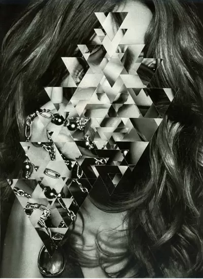
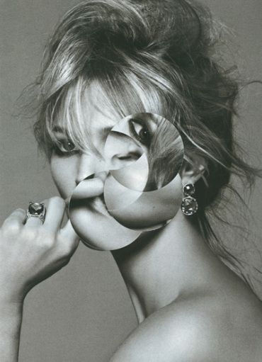
Gordon Magnin
Gordon Magnin is an LA based artist who uses fashion images and turns them into a unique collage of "altered found images" with his use of geometric patterns. His background consists of a Masters degree from the Southern California Institute of Architecture, a bachelors of science in structural engineering from the University of Nevada, meaning that his skill is entirely self taught and his experience is fewer than other artist who have manipulated images for a longer length of time to get to this level of skill.
|
|

|
He describes his work as "precise, intricate, geometric and destruction". His alteration of single images using precise geometric cuts and operations completely restructure the form of the original photos, and due to the majority of his photographs being portraits, the repositioning of geometric shapes cause deceptions at first sight as the eye is not used to features of the face being in strange places, which is what makes his work so unique and individual. His use of black and white colouring accentuates the features of the face even further due to the quality and use of shadow in his photographs. His aim of work is to break down the expectations of perfect looking models and to challenge the industry's perception of beauty. I see this as almost a mock of the industry as it decreases the beauty in the image itself.
The geometric portraits
In this assignment - Geometric portraits - I planned to get multiple pictures with various poses with different models just like Magnin has. I tried to make them seem very natural so that make images have more emotion. Then I knew i would use the elliptical marquee tool to create circular shapes and twist them to create different a distortion. I tried to also experiment with other shapes like squares. I used the contract tool to reduce the selection of the image by a set amount of pixels every time. This was very successful to create this effect. Also, I knew i would have to make my images black and white and i wanted to make my images look like older photos to mirror his style.
|
The Photo-shoot |
|
The Final Three + Gif:

|

|

|

|
WWW: In this response I very successfully mimicked Magnin's photography. I used the same shapes and effects that he does and distorted the face in the same way he does. Something I really like about my pieces is the variety of models which creates more diversity within this response. I also think that adding a gif is what separates me and Magnin. I think it is a good way to show the process of distortion as you can see each second of the face shifting forms.
EBI: I really wanted to make the images seem "older" in a way by using black and white. However Magnin uses a hazy effect to create this look. I could go back in Photoshop and make the images look more timed.
EBI: I really wanted to make the images seem "older" in a way by using black and white. However Magnin uses a hazy effect to create this look. I could go back in Photoshop and make the images look more timed.
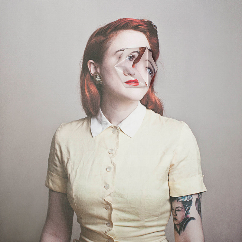
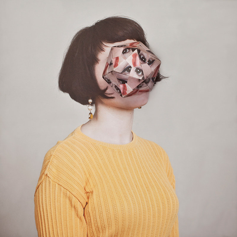
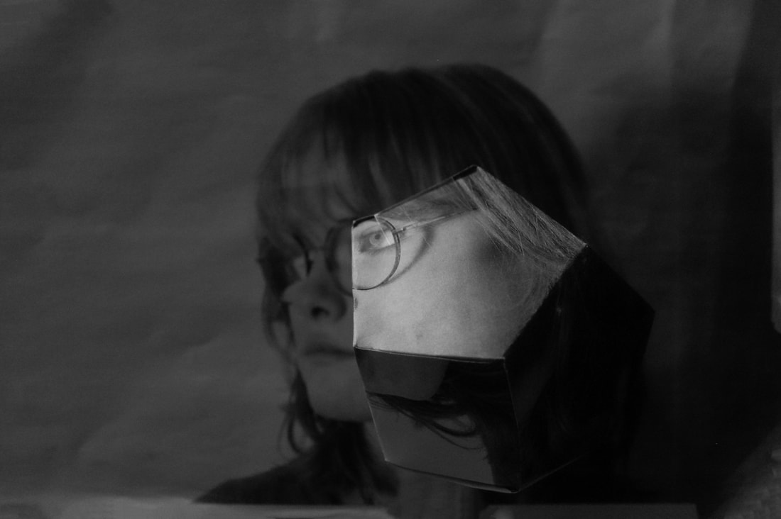
Alma Haser
Born in 1989 into an artistic family in the Black Forest, Germany, Alma Haser is now based in London and on the southeast coast. She is known for her complex and meticulously constructed portraiture, which are influenced by her creativity and her background in fine art. Alma creates striking work that catches the eye and captivates the mind.
|
|
|
Expanding the dimensions of traditional portrait photography, Alma takes her photographs further by using inventive paper-folding techniques, collage and mixed media to create layers of intrigue around her subjects; manipulating her portraits into futuristic paper sculptures and blurring the distinctions between two-dimensional and three-dimensional imagery. Haser utilises origami to create these distinctive distortions to the face. Haser named these series of images "Cosmic Surgery", however she has dyslexia and meant to call it "Cosmetic Surgery" but she thought it suited the series better.
Cosmic Surgery
In this assignment, I printed out two identical images of my model, then printed out a 3D pentagon template. The goal of this response was to create 3D fragments sticking out of a flat image. Once i cut out the template i needed to stick it behind one of my images and cut the image out again. Then I assembled the pentagon together to create the shape. After, I placed it on-top of my second image of the model. Then i lined up the face of the pentagon with the models face to create different dimensions and create different angles and perspectives of the model. I also changed the angle of the pentagon as it made up different images of the model and I changed the angle i took the picture from to create different perspectives and add depth.
|
The Photo Shoot: |
|
|
Before:
|
After:
|
Inspiration:

|
WWW: In the cosmic surgery assignment I felt that I had many different perspectives especially using the defined facial features. I also used the glasses to add extra detail for this photo shoot. The image of the model was taken at a very good angle which is slightly to the left. Something i think is very good in this take was the exaggerated light on the origami pentagon which really centralises the piece and brings focus to the main feature of this piece.
EBI: I could use a higher aperture so that the full image can be in focus and not just the origami pentagon. Also, the background is a little too dark and i could fix that with a higher ISO, Photoshop or a lighter time of day.
EBI: I could use a higher aperture so that the full image can be in focus and not just the origami pentagon. Also, the background is a little too dark and i could fix that with a higher ISO, Photoshop or a lighter time of day.
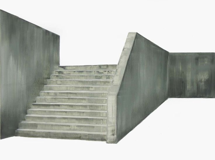
Patrick Cornillet
Patrick Cornillet is a French architectural painter, not photographer, born in 1968 in France. Cornillet resides and works in Nantes. His recent work features austere constructions in empty surroundings. Fragments of architecture left in the center of the painting, in suspense by its visitors. His works capture their spectators in an illusory space.

|

|
|
Because of this the viewer struggles to give an interpretation to these concrete structures. Unclear is if these structures have ever served a purpose other than confusing its viewers. The concrete makes us aware of the material and of the remains left by the humans and of time passing by. Even if the architectures seem austere, spaces seeming uninhabited, dehumanised, Cornillet creates a particular poetry and a mesmerising mysticism.
Fragments of a building
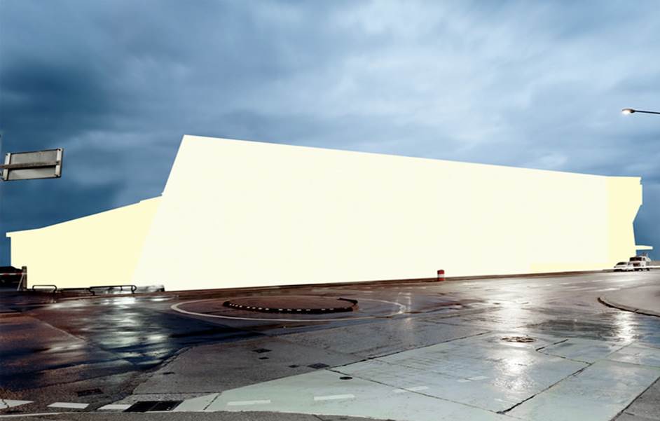
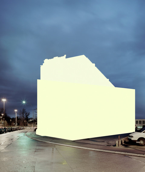
In fragments of a building we needed to take a series of images of buildings that can then be photo-shopped. I had to cut out the "main" aspect of the buildings and stick them in white or sky backgrounds. Also, i needed to take interesting angles and viewpoints in order to create diversity in my work. Make sure to not include people and where possible try to not photograph plants or trees so that editing can be easier and it looks more natural and close to the inspiration.
|
The Photo shoot: |
|
The Final Three:

|
WWW: In this development I really tried to capture images of interesting architecture in order to draw the viewer in more. Even though Cornillet's work is the opposite in excitement I decided to change that as I felt that that's what was missing personally. Furthermore, I included a sky in two of my final images because I also felt it added some interesting effects to the images. I made sure that the skies were not too overpowering so that they did not steal focus but makes the pictures appear more pleasant to the eye. Finally, i really think that the lighting of all images was perfect for this type of photography. It should be very well visible so that you can concentrate on every small detail.
EBI: Play with more angles and perspectives so that i can capture the architecture in different processes. I could also Photoshop the work to look a little bit more like a painting just like the real thing, using an overlay, grain or in the filter gallery. |
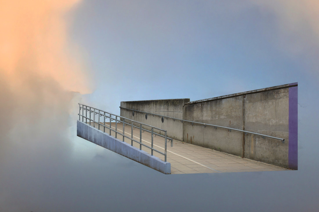
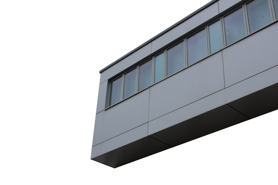
Fragments of a building - second response
In the second response to Cornillet's work I decided to go around my neighborhood and take pictures of houses, stairs, doors, churches and other interesting architecture that may work well for his style. I knew exactly what places i might find quite interesting. Slightly broken or run down objects or "things" attracted me the most for these set of images because i think it adds the most detail and interest for the viewer.
|
Photo Shoot: |
|
The Final Three:

WWW: I think that i got a really nice variety of buildings/structures that I photographed. I once again edited two of my images with skies as i really think it captures a bit more interest, but I had to include one without to stick with some of the artists decisions. Moreover, I matched the skies colour with the structures so that nothing looked unnatural and not normal. I did this with the sky replacement tool which is very quick and accurate.
EBI: I could be even more precise with cutting out edges while using the polygonal lasso tool so that my final result can be further perfected. |

|
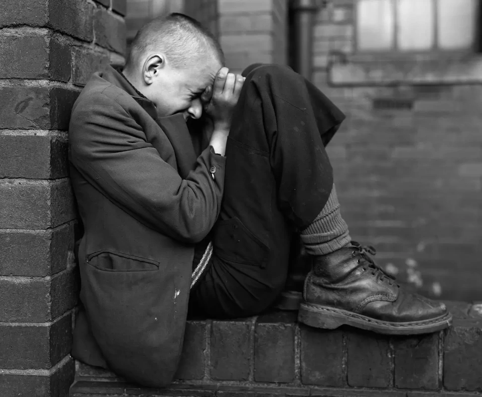
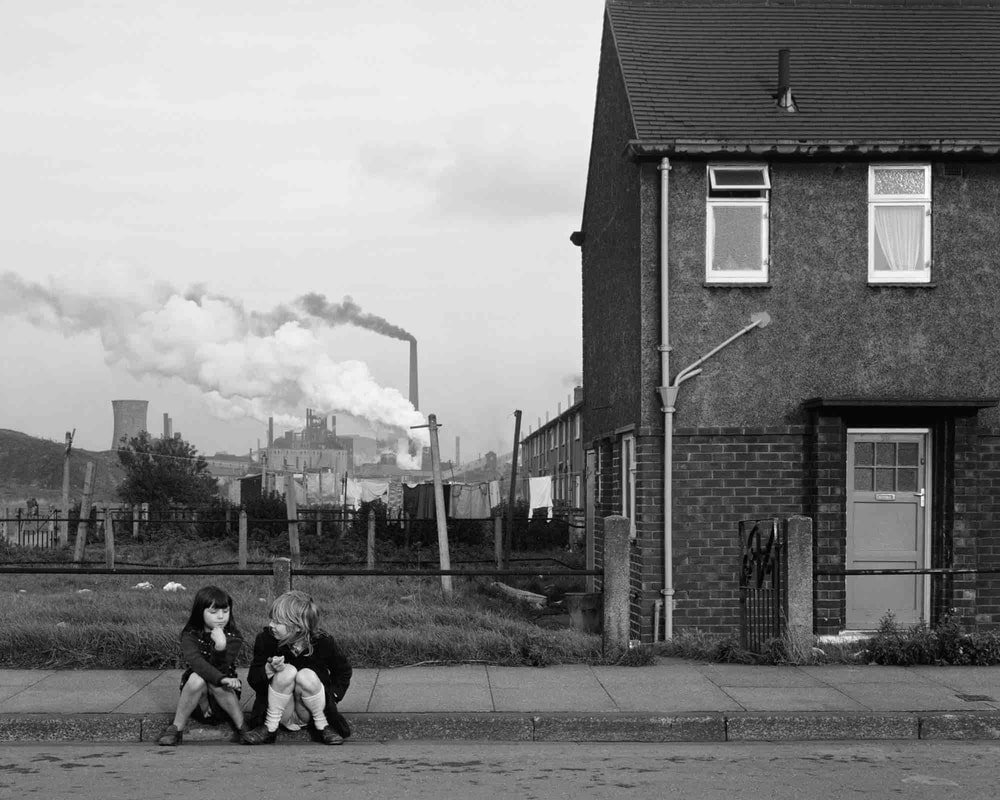
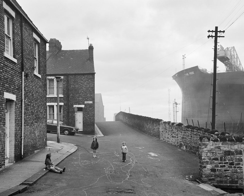
Chris Killip - Exhibition
What the exhibition was about--
Chris Fillip's continued efforts to value and document the lives of those affected by the economic shifts in the North of England, throughout the 1970s and 80s, have made him one of the most influential figures of British Photography. This retrospective exhibition of more than 140 works, serves as the most comprehensive survey of the photographer's work to date and includes previously unseen works. Furthermore, this exhibition exhibits the struggle of England in the 1970s whilst we view the togetherness of the communities and how different people take this impact.
How the work was curated--
His sustained immersion into the communities he photographed remains without parallel. Whilst marking a moment of deindustrialisation, Killip's stark yet tender observation moves beyond the urgency to record such circumstances, to affirm the value of lives he grew close to - lives that, as he once described 'had history done to them', who felt history's malicious disregard and yet, like the photographer himself, refused to yield or look away. His work was very important in documenting the lives that were affected by this wave of struggles.
Some examples of the work--
|
|
|
|
The three highlights of the exhibition--
1. I heavily enjoyed discussing the emotions each of his images contains. For me, every single image i looked at carried something new or a different take to all this commotion with the economic struggles. I feel as if some people may have suffered by: drinking or suffering extreme sadness and frustration whereas some may have talked with friends and been more social in order to sustain their needs as a person. Some images are quite gloomy which helps me gain an idea of the poor/ unhealthy condition people would have eventually ended up living in.
2. I love how all images are black and white as it washes away any sort of affectionate expression when using colour. The black and white makes it seem bleak but in a state that's realistic for the moments of crisis people were going through. The heart-breaking struggles can be more easily felt by using black and white in my opinion.
3. As a young person, seeing previous younger generations and how they grew up does make me feel more grateful of what I have. But it also makes me see how similar life can be sometimes even though this was around 50 years ago. My favourite part and message to his work is no matter how tough life is, you can always rely on a friend of some sort.
Discussing his work in depth--
When discussing his work in depth, there was one main aspect of his work that stuck out to me. This was how Killip used lines in his pieces to centralise certain objects or to create a main focus for attention or to evoke a certain powerful emotion he wants to capture in that specific image. Many of the images use lines to do this, however some don't use any which is where i like to look at whatever I think the main focus of the photograph is.
Conclusion--
In conclusion, Killips work is very inspiring and useful for me as I feel i now know how i can use lines and other techniques to achieve certain powerful emotions. His work is contextually very rich and derives from an important meaning in which I had very little knowledge on. Now knowing these struggles in the world previously it touches me more as a photographer to capture crucial moments in what will be history.
Steve Gallagher
London based Steve Gallagher is a still life photographer with a very graphic and minimal style. His photographs are all about showcasing a single product in its glory. Colour is a key ingredient in his distinct style. Gallagher shoots for some of the best advertising agencies and magazines in the United Kingdom.

|

|
Steve Gallagher utilises the softer bright colour to contrast with the strong and vibrant colours of his still life images. Something key, Gallagher also uses, is the shadow to really eventuate the depth and angles. He also uses a strong, precise strong highlight to extremely contrast the shadow. This all draws the viewer in even with such a simplistic image.
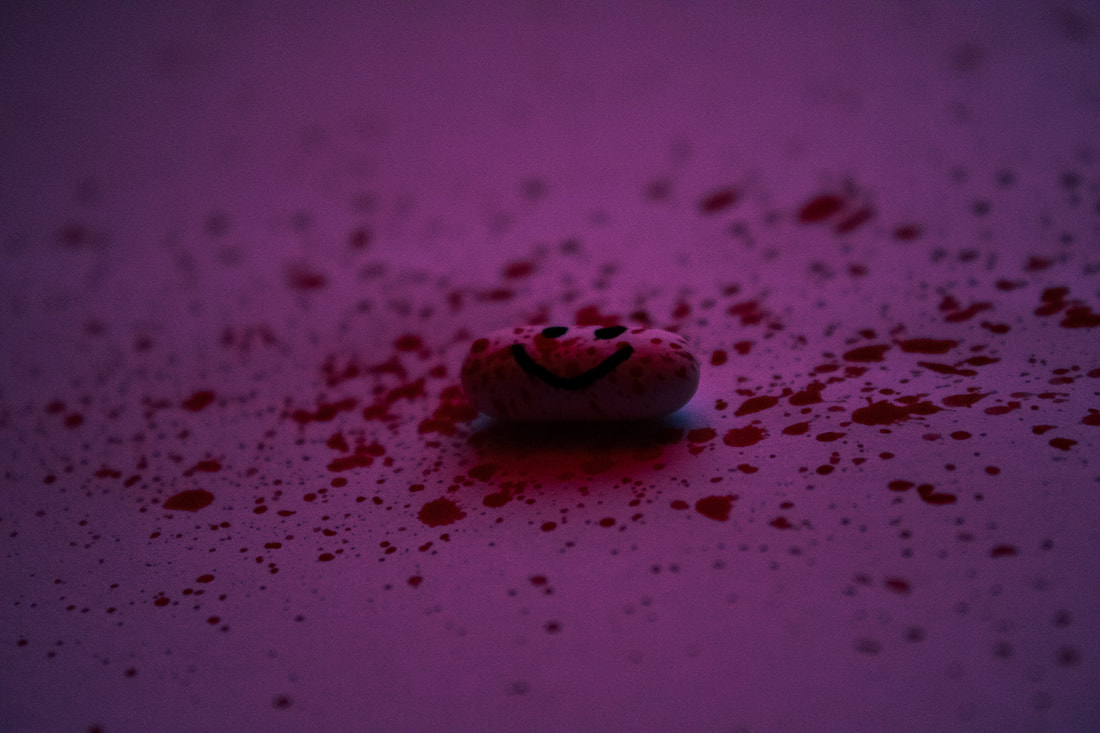
Drug distortions - Pinterest board
In this response, I decided to take ideas from my pinterest board and this called out to me most because it was the most unique. Although this may not be as powerful as using an actual photographer as inspiration in a way it is because you can really observer many different sides to photography. Another question you may ask is "explain how this is fragmented or fragments?". I understood that this work was fragmented when i drew things like smiles and sad faces on the pills which ironically add powerful emotion. The red paint i used to mimic blood or something similar in order to morph some sort of drama or creepiness within the piece. For me, the fragments here is how the emotions clash together and create this creepy feeling. These series of images are unpleasantly happy.
|
The Photo Shoot |
|
The Final Three:

|
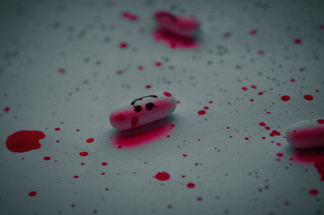
WWW: I really love how these images turned out. For example, I used a red light to create these red effects along with a really dark red paint to create the illusion of blood. All these techniques worked really well. I also used a paint brush to splatter the paint along the surface to create this splatter effect, and also used a sharpie to draw words and faces on the pills. I felt that these pills could evoke such fragments and unnatural feelings in the mind. I used Photoshop > Filter > Camera Raw Filter to change the lighting, texture and colours of the images so that each image perfectly suited the scenarios I felt they were in. Finally, I utilised only red as the main colour to express pain and anger at the same time to create an almost upsetting atmosphere for the viewer. I think that I executed this all really well.
EBI: I could tape the inside of the surface(paper) so that you cannot see the shadows below it. I could also use different shapes/colour pills to express different emotions and it also includes a variety of objects and colours. |
Nicholas Kennedy Sitton
Nicholas Kennedy Sitton is a San Francisco-based photographer who uses a technique. He uses an abstract form and twisted pattern that Sitton achieved through cutting and rotating the image segments slightly.
|

|
|
These photos relate the concepts of distortion to architecture. Creating a sense of falling into itself, like capturing a moment of demolition; Sitton destroys titanous steel structures and creates new twisted versions of reality. Whilst Sitton leaves much of the original image untouched, selections of the buildings have been rotated making the scene look like it’s spiralling into itself causing an almost hypnotic Inception-like feeling. There is a contrast between the fantasy of distortion and disorientation, and the otherwise typical scene.
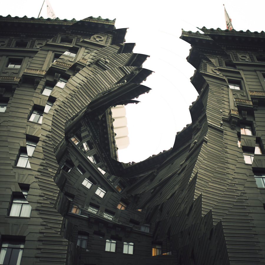
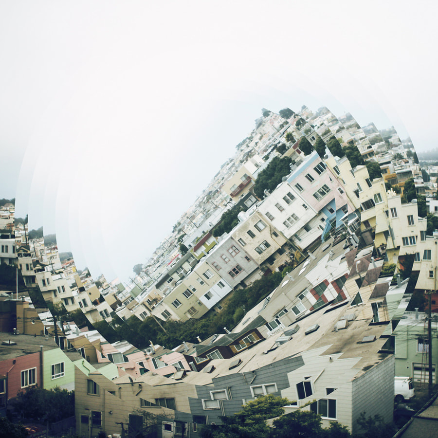
Fragmented Buildings - 1st response
For this response, I decided to go to Batter-sea Power Station because of the modern look, along with the lost older power station in between all the buildings. This was really useful as i could create a dramatic scene. Some buildings already look quite twisted, which also gave me the idea to come back here for this response. The views were also amazing and i could get some excellent images of skyscrapers. I felt this location was somewhere i needed to go as I have been going London bridge for quite a while in my Photography responses.
|
The Photo Shoot: |
|
Photo-shoot is both for Mauren Brodbeck and Nicholas Kennedy Sitton response because there are 90 photos+
The Final three:

|

|
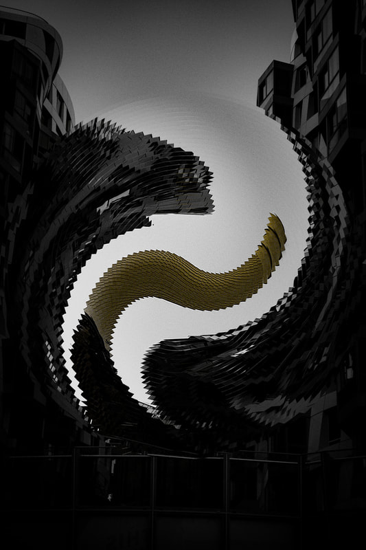
WWW:I think that the editing done here is really effective and recapturing Sitton's work. I decided to use a tighter contract and angle change so that the swirl could be more smoother and building created a wobble effect. Also, the editing of the raw image was done really well, I tried to go for a natural city edit, black and white image and final a more surreal image, based on the Surrealism exhibition i went to. It reminds me of tentacles from the ground when they are really cranes and towers. Moreover, I really like how I used the luminosity blend mode to express what the image looked like before the fragmented edit. This way you can really see the destruction. Subsequently, I think i also chose some really good places on the image to distort the towers and used different sizes throughout all images to create a dynamic effect. Finally, I used the close stamp tool, and history brush tool to clear up any white spots or distorted lines so that it looked as if the sky was normal.
EBI: I could use more layering like Sitton does so that I can create a wider depth in my image. I can also not fragment some "main" ideas in my image so that they can stand out more.
Link: Due to this being the first response, it hasn't linked to anything previously, however it is a good first response to use because it can be easily linked to many aspects of deconstruction within architecture in photography.
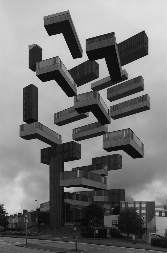
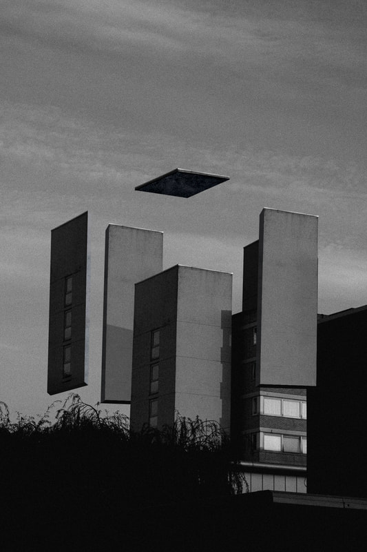
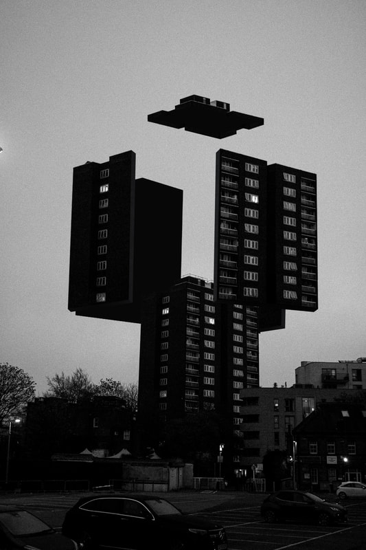
Espen Dietrichson
Espen Dietrichson is a Norwegian artist. He lives and works in Oslo, Norway. Dietrichson was educated at Oslo National Academy of the Arts. He is working mainly within the field of sculpture. Espen detaches parts of a building and levitates them to create a surreal world.

|

|
|
Dietrichson's work is focused around the distortion of architecture. This distortion stands out specifically to me because it isn't just swirls and rotations which can make an image pop. He rather utilises size and perspective to make an image stand out. By multiplying and deconstructing the buildings he can make us feel tiny in a grand world of surreal escape. To further pick up on his style of Photography, the black and white seems to decrease the bright emotions out of this piece and desaturates us to feel almost blank.
Deconstruction - 2nd response
In this response, I plan to gather up images of: blocks of flats, sky scrapers and other casual architecture you may see. I don't want to photograph something too modern as it doesn't mirror Espen's work. Also, I am definitely going to use the black and white colour scheme using Filter > Camera raw filter on Photoshop. I should also keep in mind that i must keep a lot of sky in my image for later editing.
|
The Photo-Shoot: |
|
The Final Three:
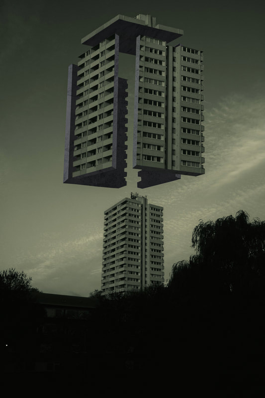
WWW: I really like how this response turned out on the whole. I had some doubts but I think i executed it really well. For example, I love the colour choices, shading and texture I've used for each image. It really reminds me of Dietrichson. Also something that looks really impressive is the roof on each one as you do not have an angle on that side of the building. I copied the outlines of the top and reflected it, then blackened the bottom side. This was a really useful way to get all shapes and angles of the roof assuming they are the same on each side. Some plants where in the way of this shoot but I just used Edit > Content Aware Fill in Photoshop to fill in off spaces or simply copied a significant portion of each image and moved it around with (ctrl + t) transforming it. My best image was definitely my second image. Simply because of how intricate some details where and how well I executed them. I am most proud of the perspectives and angles, as this is something I spent a lot of time and on and captured mostly correctly.
EBI: In the Photo-shoot I could've taken pictures of more buildings by going to a better location with these types of buildings. I could use more warp and perspective warp to fix irregular angles to the original building and also try and make the thickness of each face of the buildings the same size. I wasn't sure how to measure this correctly as well. Link: This links nicely to my previous work with Sitton because it's as if the buildings have now fully split apart, from warping outwards and deforming, to finally split and float upwards. A much more organised form has taken place in this response compared to the pandemonium of the previous response. |
|
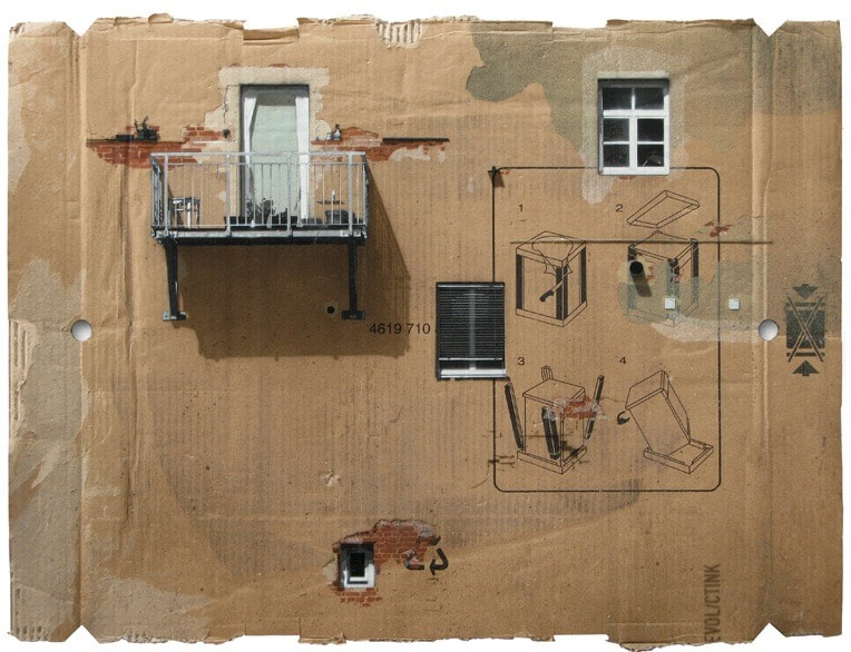
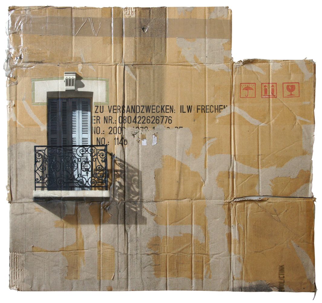
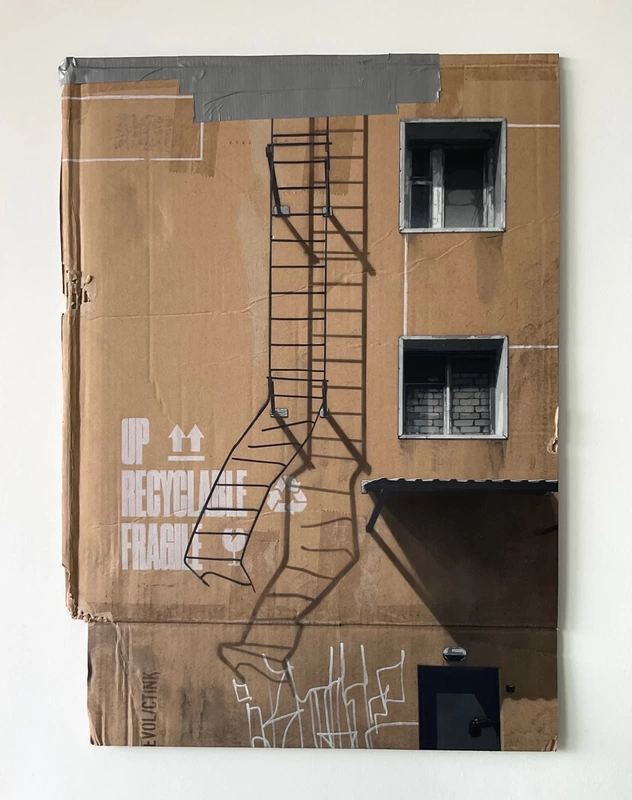
Evol
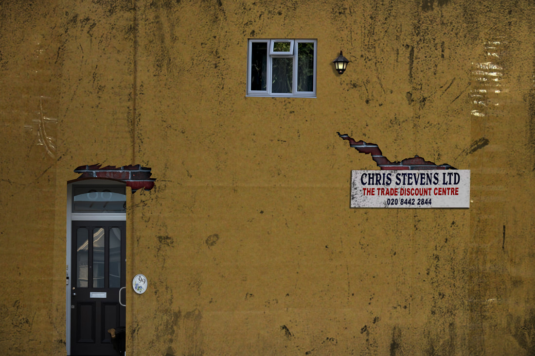
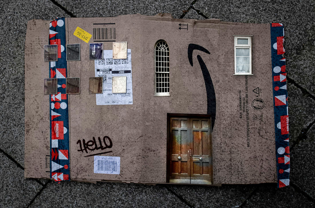
Tore Rinkveld aka Evol, is a German artist, born in 1972. He currently lives and works between Berlin, Germany and Moscow, Russia. He completed his education at Kuopio Acadamy of Arts and Crafts, Finland in 2000 and at HFG Schwäbisch Gmünd, Germany in 2001.
|
|
|
Evol’s artworks, created on found cardboard boxes, celebrate the architecture of an earlier time – the simple Berlin townhouses built around 1910. These ordinary buildings are typical of the neighbourhood the artist has lived in for years – relics of a bygone era that have not yet succumbed to the gentrification sweeping the area. The cardboard provides a rich patina on which to stencil, with existing marks and structures reflecting the passage of time on the walls. The printed graphics, tape and other minute details found on the cardboard also echo the distressed nature and visual pollution of real urban landscapes. In both his studio-based works and his temporary street installations, Evol reduces the environment that surrounds us to bite-sized pieces. Through this reversal of scale, he somehow renders the work harmless: while evoking a stark urban environment, they remain charming and approachable. Drawing on his background in graffiti, he uses his artistic skills to explore the inner workings of the city and makes us look at our surroundings in a new light.
Cardboard Box House - 3rd response
In this Photo-shoot, I used a mixture of images from Bulgaria and Brighton. I made sure to take a lot of images from holiday journeys so that I can use them for chances like this. These images really worked well because I can focus on smaller details within the images such as doors, ladders and windows. Also, these locations had really good lighting and very unique structures everywhere.
|
The Photo-Shoot: |
|
The Final Three:
|
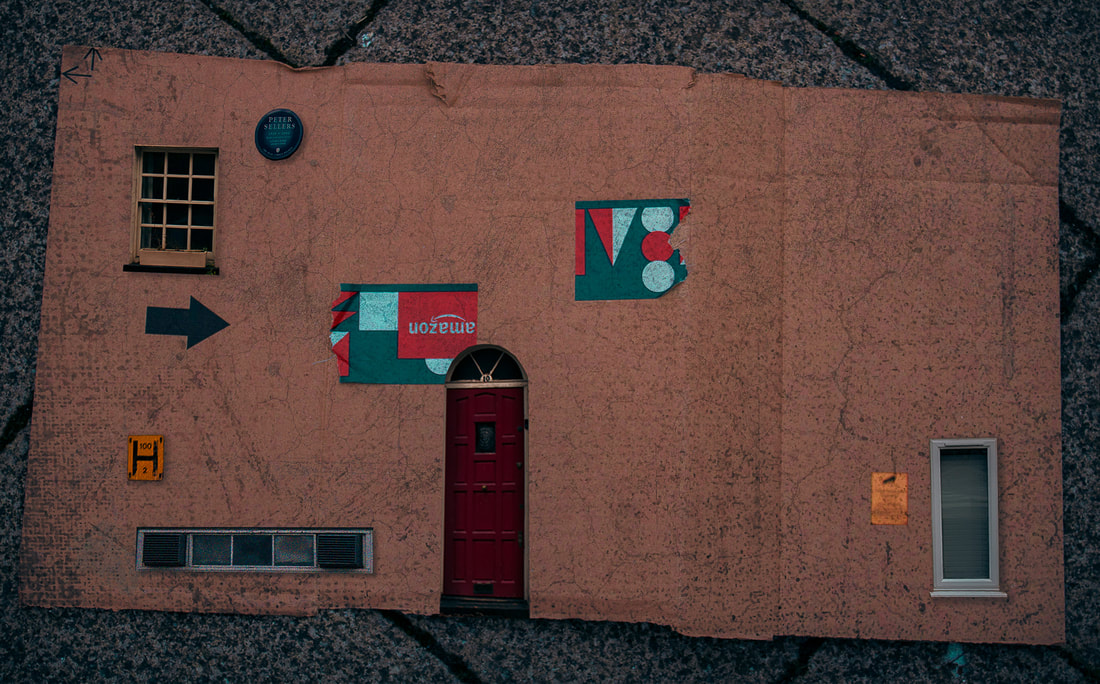
WWW: I think that this response was very challenging, however, i think that i executed it very well. For example, I have very successfully utilised neural filters to match colours, and camera raw filter. I also used drop shadow for things that popped out to make them pop out. And i used inner-shadow for things that need to seem as if they are in the cardboard. Firstly, I used a solid cardboard background however, I found that using a more natural cardboard piece that I found on the street was much more effective, as it looks more realistic. I also used a grunge effect to make the cardboard and objects within seem more disrupted and old.
EBI: I could have used the inner-shadow more effectively and changed some perspectives a bit more so that more realism is achieved. Link: This links well with Espen because I have zoomed into the smaller individual walls of each side. Emphasising detail by adding abnormalities to the image, and weakening the walls. |
Mauren Brodbeck
Mauren Brodbeck was born in Geneva, Switzerland. I consider Brodbeck's work to be considerably abstract as you can have any take on her work. She utilises solid colour to create an empty feeling where the strong singular colour evokes the feeling you recognise that colour with. For example red: anger, blue: sadness. I think that she creates these dimentions of emptiness to question the sociotal norms.
|
|
|
Mauren expresses the following about her work: "In my practice, I investigate the shifting relationships between our reality and the digital world, exploring how we forge our identities within societal constructs and rupturing our perception of reality to expose unexpected beauty and new perspectives. As a female artist, I am deeply passionate about examining the concept of individual liberty and how it is subsumed into society-imposed mental patterns and daily habits. In my work, I focus on female identity and self identity, intimacy, the human body and self imagery, and creation and destruction – opening up dialogues to access new and unfamiliar territories. I love to explore and play with visual, sonic, and cinematographic codes, manipulate time to stretch out or compress visual and auditory experiences, and use duplication, sampling, and layering of multiple visual and aural components – creating pieces that disrupt societal normalization through the physical senses.".
Colour Blocked-Buildings - 4th Response
In this response to Brodbeck I decided to go to Batter-Sea Power Station because of the unique structures I could pull from this Photo-shoot. I felt that these structures can clearly express the same emotions that Brodbeck expressed. They have loads of different shapes within them which create a very unique a significantly different outline to any other typical building. Not only, were the outlines perfect, but I felt that the other objects within an image from Batter Sea is very eye-catching.
|
Photo-shoot: |
|
The Final Three:

|

|
WWW: I really like how I experimented with three different techniques. Firstly, I made the solid colour and tried to match the colours of the general hue of the piece which was yellow. I felt that the chimney was a perfect structure to fill as it is clear and large when compared to everything else which isn't as centralised. Secondly, I used an overlay on the solid colour layer so that the background was sort of transparent while changing some hues in the building to a much more cyan tone. I also reflected that same darker colour on the windows to the right which i found created more realism in the image. Lastly, the image of the city was very successful because of the highlights and shadows that I used, I did this by simply selecting the layer and using a paint brush with slighter lighter/darker hues. This worked really well to create depth and smoothen the image out.
EBI: I could be even more precise with my selection as i contained some people/ lamp posts in the images. this can create a similar cutting out shape like Brodbeck in her images.
Link: This links nicely with Evol because I have transformed the weak structure of cardboard into the actual building utilising different base colours for more variety. I have smoothed the texture to mirror the work of Brodbeck and utilised some shadow and transparency to reflect with Evol.
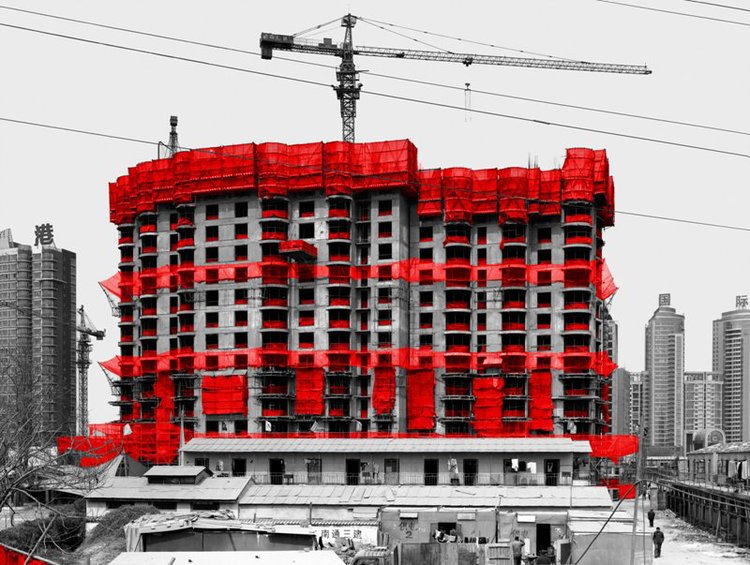
Zhou Jun
Jun has utilised three solid colours : black, white and red to increase the drama of what Jun highlights in his image. This is the scaffolding of buildings within China. By using the colour red, he clearly illuminates this object and emphasises the art and common occurrence of it. This makes me think of how useful something so irrelevant is in life, when it is the base construction element to what helps create these grand structures.

|
|

|
Jun says about his work "The three decades of development China is experiencing – building to a crescendo with the Olympics – are unparalleled in history. The colour red, which I use to highlight specific parts of the photograph, can elicit different responses in people from different countries or cultures – at times, it can even have opposite meanings for people. I want my work to be interpreted differently by people depending on their response to the symbolic meaning of red. In this sense, the work has the potential to reveal international perspectives to common subject matter.".
Fragmenting "Red" - 5th response
In this response, I plan to travel around Muswell Hill in order to take some smaller scale pictures of scaffolding, around my neighborhood. This way I can get variation in my images of different areas. Now that, that's done, I plan to head off to Central London, around Waterloo, and take pictures of much grander buildings, maybe even take a few of the images from my previous tasks.
|
The Photo-shoot: |
|
The Final Three:
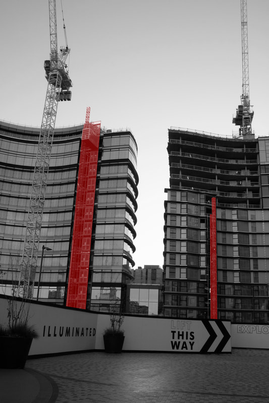
WWW: I really like how I have utilised the magnetic polygonal tool to clearly select the scaffolding, I then used the quick selection tool to refine any rough edges. I used a lighter red tone to further reflect with the photographer oft his response. I think that Jun has outlined the scaffolding in his images to express how it is the baseline of nearly every structure we have built as a society today. Without it, we would be lost. I think that I have coloured the scaffolding well. Differently, I have used the lighten overlay to express some highlights within the powerful red colour. I think that red was a good colour to use because it makes u more aware of the thing underneath it, or what it's trying to accentuate.
EBI: I felt that the images were either full of too much scaffolding, or not enough scaffolding. The proportions of scaffolding to the rest of the image was off. I should've angles my images better, or even cropped some images. Link: This links well with Brodbeck because I took the solid colours off that response and brought them here, plus included the transparency because i thought it looked most effective and linked with the photographer - Jun. |
|
Alexey Bogolepov
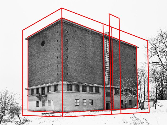
Russian photographer Alexei Bogolepov discusses ideology, geometry and the gulf between intentions and reality in Soviet city planning. Alexey Bogolepov is a photographer based in St Petersburg, Russia. His work focuses on the architecture and ideology of modernism, both in the former Soviet states and worldwide.

|
|

|
They say "There is a prevailing idea about the sinister and ominous qualities of Soviet architecture and its potential to restrict freedom of thought and movement. While not unfounded, this discourse suggests an interaction between only two actors — the state and the individual. In reality, there were other actors in play, namely the architect and the bureaucratic chain of approval. The initial drafts of Soviet city planners were often brilliant and sophisticated, infused with an optimistic outlook and a positive vision of humanity. There is a qualitative gap between what was planned and the reality of what was accomplished, and I’m curious as to whether the latter came out as it did precisely because it was conceived in an idealistic, purist, ostensibly egalitarian way. Perhaps there is a seed of oppression inherent in idealism itself?".
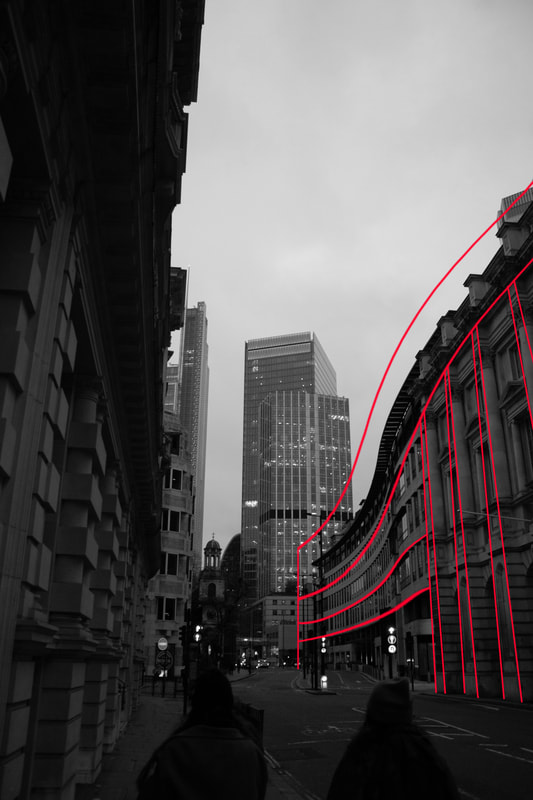
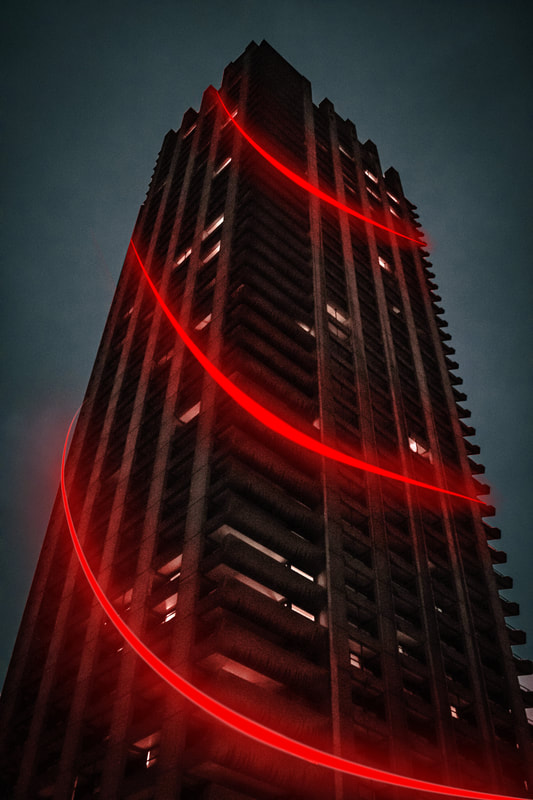
City and Reconstruction - 6th response
For the penultimate response I plan to head to the Barbican, which is famous for its brutalist architecture, which is exactly what i want for this response as a way to clearly link Bogolepov and me. Also, I plan to use Adobe Photoshop to create thin, red lines that run along the main points of the images. A black and white adjustment should also add to the similarity of me and the photographer. Overall, this response should explore the main features of Bogolepov's work, however be adapted in my own creativity.
|
Photo Shoot: |
|
The Final Three:
|
WWW: I think that I very successfully utilised the pen tool to create solid red straight lines which mirror the style of Bogolepov. I have clearly outlines the main features of the architecture and I have fragmented them outwards. I aimed to capture photos of architecture, which can be linked to the movement - brutalism. The Photo-shoot was very successful at this and consists of many images of brutalist architecture. Furthermore, I used opacity and copying the base image twice and moving it up and left/right to help retain parallel lines with the key features of the structure. Also, I tried to use curved lines to develop in a way which was significant to me. This worked very well as it was something Bogolepov didn't have, but looks effective. To do this I used the warp tool. Subsequently, The width of the brush was 4px to further reflect on the key design of Bogolepov. Finally, the black and white adjustment to the image highly makes the main focus to this piece the lines. It makes us concentrate of the general shape of the building.
EBI: To curve some red lines I used the warp tool, which was effective, however, there may be another way to curve the lines, so that the lines don't change in thickness. I also could've experimented with some overlays of the lines and played with shadows to create realism. Finally, I should've took these photos possibly at a lighter hour, to create lighter images, however I countered this through increasing the exposure of my images. Link: This links extremely well with Jun because of the red colours and black and white images. Bogolepov has utilised these red lines just like Jun uses red shapes to outline certain features in architecture. |
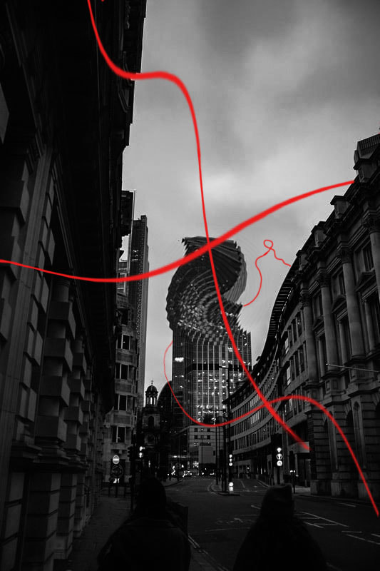
Merging fragments - Final response
For the final response of this piece, I wanted to create something extremely impressive and eye catching. So i thought what better than merging most of my favourite parts of each response? I think that it introduces a lot of positive chaos within the images and makes it immensely interesting to look at. Also I plan to use Photos that I have previously taken to stick to the idea of merging my images. It is also good to reuse some of my images from precious Photo-shoots as I felt they were too good to leave behind in the Photo-shoot. I will be utlising: red thin lines, that accentuate a focus to the image, red boxes for scaffolding to highlight the key feature of scaffolding being the physical building block for every piece of architecture, distorted swirls and deconstruct the image. This should all create 3 final pieces of most of my work merged into one.
The Final Three:
WWW: I think that I developed this piece very well into the "all merge" aspect. I really like the red lines and also the outward motion of the image. Also, I think that the swirls of each lines create a lot of movement within the image. Furthermore, i think here I used the red to mirror previous responses but also to evoke danger. I think that my images are very interesting because it contains a high amount of movement as you follow the lines, view the distortion and 3D look of buildings falling apart. Subsequently, the black and white was used to focus the viewer on the red lines and also give off a brutalism aspect to these images. Finally, the high contrast in exposure and shadow is utilised to create further depth and finalise the key feature of movement in my piece.
EBI: Some of the red lines arn't fully connected together and i could've paid more attention to that and manage my time more. Also, the some areas in my image are too dark and i should've lightened those a bit more. Link: This was a great link back to most of my previous responses, I featured all: Bogolepov, Sitton, Jun and Espen. But I changes the main purpose of Bogolepov's work to suit mine and i style i like better. |
|
Process:
1) How I used the red lines from Bogolepov:
|
1) Firstly, you need to create a dot like this but choose the colour you will use and size you would like: |

|
|
2) Secondly, you need to hold shift then click anywhere where you want a line to be drawn, this can be shown here: |
|
|
3) Thirdly, to create a curved effect for the lines you must ctrl + t then right click and select warp. It then pulls up an option for u to change and distort features of the line: |
|
Then repeat process and link lines up to create a swaying effect.
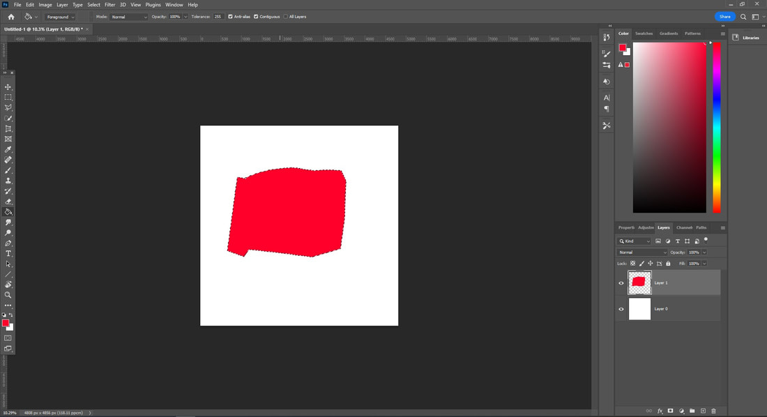
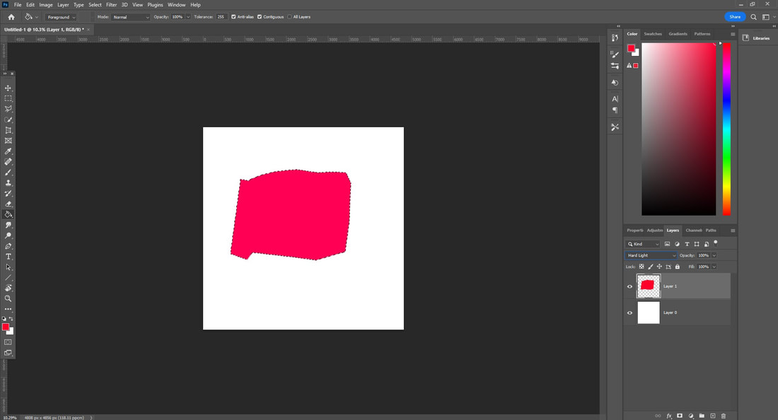
2) How i coloured walls like Jun:
|
1) Firstly, you must select the area you would like to turn red and create a new layer. To do this utilise either: object selection tool, quick selection tool, lasso or the most effective polygonal tool: |
|
|
2) Secondly, you need to use the paint bucket, select a colour you want to fill the layer in, then click inside the selection to pain the selection: |
|
|
3) Lastly, you can select a blend mode to focus on some lighting, but this is not necessary: |
|
3) How i distorted areas like Sitton:
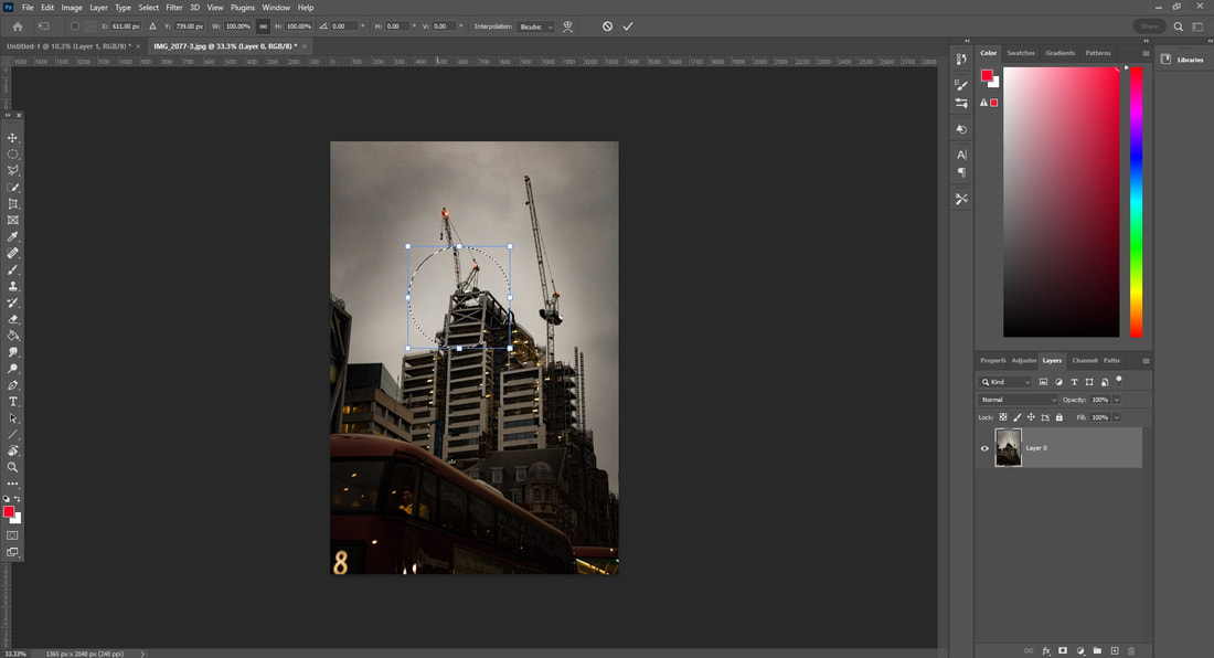
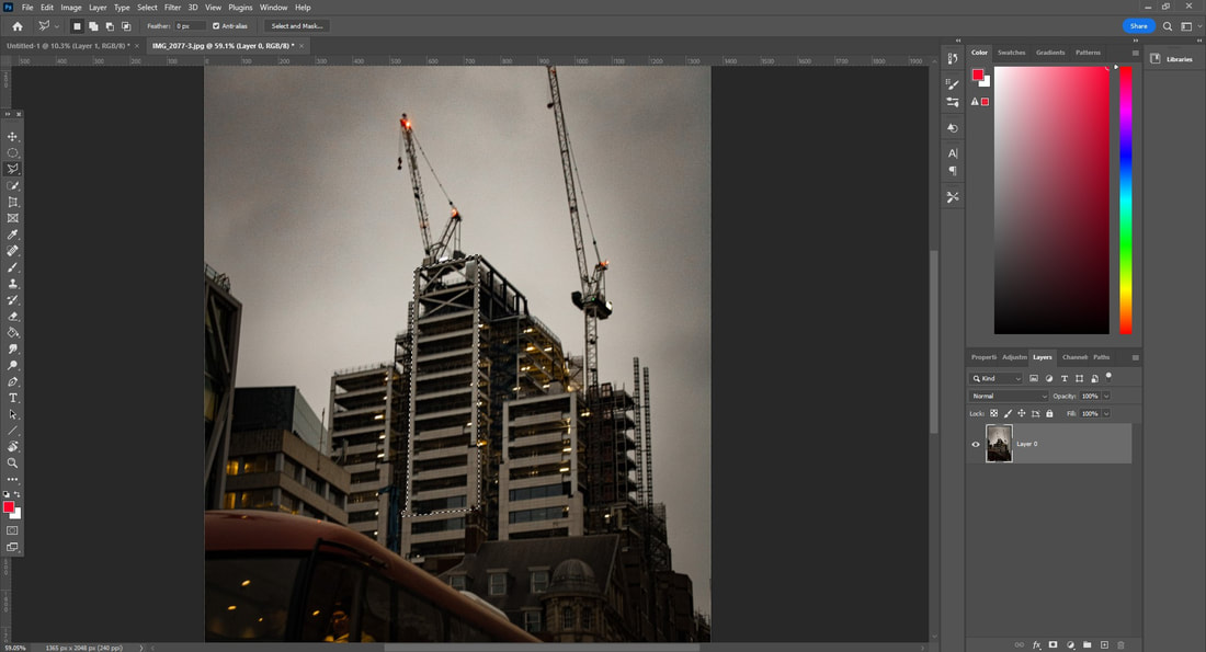
|
1) Firstly, select an image you would like to rotate, then use the elliptical marquee tool to select the area in which you would like to rotate: |
|
|
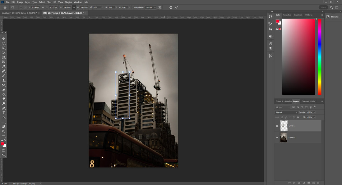
2) Secondly, select ctrl + t and rotate the image by 5 degrees: |
|
|
3) Then, click Select > Modify > Contract and contract by 5px: |
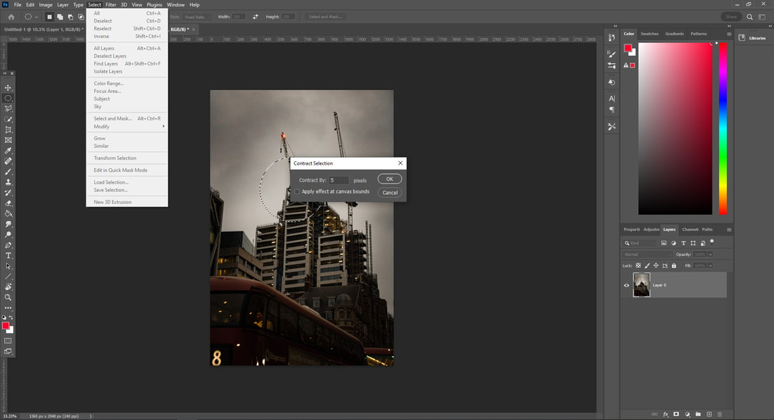
|
Repeat this process until the centre to get a distorted effect:
4) How I deconstructed walls like Evol
|
1) Firstly open the image up and select the polygonal tool and select a wall that you want to move: |
|
|
2) Secondly, copy ctrl + c and paste ctrl + v onto a new layer. And move this new layer slightly upwards: |
|
|
3) Then select an outline for parts below the new layer so that it adds some depth, we will then colour this in black on another layer below the previous one. This makes the image look more realistic: |
|
Concluding Fragments
In conclusion to fragments, I really enjoyed this topic, I have really explored a variety of areas in fragments, from portraits to architecture. I decided that i enjoyed architecture more and utilised the brutalism art movement. I preferred the artistic value of architecture more rather than portraits when referring to fragments as I found it more destructive and interesting to fragmentise physical structures. Furthermore, I even learnt that fragmenting isn't just separating and distorting items but rather creating and moving different unique shapes you cannot see normally. Finally, I mostly utilised Photoshop for my work as I found it most effective for fragments, utilising collages would've been interesting but slightly more messy especially when dealing with "fragments".
