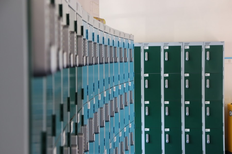
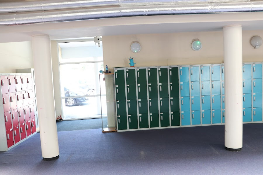
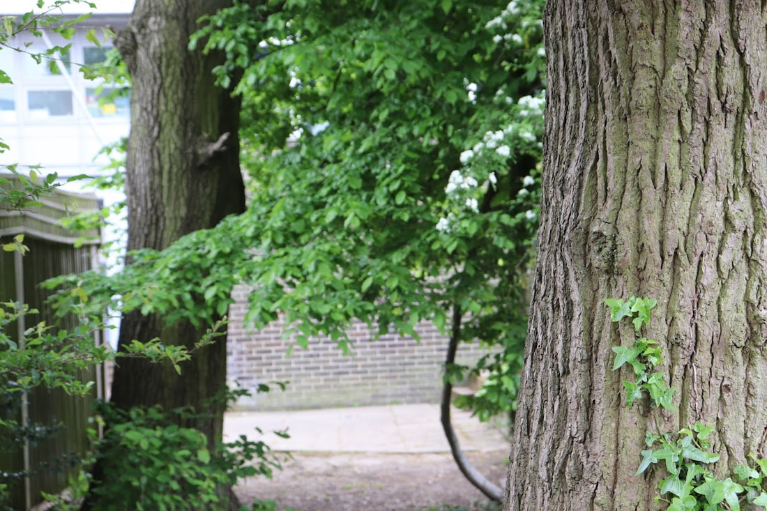
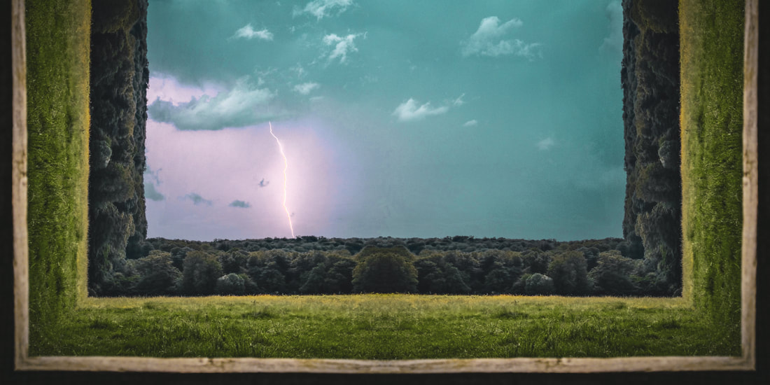
Composition
Composition is the arrangement of shapes in an image - their position, relationship to one another and to the image as a whole. In this task we were asked to create a collage for each of the four different compositions, then we had to find compositions to photograph that reflect our collages. I went ahead and also created the collages in Photoshop so it is clearer.
|
Rule of thirds


|
Triangles


|
Layers


|
Balancing elements


|
WWW: I really like how the collages really did reflect the compositions, which was the aim of the task, and i think i got clean photographs which are easily understood by the collages. Finally, I rotated and cropped some photos so they reflected the collages best and I think that they are very unique in my style.
EBI: Some photos aren't level which I could improve on next time.
EBI: Some photos aren't level which I could improve on next time.
Andy Yeung
Andy Yeung is a photographer based in Hong-Kong who focuses on landscape, architecture and aerial photography. born and raised in Hong-Kong, Yeung culls inspiration from the familiar, everyday aspects of the city.

|

|

|
Yeung states "Hong-Kong is a crammed city with lots of high rise buildings and skyscrapers. It's smaller than New York in terms of size, but it's skyline made up of 7000 skyscrapers is longer than that of New York. I notice that commuters in Hong-Kong go in and out of these buildings everyday with their nose buried in their phone, not noticing how noticing how interesting these buildings look. As a born and raised Hong-Konger, I'm deeply concerned that people are so wrapped up in their own lives that they just don't take notice of the beauty around them. I thus decided to compile a "look up series". hoping people can put down their phones, stop being a phubber, and look up and appreciate the beauty of architecture that they see every morning". This is the reasoning as to why he came up with the "look up series", to appreciate the wonderful architecture people always pass.
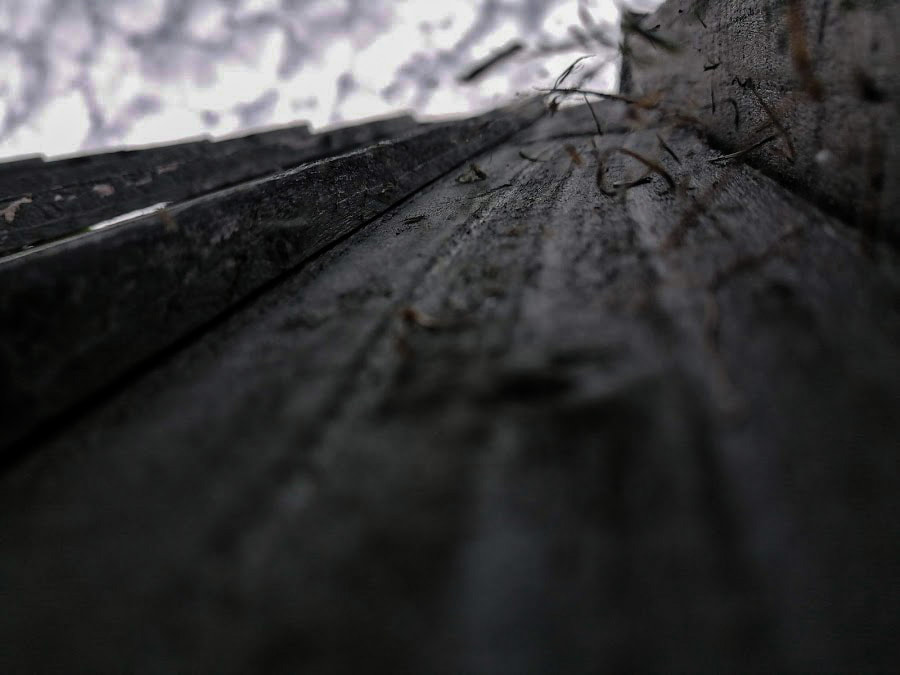
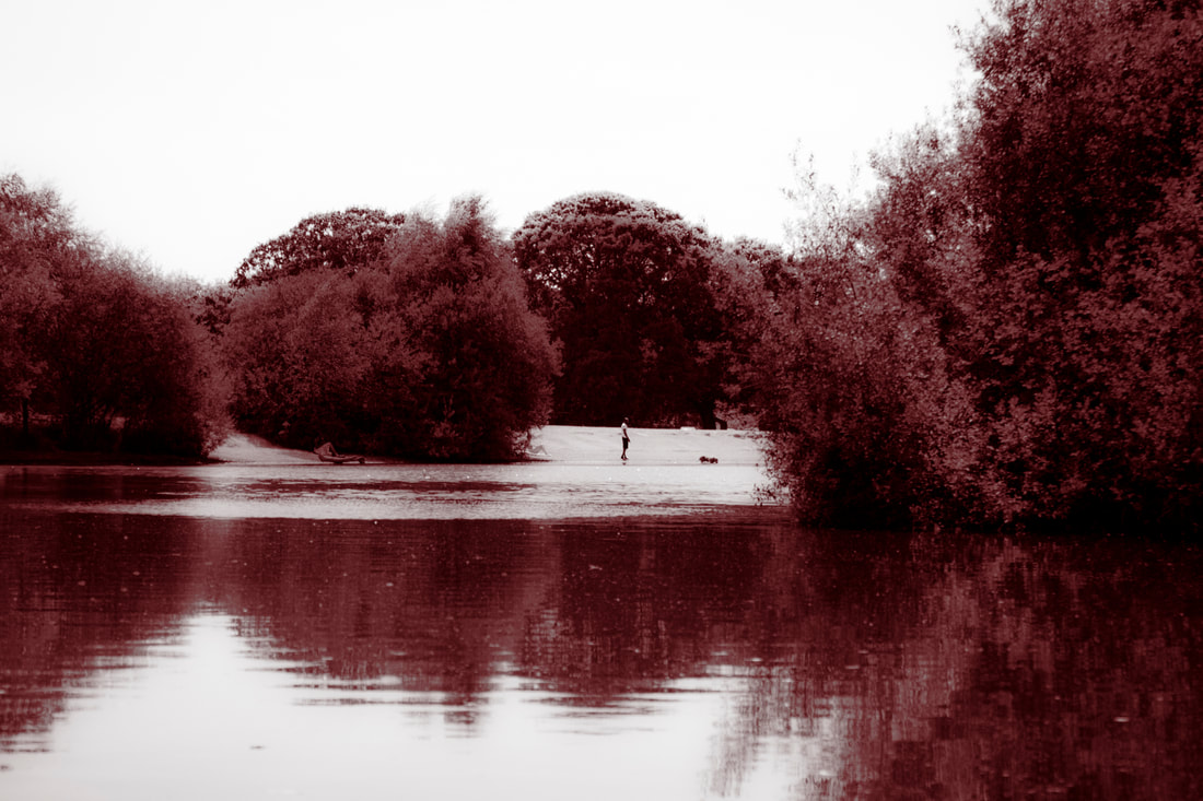
Looking up
Using the work of Andy Yeung for inspiration i created a series of dramatic images of buildings in my area, photographed them from a worm’s eye view creating this effect: when photographing i remembered to pay attention to the following: the cropping of my picture - making sure to use the edge of buildings to create a dramatic effect, the ISO - Making sure it is set to a minimum of 400 and get low and experiment with different angles.
|
The Photoshoot: |
|
The final three

WWW: The editing and sky replacement really crystalises the photos, I think that the skies i chose were great, the colours were great and I have variety in the photos I took. For example, there are old buildings and modern buildings. I specifically think that the colours are very good and i love how well the reflections on the skyscrapers turned out and the highlights and shadows. In addition, the angles i took the photos at are very good and different and i cropped them all well. EBI: Explored different weather, for example night or in rain. |


|
|
Process: I used many adjustments to make these photos have good colour, shadows, mid-tones and highlights. Also, i used the sky replacement tab in edit to replace the sky and make the photo more interesting, but i tried making the building still the main point of focus. I used the gradient tool to make some highlights different tones throughout the image and i used many layer masks with this to safely remove/add colours and skies. Finally, i used Gaussian blur on the reflection to make the image more realistic.
|
|
Video on Andy Yeung's work
This portrays the work of Andy Yeung's reflection series in a video. this video illustrates all the different architecture in Tokyo. Having seen all his work I imagined something like this.
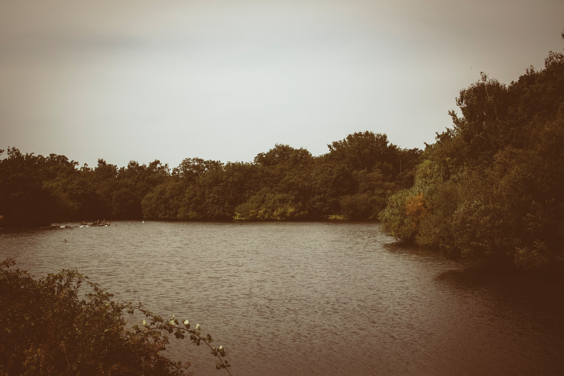
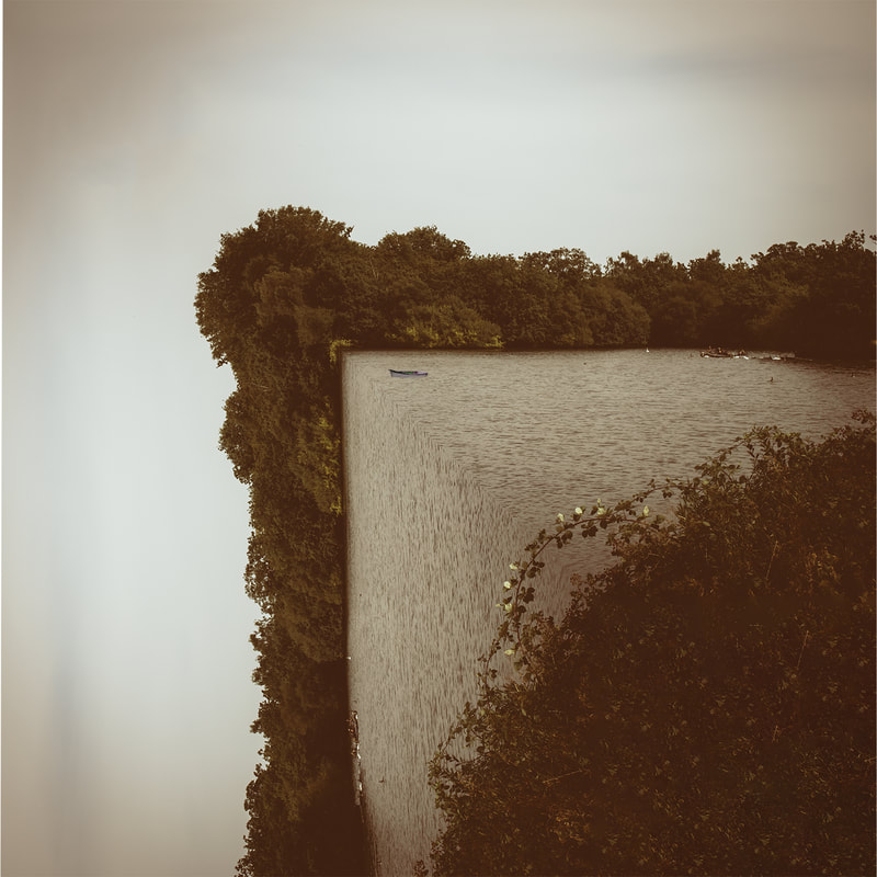
Reflections
In this assignment we were asked to use Photoshop to create a reflecting effect. This is done by copy (ctrl +c) and pasting(ctrl +v) the image and flipping the images vertically or horizontally depending on where they are on the canvas. Then it creates this effect. I used a canvas size of 1080 x 1350 and the default Photoshop size.


|

WWW: I really like the different shapes, lighting and colours iv'e used to create a wide variety of images, I also really like the skies and trees iv'e used as I think they bring something different that Yeung would maybe not have included. EBI: there are some white lines from the Photoshop, I think I could've fixed that with the spot healing tool or by using content aware filter. |
|
Process: |
|
Reflective gif
In this assignment, I was asked to create a gif of the earlier - reflections assignment. Here I used Photoshop to create a gif and one by one layered the four picture. I used window > timeline and created a "layer to frame" animation to result:
|
Process: |
|
The gif:

|
WWW: I like how the gif goes back and forth - I did this by duplicating the frames on either side of the timeline - I also think I used a good picture to portray the point of the assignment. Finally, I think that I used a good time interval between each frame (0.5). EBI: The images are slightly uneven i could've adjusted them better by moving the size of the images (ctrl +t). |
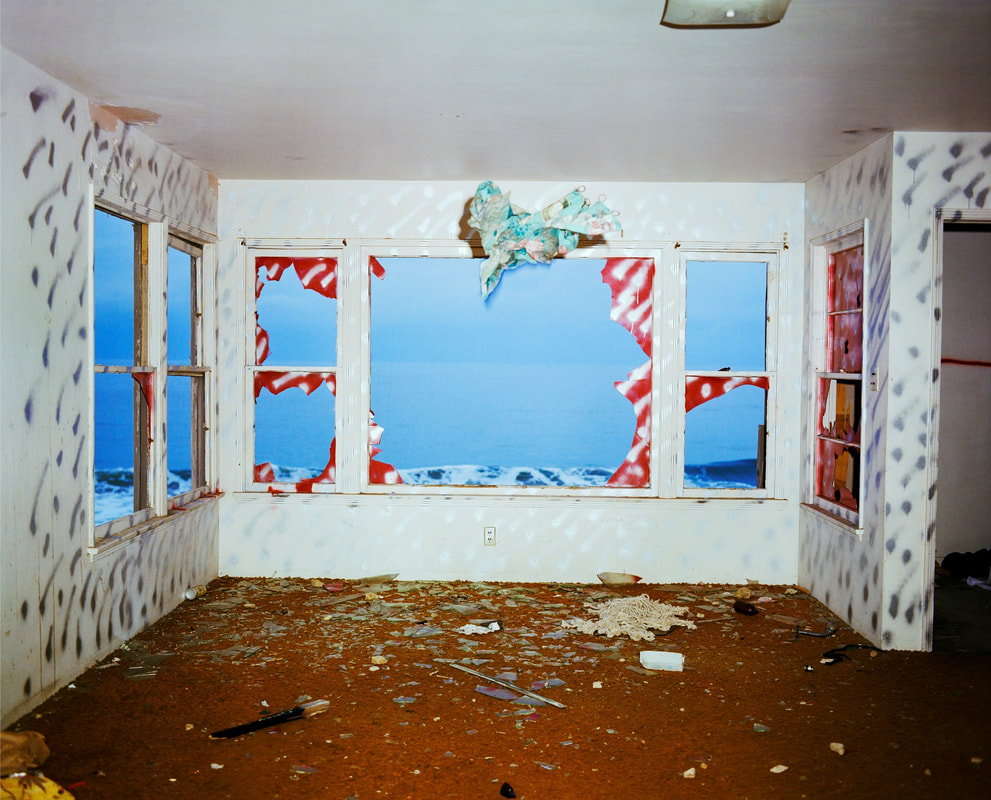
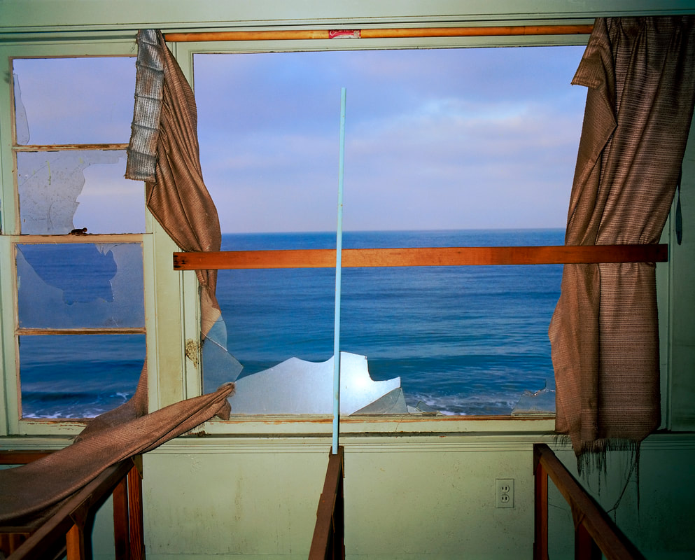
John Divola
In the 1970s, Los Angeles photographer John Divola began photographing in abandoned, often dilapidated houses. With his series Vandalism (1973–75) and Zuma (1977–78), however, he didn’t just photograph houses.Here, Divola describes how he manipulated the environments with painting and other interventions as a way of “vandalising the tradition of photography.”
|
|

|
In Zuma project, he has described being interested in the relation between real artworks and representations of them, and the issues of the natural and the artificial. Divola said "I attempted ... to develop a practice in which there could be no distinction between the document and the original". In his series of photographs from 1977, he used deserted houses on Zuma Beach and covered their walls in graffiti. He photographed the ocean from the house's interior through windows and cracks. Divola states: "On initially arriving I would move through the house looking for areas or situations to photograph. If nothing seemed to interest me I would move things around or do some spray painting. The painting was done in much the same way that one might doodle on a piece of paper. At that point I would return to the camera and explore what ever new potentials existed".
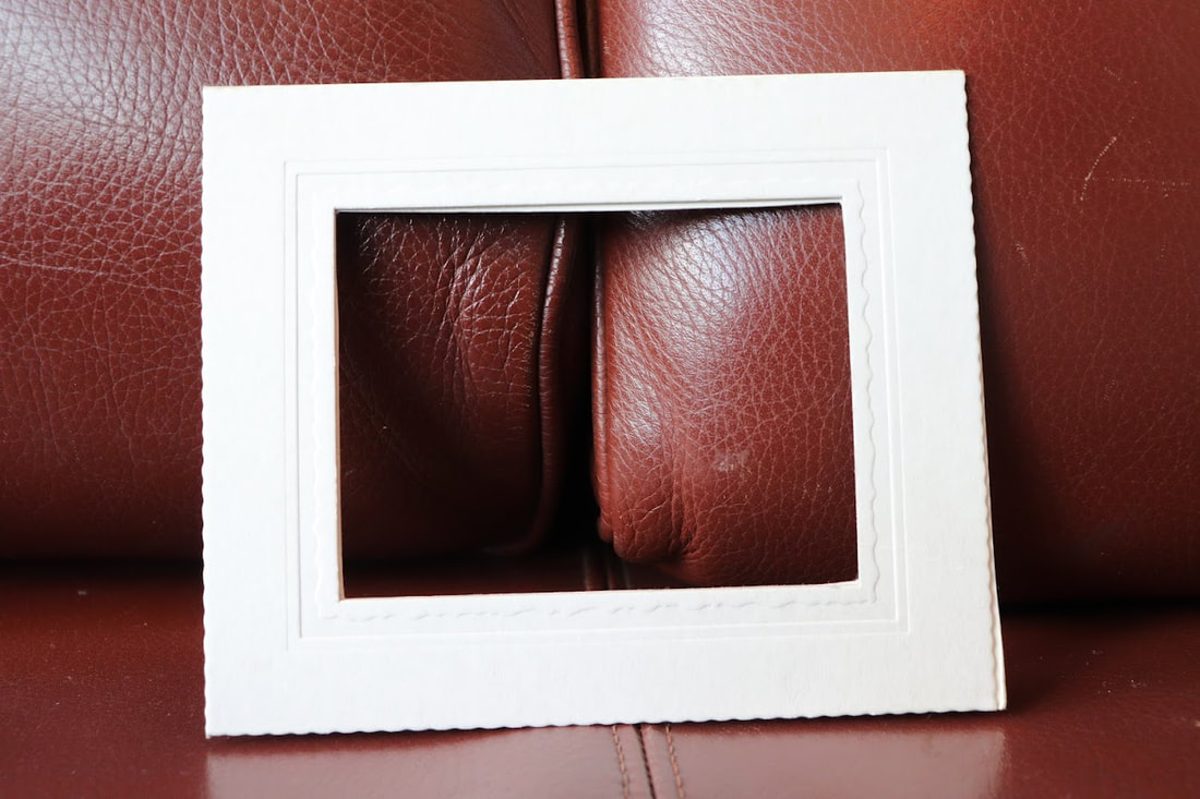
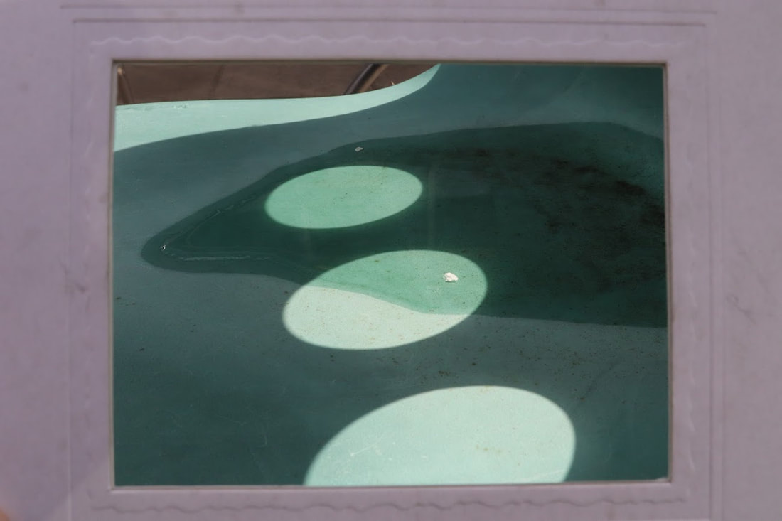
Framing the environment
In this assignment, we were asked to take a picture of our environment, then later frame parts of that photo as a close up. we used a paper/cardboard frame around the close ups. Then we put the photos by their side.
|
The shoot: |
|
The final three
|
Widespread
|
Close up

|
WWW: I think that the close ups were really well detailed and i focused on the main structures on the close ups. For example, the shadows and light and the different patterns and textures on the couch and the sticks. I also focused well on the shadows of the chair. Overall, i think that this shoot was executed well and the zoom out shots had a lot of detail to choose from for the close ups.
EBI: The zoom outs could be nice and include more contrast in shadows and light. I also think that i could have taken the images from lower angles to create different images.
EBI: The zoom outs could be nice and include more contrast in shadows and light. I also think that i could have taken the images from lower angles to create different images.
Second response - Framing the Environment
In the first response I was tasked to capture a picture of the environment then later took a close-up of an object within that picture. Developing this idea, I decided to scrap the frame and add a streak of colouring to the photos. I also put both images into one using Adobe Photoshop.

WWW: In Photoshop i quickly and effectively added a green and brown streak while using the eye dropper tool.
EBI: Develop further with more contrast in colour.
EBI: Develop further with more contrast in colour.

WWW: I love how i used a gradient and the rectangle selection tool to drag the pixels along and create a faded look. Also, i used liquify to join the two pictures together which I think works really well. I definitely think i developed this idea in my own way while still keeping some elements of Divola.
EBI: Made each side more even by using the correct canvas size.
EBI: Made each side more even by using the correct canvas size.
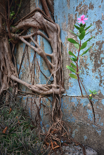
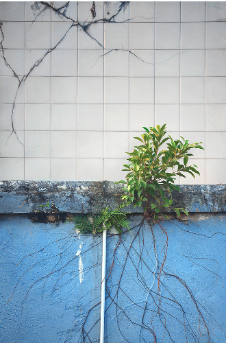
Romain Jacquet-Lagreze
Romain focuses solely on the idea of wild life growing around residential buildings in Hong-Kong in 2014. Romain cleverly juxtaposes plants with humans in his series, wild concrete.
|
|
|
Romain utilises interesting colours such as white and blue and occasionally uses nature to contrast in colour. However the textures he uses is a heavy difference between the human and the plant world. He switches between focus of either nature or man-made products. Furthermore, the vines are used to create a swirl of randomised nature which he has also includes the urban world in.
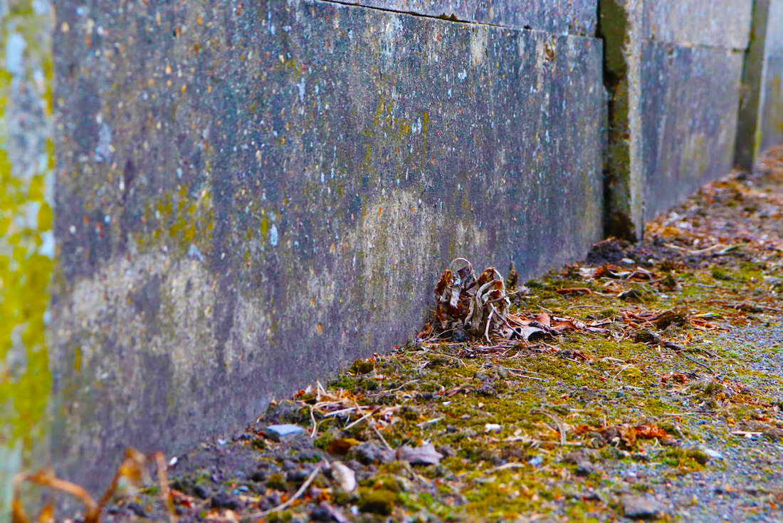
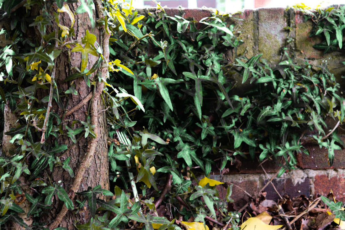
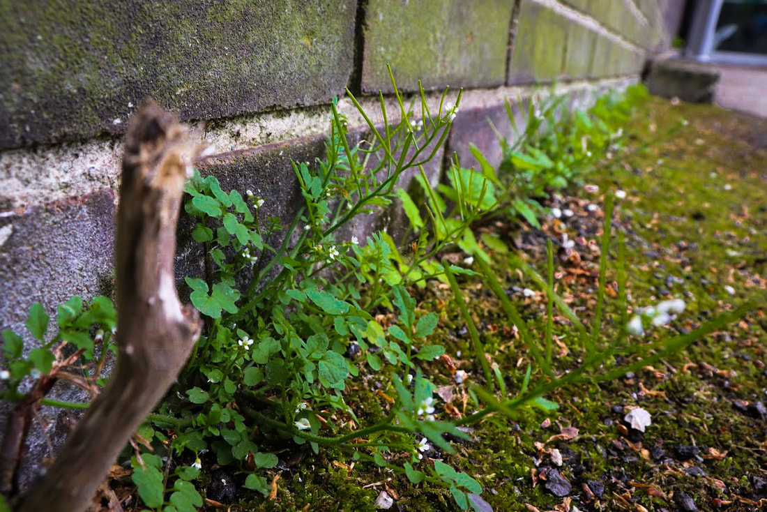
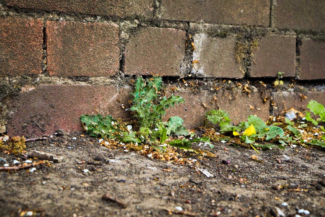
Wild Concrete
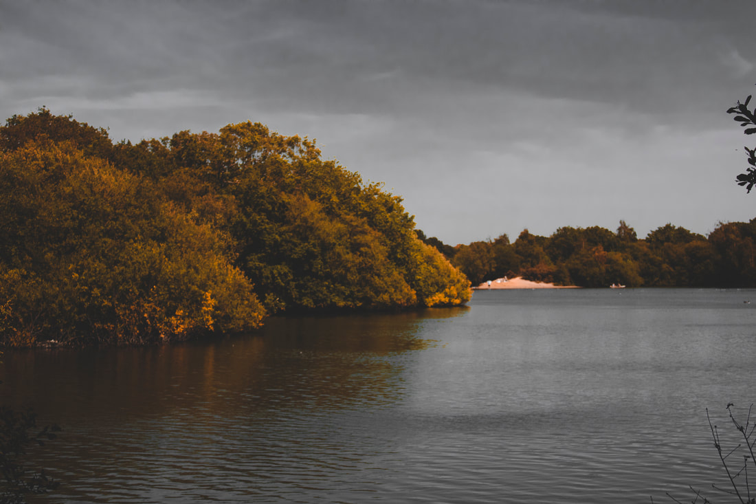
During this topic, I looked at the Photographer Romain Jacquet-Lagreze, who analysed closely the effect of nature on man-made structures. Today, I further developed this idea and created my own shoot. I found that using the camera at 700 ISO was best for this type of work, but made sure I had heavy contrasts of shadow like Romain does.
|
The Photo Shoot: |
|
The final three
|
WWW: I think that the vibrancy in nature was very well used and i really enjoy looking at the contrasting effects of shadows and lighting. Furthermore, i also think that i turned really simple objects into something quite interesting such as something as simple as the dirt, the area i photographed was also very decrepit and overgrown. I think that the angles the pictures were taken were also very nicely taken. In addition, i used Photoshop filter > Camera Raw Filter which hugely increased the clarity, textures and saturation of my images to closely resemble Romain's work.
EBI: Include more destruction of man-made products that nature has crawled through for example crackled walls with vines crawling through. |
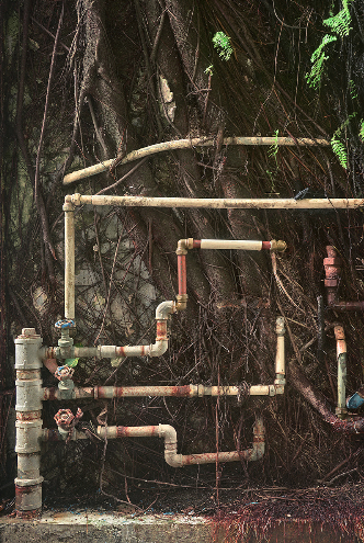
Second response - Wild Concrete
Today, we went outside and took pictures of similar work inspired by Romain Jacquet-Lagreze. The difference between the first and second attempt was, i tried to focus more on decrepit objects like crackled walls, unlike last attempt where i used more linear photographs that were very clean. I also used Filter> Camera raw filter to increase the texture, clarity and saturation of my images to closer reflect Romain's work.
|
These are the camera raw filter settings on Photoshop that i use to up the: shadow, mid-tones, highlights, saturation, hue, texture and clarity. |
|
|
The Photo Shoot: |
|
The final three
WWW: I think that the hue and saturation that I used was really nice and the vibrancy is perfect and very realistic . The shadows of underneath the leaves are very well edited and I used very natural colours and didn't go over the top with textures and clarity. In addition, I think that this area of land had much more different angles and places of overgrown vegetation. The ground had more moss and weeds sprouting out, which I really think is the main focus in my pictures. EBI: I could have used a wider variety of plants and and walls with different colours to create wider contrasts. |
|
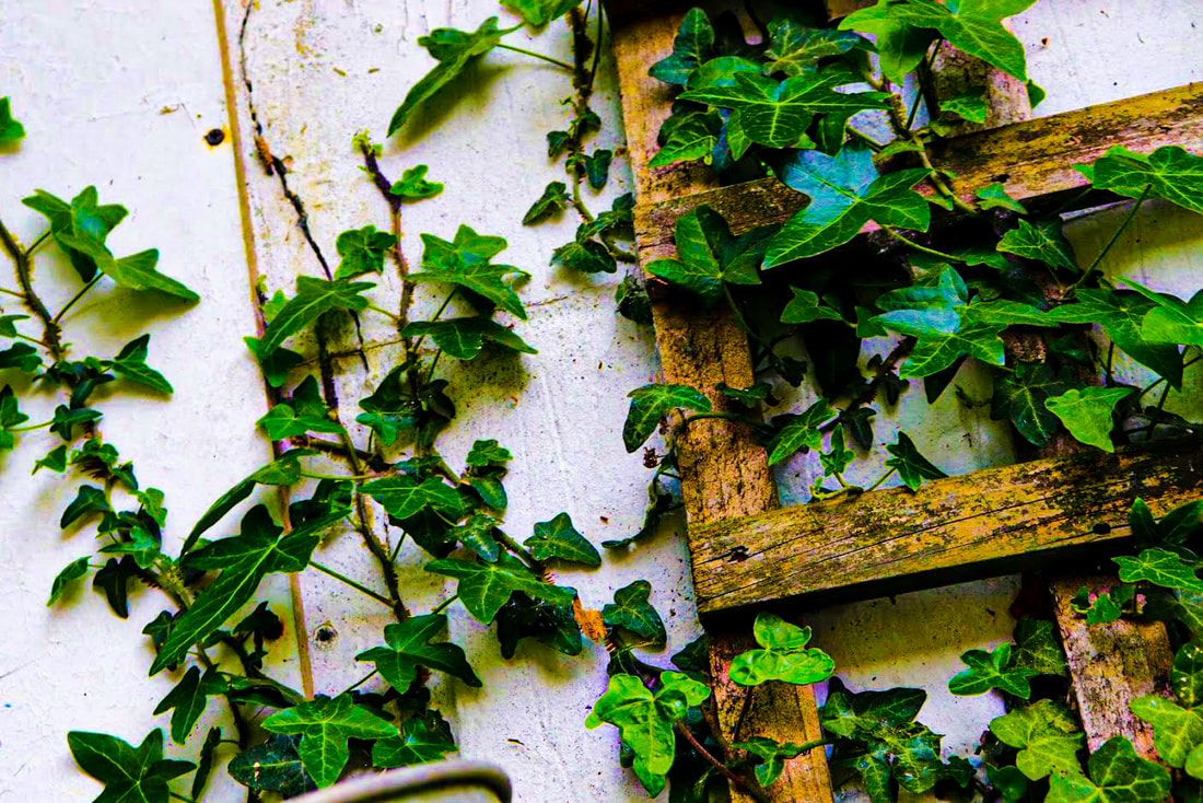
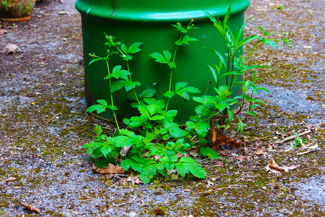
Wild concrete home response
In the wild concrete home response i took my camera, headed to the back and front garden and took shots of what i thought portrayed the image of "wild concrete". I waited awhile for a sunny day and the wait was worth it because the light really helped specifically with this response.
|
Photo shoot: |
|
The final three

WWW: I think that this image really reflects the idea of "wild concrete" with cob webs scattered around everywhere, the grass coming out of the concrete and crawling up the wheel and the flat tyre symbolising nature taking over man-made products and breaking them. The flat tyre symbolises exhaustion and how old this car really is and how wild green is around it, destroying it.
EBI: make the metal seem dirtier so that the term "wild concrete" is more valid. |
WWW: I think that the shadows and lights are contrasting really well in this picture. I love the web which portrays the "wild concrete" concept and the small bits of grass floating in between it - it's as if they are frozen. I also really like the texture of the wood shooting up from the bottom of the frame. Finally, i think that the angle that this picture was taken heavily helps as to why it was executed so well.
EBI: More nature could be overtaking man-made items. |

WWW: Even though this image doesn't really have "wild concrete", I still think it does and here is why: I feel that the charcoal is the nature and the flames and smoke are now the man-made products or our negative doings. It's as if they are crawling in from beneath and destroying nature. This image is different to the others because it portrays the "concrete" destroying, rather than the "wild" taking over. I also think that the texture is very clear and noticeable and this creates effect and atmosphere.
EBI: Some sparks are not still in motion - heighten the shutter speed to catch the sparks in motion (1/1000)
EBI: Some sparks are not still in motion - heighten the shutter speed to catch the sparks in motion (1/1000)
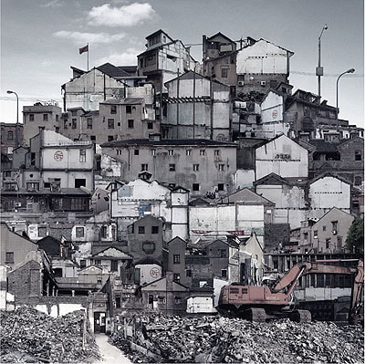
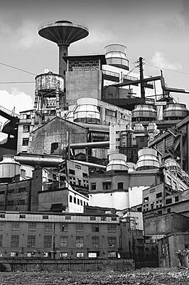
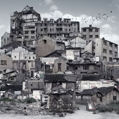
Sun Ji
The work in Sun Ji's "memory city" are architectural collages that speak of urban transformations as destruction and displacement of the old must make way for the new. The artist began in 2005 where he photographed separate pictures of houses and rubble. He recreated impressions from his childhood.
|
|
|
The resulting compositions become dense, layered mountains of neighborhoods stacked one atop the other as if waiting to be leveled. He loved using the urban landscapes in shanghai and photography partially torn down in residential areas. Also, he cleverly used black and white to reduce clash of different colours of each building.
Layered landscape
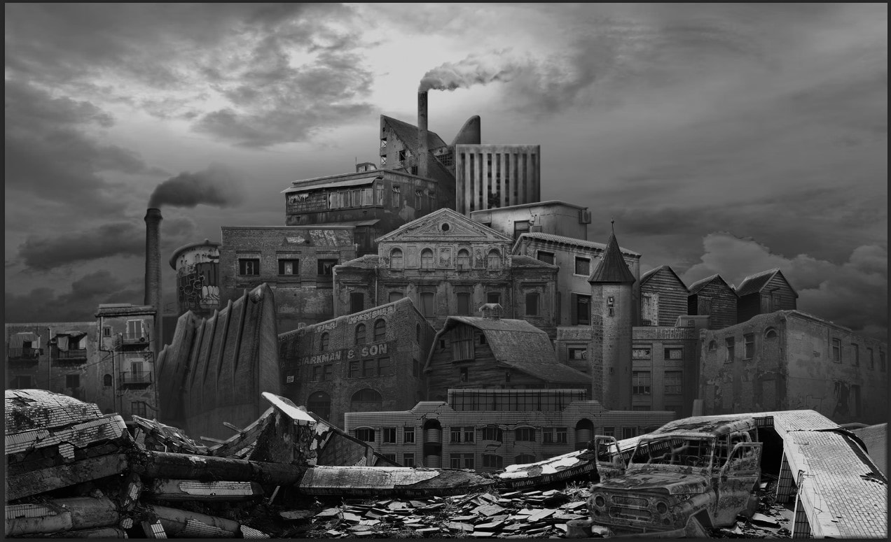
In this assignment we were asked to create work inspired by the photographer Sun Ji. I knew before this assignment I needed many layers of buildings, shadows and highlights to make this effective in the style of Sun Ji. I loved the black and white in Sun Ji's image so i took that idea to create a more simplistic image. I needed to individually cut out each layer and organise them in the style of Ji.
First image:
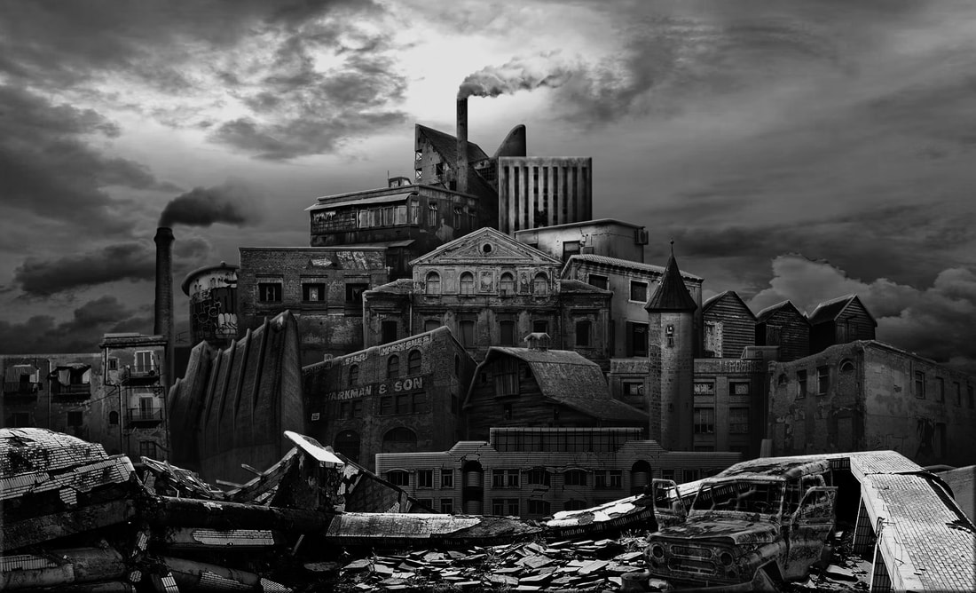
WWW: I love this piece, i think that by using loads of different layers it made each part stand out - the background, mid-ground and foreground. Also, i love how well i blended the smoke from the chimneys in Photoshop and i love how well the car fits in, in the bottom right to add detail to the picture. By using the gradient to make shades i think it was very practical, easy and fast. Moreover, the sky i used was similar in the style of Ji and i think that making this black and white brings more interest and contrast and brings focus on the mid-ground. I think i used a variety of buildings and i used unique objects - towers, chimneys with smoke and cars - unlike Ji. Finally, I love how the mid-ground is a triangle which creates focus at the top of the "tower" of buildings. To sum up, I think I took the main aspects of Ji's work but included some of my own ideas to create a difference but positive peculiarities and I executed this piece very well.
EBI: Some shadows are too strong/dark I can lower them by changing the opacity of the shadows in filter > camera raw filter. And use a couple of my own images.
EBI: Some shadows are too strong/dark I can lower them by changing the opacity of the shadows in filter > camera raw filter. And use a couple of my own images.
Process:
|
1) I started off looking for a good foreground, I wanted to use something that was close up but not too distracting.
2) Once i had found something i liked i cut it using the polygon tool so it was smaller and fit my image the way i wanted. |
|
|
3) I added a rusty car to add to the atmosphere, I used the magic wand tool to cut out all the white sections and so that the windows were see through. I also used a drop shadow in FX effects to make it seem there and fit in with the image.
|
|
|
4) After that, I grabbed loads of image with good angles, texture and theme as my mid-ground. I liked to use warehouses that were abandoned, some chimneys from factories and a couple tips of sky-scarpers. Here are a couple: |
|
|
5) Here are those images in my photo: I cropped each image and layered them one by one. The buildings at the bottom of the image were layers which were layers on the top of the layer panel. This means anything above them will show over them if its in the frame. |
|
|
6) Then, I added smoke from the top of the factory chimneys as it added a bit of motion in my piece. However, cutting the smoke wasn't easy... I decided to select as accurately as possible the smoke and feather the selection in Menu > Modify > Feather with a radius of 4 pixels.
|
|
|
7) After I finish all of the layers in the mid-ground i moved onto the sky, i chose a relaxing - not too chaotic - sky so that you can focus more on the centre and tower of buildings. |
|
|
8) After i had all my images in Photoshop, on the top layer I added a hue/saturation layer and desaturated everything to link it closely to Sun Ji. 9) However the smoke had looked like this and i fixed that by selecting multiply and then, using the eraser tool with a low hardness, I brushed away parts that didn't blend with the sky so that they could blend and fade in with the sky. |
|
|
10) Next, I used The gradient tool to add shadows in each layer, layers that were lower down in the picture had more shadows. I also used FX effects and used bevel emboss to add some highlights to the edges on some buildings and shadows on the edges. This was the result of that: 11) Finally, I used Filter > Camera Raw filter to change some textures, refine shadows, mid-tones and highlights and clarity. I also enhanced the darkness as i thought it gave the piece more atmosphere. |
|
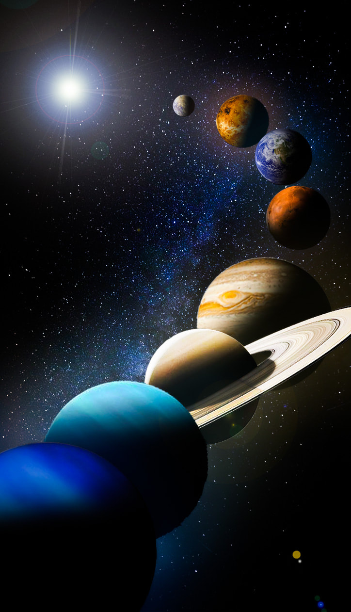
Second image
|
WWW: The use of lens flare, gradient, fx effects, outer glow, bevel emboss and many layers were all very successful and turned out just how i wanted them. My favourite part are how well the shadows blend on each planet and the angle at which they are at. I also think the lens flare works really well as the sun. I tried moving away from the style of Sun Ji and decided to layer planets instead of buildings because i find them so simply interesting. Of, course i kept the layers going over each-other and created a sense that the planets were swirling round the sun together. I decided to change the format in the last three planets to adds some contrast in positioning to create an increased amount of interest. EBI: The background could be a bit more engaging and fix some of the cutting by using the polygonal tool for everything instead of occasionally using the quick selection tool. |
Third Image

WWW: All shadows and highlights are greatly contrasted which i really enjoy about this piece, and perfectly links to Sun Ji. I decided to use bigger buildings as they suited the idea best in this photo. The orange lighting was also executed really well, and i love the desaturated sky resembling Sun Ji's work. I decided to only use three buildings instead of various but all at different distances, while using the rule of thirds to create 3 major focuses.
EBI: Some shadows aren't at the correct angle, for example, the empire state building.
EBI: Some shadows aren't at the correct angle, for example, the empire state building.
Layered landscape + using paper
In this assignment I was assigned to create a collage essentially making a layered landscape photo inspired by the work of Sun Ji. I used images from the internet and stuck them underneath or over each other to create depth. I used a variety of backgrounds to create a more "entertaining" image.

WWW: I really like how i chucked all buildings in a corner and not on one side, i think this makes my piece look different. Also, I like the backgrounds I chose and i think the buildings work well together and are well scaled. Finally, I love the distorted picture, i used the spot-healing tool in adobe Photoshop to create this. I find this disoriented photo interesting and i wanted to still include many layers but make them more ripped and smudged. EBI: Try choose photos with similar shades for an even better result. |


|
Old - Modern - Unique , Homework
In this homework i was asked to photograph pictures of old, modern and unique buildings or structures. I decided to adventure around various places in England to find these sort of contrasts. I went to Colchester, central London and Brighton to produce these photos.
|
photo-shoot: |
|
|
Old


|
Modern


|
Unique


|
WWW: I like the lighting in most of these pictures - no over exposure as well. Also, I felt that the old images were quite difficult to find but I had executed well, I didn't want to just find churches as i thought that would get boring.
EBI: I would like to see some more adventurous ideas and more unique buildings which could even be wild sculptures which which don't stereo-typically fit with our environment.
EBI: I would like to see some more adventurous ideas and more unique buildings which could even be wild sculptures which which don't stereo-typically fit with our environment.
Sebastian Magnani
Photographer Sebastian Magnani carefully positions round mirrors in outdoor settings to capture two landscapes at once: the ground below and the sky above. In the ongoing series Reflections, some compositions reflect connected imagery, like blossom-covered grass and a flowering tree.
|

|

|
Magnani skillfully captures the aura of the mysterious vigilante and places it within the context of our everyday reality, thus colliding two worlds with surprising and inspirational results.
First response - Reflections
For my first shoot i intend to Photograph a nice colourful image of the ground with a mirror placed in the centre of the image reflecting a sky in my garden, which i will then later edit in Photoshop to express more colour and clarity in the sky. I also have decided to use some black and white images which i would edit in Photoshop to be black and white and also some images of windows to add variety. I also will use the hue/saturation adjustment to adjust some aspects in my images.
Photo shoot:
The final three:
|
WWW: This shoot went really successful as I photographed a wide range of images ranging from: close ups to mid shots, black and white to coloured, straight on angles and side angles and finally adjusted the focus for different results. I decided to Photoshop some colour in my images to change the atmosphere of some images along with the exposure. I decided to acquire lots of variation in these pictures so that i could focus more or my later responses with my favourite part of the reflection series. The contrast in light and shadow were executed really well here as well. EBI: Some images are slightly grainy, I could improve this by adjusting my camera settings to suit the conditions outside. For example select a good ISO, and white balance. |
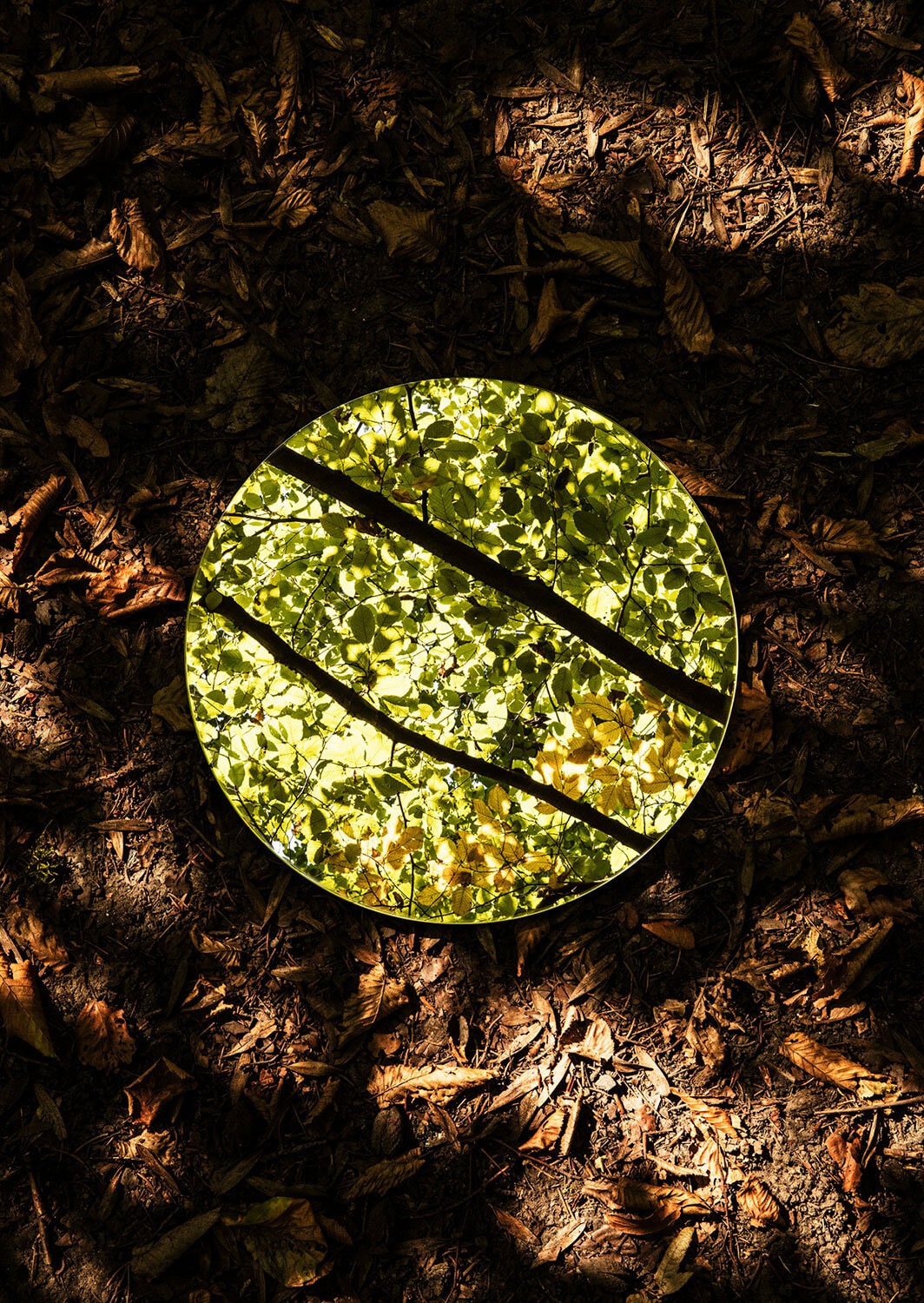
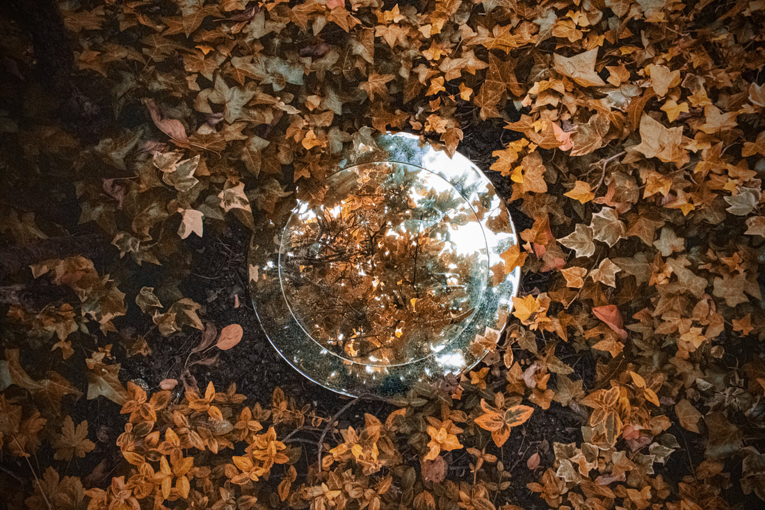
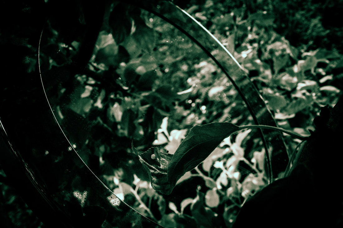
Victoria Siemer
Victoria Siemer is a Brooklyn-based American graphic artist who focuses mainly on photo manipulation using Photoshop. She goes by the moniker "Witchoria" because "digital manipulation has given me the ability to create my own alternate realities where anything is possible. Sometimes it feels like magic."

|
|
|
She takes shots of mountainous areas, hilly areas, rivers and city landscapes. She then edits a haze effect in the background of eachimage and reflects that image in a shape behind the main focus of a photograph.
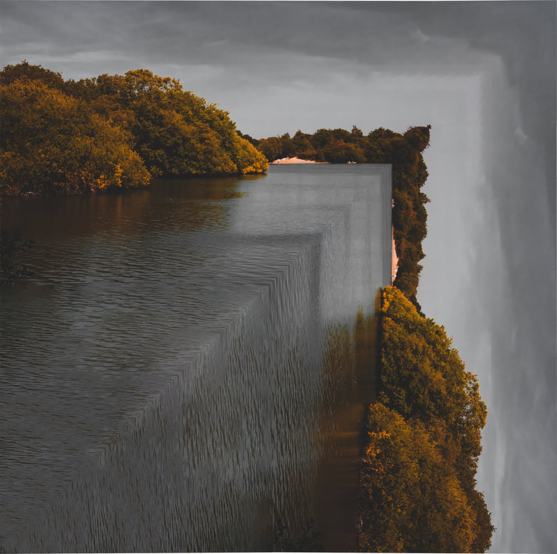
Second Response - Reflection
In this response i decided to take the idea of the shape of the mirror and move it into photoshop. I also really liked the idea of wider photos, with a massive reflection in the centre of the image. The gloom in the background is really effective in bringing focus to the images as well
For this response, I will take pictures of landscapes: city, river and hilly areas to closely resemble Siemer. Ally Pally, epping forest and London - River thames are all options for this response. A heavy part is the photoshop. I reckon i'll copy the image flip it 180degrees and mask it over a shape.
For this response, I will take pictures of landscapes: city, river and hilly areas to closely resemble Siemer. Ally Pally, epping forest and London - River thames are all options for this response. A heavy part is the photoshop. I reckon i'll copy the image flip it 180degrees and mask it over a shape.
First image:

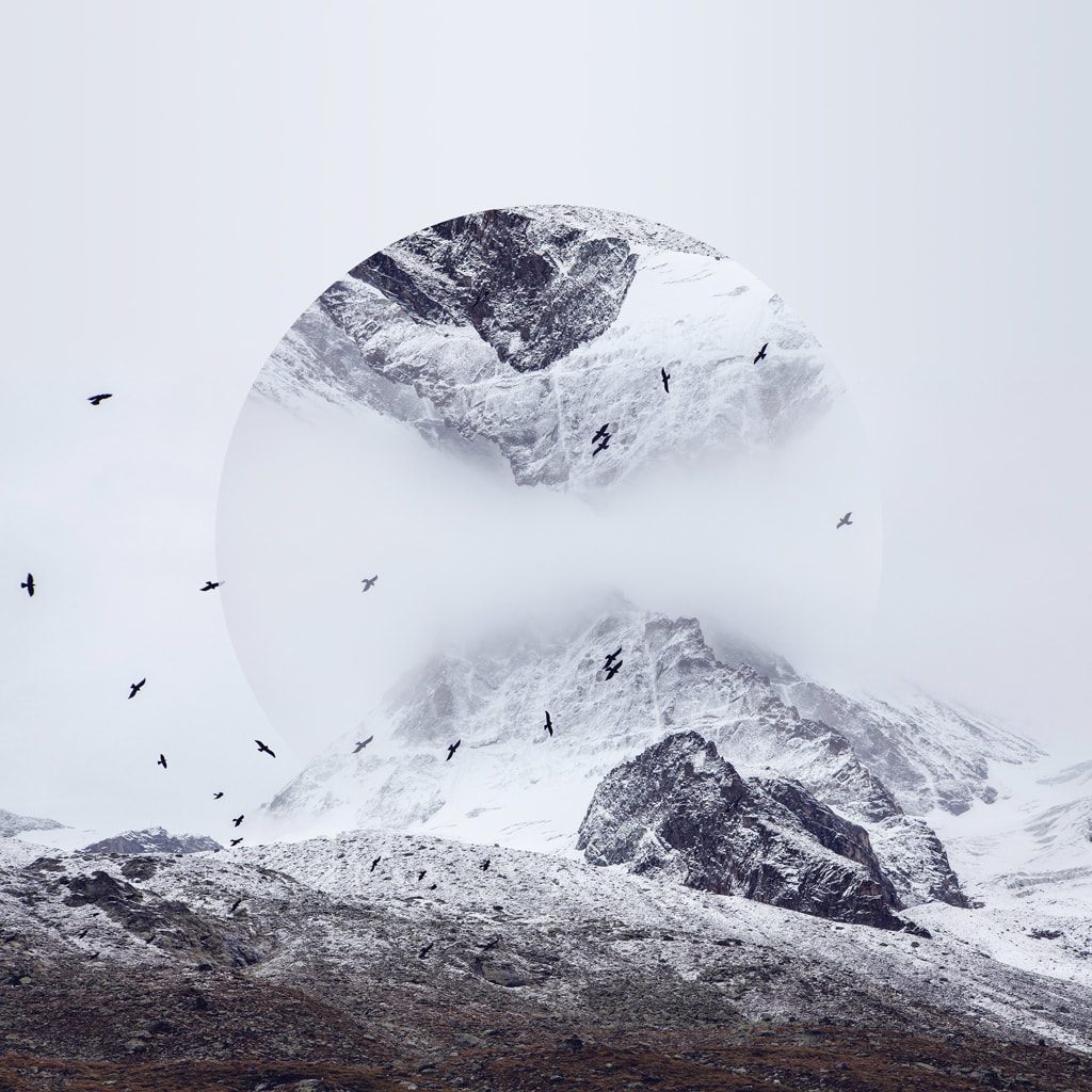
WWW: The shadows, highlights, mid-tones, colours and reflection was all executed very well. I especially like the birds in this image. I captured this shot outside of my house and thought it could be a really enjoyable reflection. I like how the tree is the main source of reflection and how i used a gradient to smoothly reflect this. I used the shift + ellipses tool to accurately cut a circle. This was time saving and precise. I then used the ellipses gradient on a layer mask and inverted the layer mask to create an effective gradient all the way around the circle.
EBI: I could reduce the noise in filter > camera raw filter so that the image looks more gentle and cleaner.
EBI: I could reduce the noise in filter > camera raw filter so that the image looks more gentle and cleaner.
Second image:

WWW: The reflection of the image is really nice and the transition between the dark side of the sea and bright side of the sea is clean. I simply used a gradient and the rubber tool for this. I took this image in Brighton and realised in worked very well for Siemer's style of work. I like how the shadows match the colours of the area they are in, this makes it seem more realistic.
EBI: I can use liquify to warp the reflection of the boats further.
EBI: I can use liquify to warp the reflection of the boats further.
Third image:

WWW: The sphere is very effective and i like the shadow beneath it. I also like the reflection through it and how it distorts the reflection. I did this by doing Filter > Distort > Spherize. I took this image at the heath at a lake. I decided to use this image to create a sphere in because of all the detail and grass scattered around. It makes the sphere look more complicated.
EBI: I could flip the image vertically to change the angle of the reflection. This would link it further to Siemers work.
EBI: I could flip the image vertically to change the angle of the reflection. This would link it further to Siemers work.
Link: This links with the previous response because I have utilised the real life shapes and circles I have created and transferred them into Photoshop. I have used different distortion types to distort our "environment", to increase the effect like the previous response of the distortion.
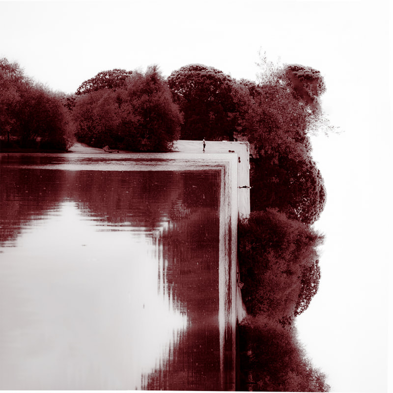
Third response reflection
For the second last response I decided to use the same artist as inspiration because I enjoyed the results in my second response but felt I could improve even more with them. I think I can capture the theme of her images more by including more circular structures in Photoshop. I think I'll use some of the same images but edit them in a different way. I'll definitely target the sky more.

WWW: In this development, I tried to stick closer to Siemer's work and tried focusing on reflecting a sky with a slight contrast of the buildings. I took this out of my window and waited for a nice sky. I then used Lightroom to adjust the colours and tonal values. In Photoshop i then added a circle selection then put a mask on that layer and used a gradient to smoothen out one side to closer reference to Siemer.
EBI: I could adjust the colour noice and sharpen the image to allow it to look more natural
EBI: I could adjust the colour noice and sharpen the image to allow it to look more natural
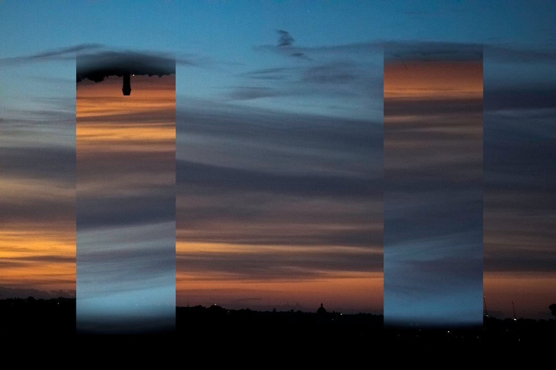
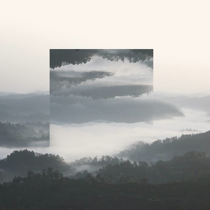
WWW: I really like how i developed this, i used two rectangles instead of a circle because i wanted to move away from Siemer. I wanted to still include a slight contrast at the tip of each shape. I used a gradient to blend in both sides of each rectangle. This was effective and useful which closely resembled Siemer's work in that aspect.
EBI: I want to move away more from Siemer and create something similar but highly unique to me.
EBI: I want to move away more from Siemer and create something similar but highly unique to me.
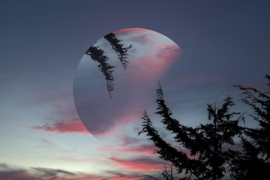
WWW: I really like this piece because of the sky and the two branches on the tree poking out into the centre of the image. I then reflected it using the ellipses tool and used a gradient as usual to fade it in. The silhouette works nicely with the angle of the image. And the tree does not overcrowd the image.
EBI: Maybe feather the selection of the circle to reduce the cut of the two layers.
EBI: Maybe feather the selection of the circle to reduce the cut of the two layers.
Link: This links with the previous response, as I tried to utilise the sky a lot but i also used the same artist as inspiration. I think that this response highly links with artist a lot more than the previous response.
Petey Ulatan
Petey Ulatan is an artist who has a diverse body of work, stemming through a decade of creative pursuits. From surrealist art, contemporary design, to different genres of photography; his journey has crafted an artist not restricted by the rules of tradition.

|

|

Ulatan really makes us feel tiny in an already massive world we live in. The skies pouring with water illustrates this immense feeling. the sublime here is the main factor which benefits this feeling - the overwhelming beauty of nature. He uses the seas/oceans to portray beauty. The dark blues and light blues are all reflected up or down to create a fearful but exciting feeling.
Fourth response reflection
For the fourth response, I am going to take pictures of rivers/lakes/seas instead of skies to create a similar contrast and reflect the whole image as if the water curves round. I plan to possibly go to the Thames to create a diverse contrast of the city and a river. There are also some really nice streams near where I live in some parks. I am going to reflect the river at a right angle.
First image

Process:
For this response, I decided to start by fixing some of the clear errors from the original photo. For example, are darkened the sea colour with saturation and in panel section. I wanted to make my image still appear "tropical" but more natural. I used edit>perspective warp so that the horizon line was straight and a 180 degree angle. I then copied this 3 times and placed the image on the left side of the layer without the rocks. I decided to remove the rocks because they were quite close to the picture and out of focus. I then used a protractor and measured the point at 45 degrees and cut up from there. I then did this with each resulting in the mirroring of the three layers. Finally, I used a horizon from Photoshop as i wanted something relaxing/ a darker tone to bring a calmer atmosphere to my piece.
For this response, I decided to start by fixing some of the clear errors from the original photo. For example, are darkened the sea colour with saturation and in panel section. I wanted to make my image still appear "tropical" but more natural. I used edit>perspective warp so that the horizon line was straight and a 180 degree angle. I then copied this 3 times and placed the image on the left side of the layer without the rocks. I decided to remove the rocks because they were quite close to the picture and out of focus. I then used a protractor and measured the point at 45 degrees and cut up from there. I then did this with each resulting in the mirroring of the three layers. Finally, I used a horizon from Photoshop as i wanted something relaxing/ a darker tone to bring a calmer atmosphere to my piece.

WWW: I like the reflection of the sea on both ends like a waterfall. I cut the corners off at a 45 degrees angle. This made a good reflection. I used the perspective warp tool to fix the angle of the horizon line. I then used a sky from photoshop sky replacement to replace the original sky. I prefer using a horizon as it introduces a variety of colours.
EBI: The colours don't all match i can use camera raw filter to match the reflection by making the sea look orange. I also need to blend the sky and the sea more accurately.
EBI: The colours don't all match i can use camera raw filter to match the reflection by making the sea look orange. I also need to blend the sky and the sea more accurately.
Second image
|
Process:
On the right is the image I took. This was taken in Bulgaria on a beautiful headland. I started by taking my image in Adobe-Photoshop and used the crop tool to roughly remove the grass at the bottom of my image. After that, I used the polygon selection tool > inverted selection and deleted the sky as I knew I wanted a deep and relaxing sky like the last image. Then, i cut from one end of the image (bottom left) to the other (top right). I copy and pasted this with ctrl + c and ctrl + v. Next, I flipped the new layer horizontally and turned it 90 degrees so it looked like the sea was reflecting. I then had the left of my main image. I merged all the layers so far and copied it and flipped horizontally to create a second side, and a column going down the middle. I decided to use sky replacement to replace the sky using Photoshop's skies. I found this really calming sky that i wanted to use and placed it in. While i did this I heightened the temperature, and matched the colours of the foreground with the background. At this point i felt as if i was missing something from my image and decided to add some sort of fog/mist at the bottom of picture. I created a new layer, named it fog and pressed Q and > layer mask on the left on the tool bar. Finally, I went to filter > render > difference clouds and filled the selection with white colour. I got rid of the mask, feathered the selection and tinted it light blue to match the water, resulting in: |

|

WWW: I love how well all the colours match and work together. They really compliment each other within this piece. I'm also really happy that i decided to add a mist/fog at the bottom of the picture as i feel it really adds depth to the image. It makes the picture look as if the water is falling down and down. Furthermore, I like how well i improved from the first take of the fourth response, which shows how much I've improved with Ulatan's style. The mist brings me away from Ulatan's style into my own which i also admire about this work. And finally, the sky really relaxes and soothes me with want i think is the perfect sky for this image.
EBI: I could create some sort of mid-ground which draws more attention to the viewer such as some sort of small boat, or an airplane. I think it would bring more focus into the image and further pull me into my own style.
EBI: I could create some sort of mid-ground which draws more attention to the viewer such as some sort of small boat, or an airplane. I think it would bring more focus into the image and further pull me into my own style.
Third image
|
Process:
For the process of this piece, I firstly took a picture of a field with trees lining it in the country side. After that i reflected the sides with the options flip horizontal, and turn 90, 180 and 270 degrees. After they were all lined up, i corrected the size of the image so that as much as the image could fit in the frame. After that, I used Photoshop's sky replacement tool again as i found it was most accurate. Also, I added a lightning bolt to add drama to the scene. Lastly, i fixed all the colours and brightness with the hue/saturation and brightness/contrast. |

|
WWW: I really like the streak of lightning in this image, I think it adds something to focus on and evokes fear within this piece. Furthermore, the reflection of all the different layers in this piece play so well together and i have reflected them very accurately. Sky replacement positively aided me for the sky and i decided to not reflect the sky in any way to add some sort of juxtaposition. Finally, i love the small frame of the fence on the outside of the image, it really helps bring dramatic attention to the photograph.
EBI: I could make the centre of the piece slightly more darker, or maybe add a vignette to create increased focus and drama for the image as a whole.
Link: This severely links with the previous response to create more signifiant reflections which create more mystery. Because of the contrast in reflection types it creates a nice juxtaposition between the two, however I have kept the style of landscape with these images.
Fifth Response
For the Fifth response decided to keep the style of Ulatan, but portray the photos in a much more old manner. I tried to reflect them in different ways as in the fourth response. Most importantly, I wanted to mix land with water to create a mixture of the two styles of work I've made. I traveled to Hollow pond in Epping Forest to take these pictures, there were so many possible angles and different areas to photograph. You would think these pictures are from different areas.
|
Before:
WWW: I strongly like the colours in this image. The orange splattered across the navy blue plays really well together. I also really like how i reflected the pond. It looks just like how Ulatan would reflect it, but i tried to create a different atmosphere which i have successfully done. Also, I used content aware filter to add more water and sky and it looks extremely realistic. I fixed some parts with the spot healing tool too.
EBI: I can create a small black line between each line of symmetry. I can more closely mirror Ulatan this way. |
After:
|
|
After:
|
Before:
WWW: The two colours of red and white look so organic. I notice that the colours I use in these developments are really effective even though they are quite unique to use for this. I think this is the main difference between mine and Ulatan's work. Surprisingly, I really like the reflected man just coldly standing there almost looking back at himself. It makes this piece feel lonely. I decided to make this piece feel quite old by using strong exposure and strong shadows too.
EBI: Some parts I found difficult to reflect especially using the content aware tool because there were lots of different shapes involved. I could spend more time on this to fix this problem. |
|
Before:
WWW: Again, i really appreciate the colours here even though it's just black and white. I decided to darken lots of the image and lighten the pond to bring more focus to the pond and use the vegetation as guidance for the single boat about to drop off the edge. Moreover, I didn't reflect the boat because I wanted to create something that strongly juxtaposes within a piece that is so predictable.
EBI: I could increase the value of the image by bringing in another reflection on the other side of the image. For example the other half of the "before" shot. |
After:
|
Link: This links with the previous task because I used the same artist, but I wanted to travel somewhere further and use both a strong mixture of land and water. This piece looks very similar to the others, but also close to the artist himself.
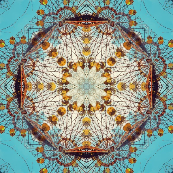
Gina Soden
Known for her evocative photographs of abandoned buildings that breathe beauty into decay, her new series breaks into abstract terrain. Just as a kaleidoscope operates on the principle of multiple reflections, so too do these prints.

|
|

|
Soden has flipped, inverted and rotated fragments of her own images of various spaces and architectural components – from tiles to antennas and from ceilings to staircases. In these prints our position is completely different, instead we are plunged in to the middle of something and have to work backwards to orientate ourselves. They demand endless inquiry and searching for forms.
Final Response
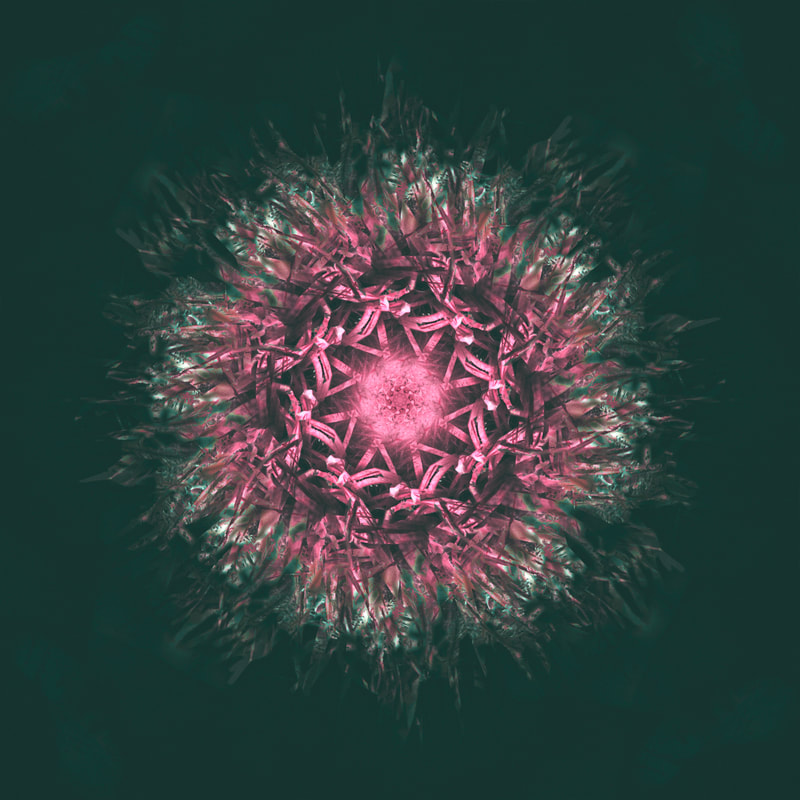
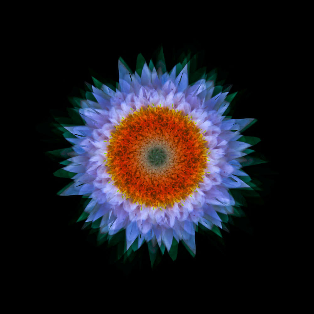
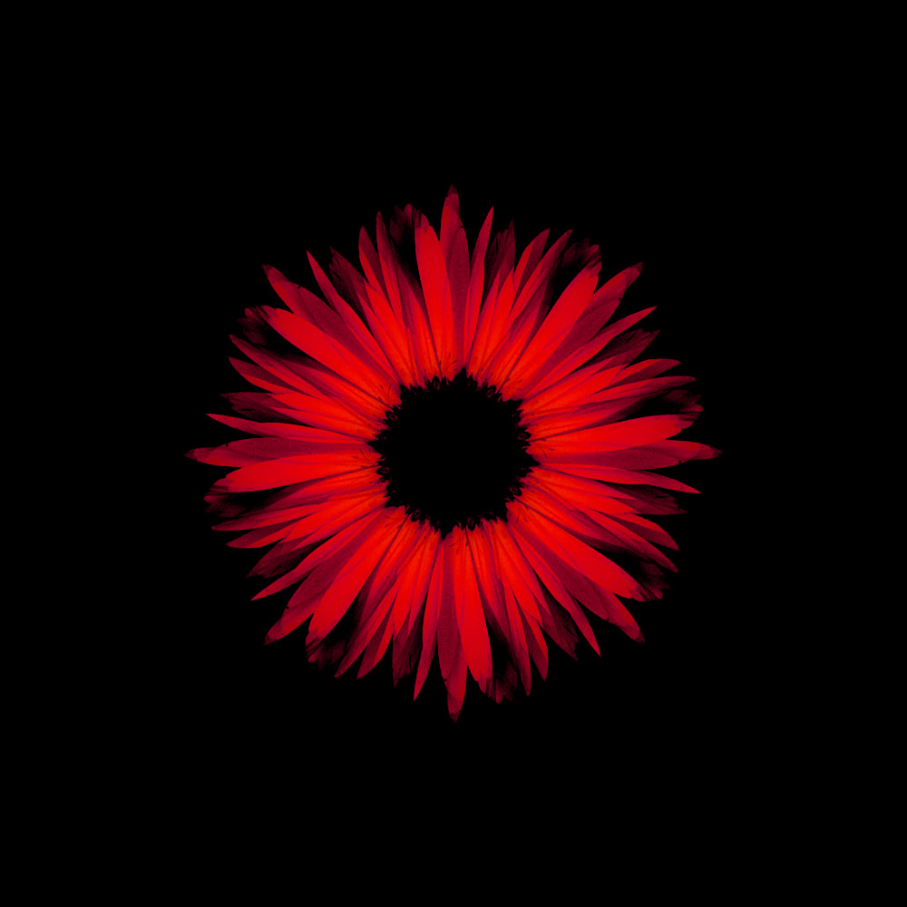
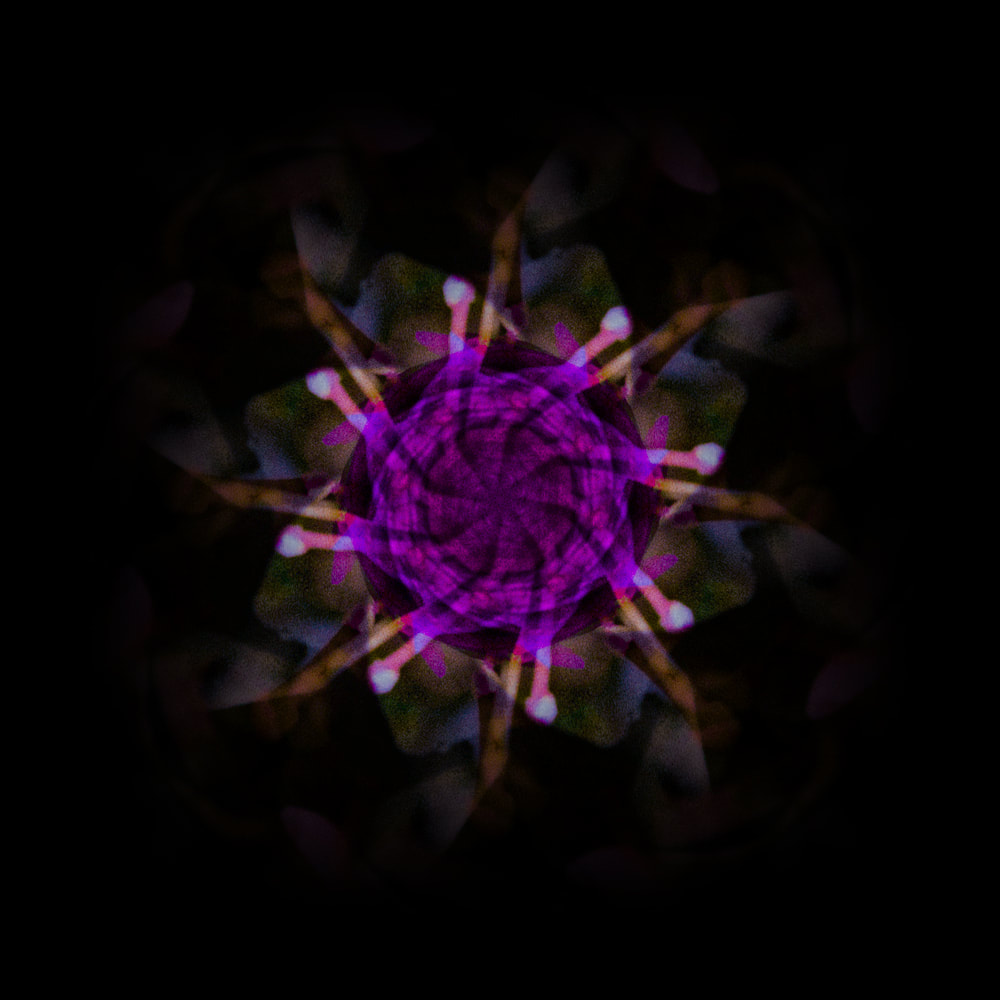
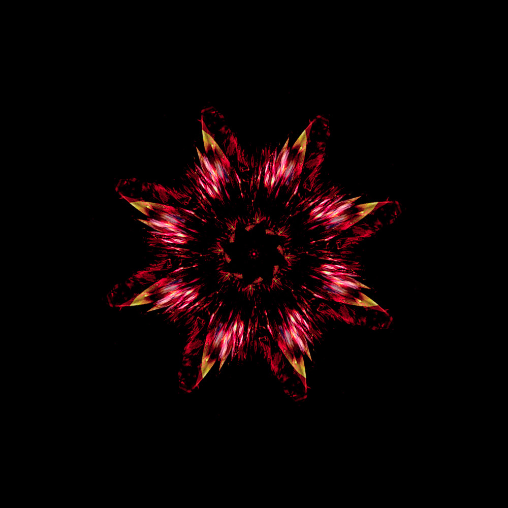
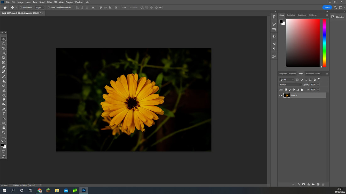
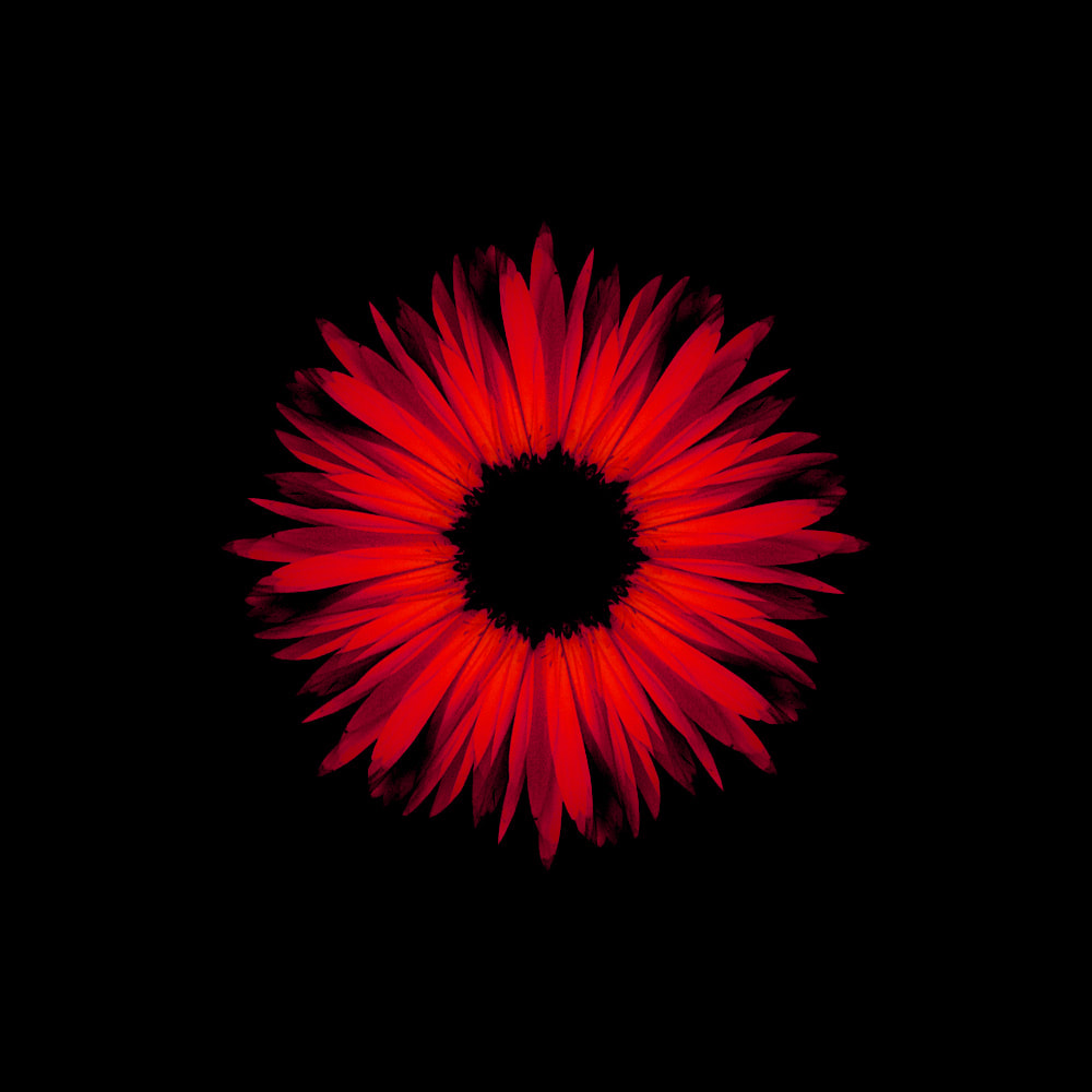
For this response I plan to head into my garden and take pictures of some of the flowers and plants there. I really like using my garden for photography because of all the different colours and lighting. This can really create a variety of results for my Photography. I will also use Adobe Photoshop to help me develop the before picture into a kaleidoscope image. Occasionally, I plan to also use hue/saturation to create further contrast and interest. I decided to move to close-ups instead of landscapes but still keep that intense reflecting imagery but increase it so much more. As a result, this is my final piece as i felt it captured so much of my work overall. All the shapes, colours and most importantly reflections.
|
Before:

WWW: My first shot was beautiful of the flower. I then wanted to develop it into something very abstract and thought of a kaleidoscope! It was quick and easy in Photoshop. The soft bristles really add a certain calming atmosphere to the piece. I also really like the change in colour as it adds vibrancy and love in a way. And lastly, the shapes are exactly what i wanted to get from this idea. The centre of the image looks like it's illuminating the whole image, it feels mesmerizing to look at. I think I really experimented with shadows and highlights to which adds more depth and passion to the piece.
EBI: Include a couple more colours or change the green around the image using the hue/saturation tool because pink and green don't really suit eachother. |
After:
|
|
After:
|
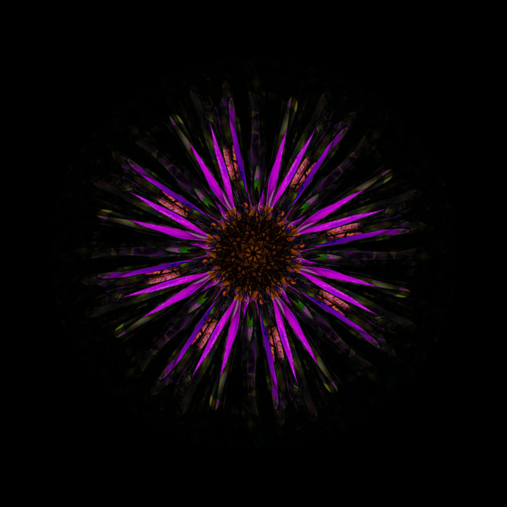
Before:
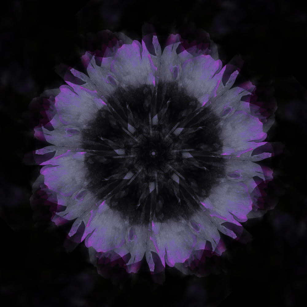
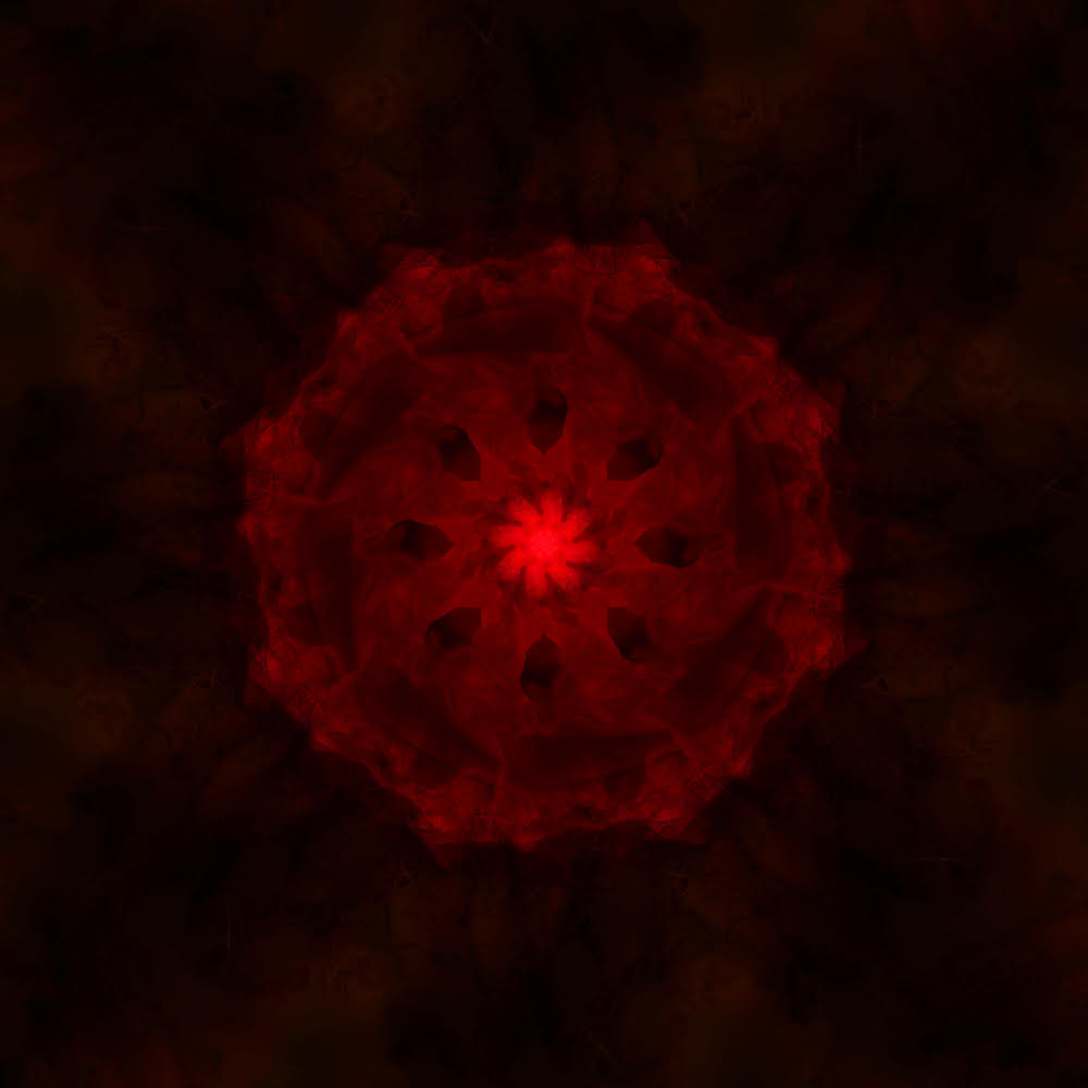
WWW: I really like how i brought attention to the centre of the image. I feel like it gets more interesting the more you stare at it. Also, all the different shapes and patters are, again, so mesmerizing and captivating. I love the soft bristles at the end of the flower as it ,yet again, adds a calming/soothing atmosphere. I like how i use black as the background to create focus to the flower and it slightly fades out in purple streaks. The colouring makes the piece have more depth and level.
EBI: Add more colour to the centre of the image, to create a more interesting kaleidoscope effect. |
|
Before:
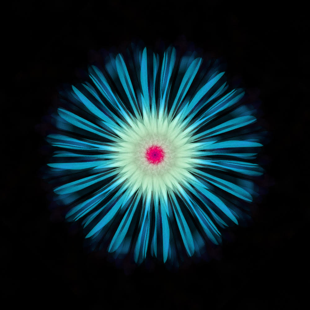
WWW: In this take, I utilised a series of different colours and temperature effects to liven up the image. I used the spot healing tool to get rid of ugly black spots of the flower. My favourite aspect of this piece is the fluffy petals that i've created using texture and clarity in camera raw filter. I tried to - again - make the flower fade out of the image with a black background and i did that very successfully. I like how I saturated the colours more in the centre to draw more focus to the image but also matched the very centre with the outside colours of the image. Finally, the picture clearly has layers because you can see the petals building up in size and amounts.
EBI: Slightly bring down the red in this image because it's very strong compared to the rest of the colours in the picture. |
After:
|
After: Before:
|

WWW: In this image i really like how the background has a subtle red tint to match the colour of the main object. I had a slight problem with making a background like this but i used content aware fill and copy and pasted some parts to create the reflection effect. I also really like how in this image the flower looks more "dusty" and has deep intricate textures. It almost looks like a cloud of smoke rather than a solid object which I think is a nice concept. I used the lighten overlay instead of the typical multiply to create this effect.
EBI: I could've chosen a better flower to create more details around the sides of the image. The main focus could also be a bit bigger itself. |
Before: After:
WWW: I really like how long and sharp each petal is. I also really like the different colours contrasting throughout and textures. I think that each colour very cleanly transitions to the next. The centre is very eye catching with its strong colouring and the outskirts of petals contain a soft blue. The white around the mid-centre has an extremely beautiful transition from blue to white. Finally, I think that the different textures is what makes the piece stand out. The viewer may find texture to be the most entertaining side of this image because of how intricate and detailed some aspects of this photograph are.
EBI: Possibly may the edges of the petals have a darker blue to further carry this transition of colours. |
|
After: Before:
|
WWW: Firstly, I really like the dark centre in this image because I think that it adds a dramatic atmosphere. Then the small streaks of black leading into the striking red. I think that these two colours play very well together too. I also think that the layers and layers of petals can be clearly seen towards the end of the flower. It makes it seem more grand and also dramatic. I feathered the outer edge of the piece to add this fading effect as if the darkness is eating the flower. Finally, I think that by using only one colour it draws the viewer in more easily to look at the different effects and textures i used.
EBI: I could've made the image slightly bigger in terms of scale so that the texture can be seen better. |
Before: After:
WWW: This piece stands out to me, not because it looks the most pleasing to the eye, but because of its "spinning" effect it includes. I did this by playing with the opacity to slightly blur it in a way. I also, like the detail quite a bit, it seems to build on structure the more you observe outside of the centre. The sharp petals around the flower really carry out the blur effect of the reflection. The colour is as if smudged with the background making it seem not really part of the plant.
EBI: in the original image, the seeds towards the top of the flower are slightly out of focus. I can fix this by using a higher shutter speed, maybe 500. I'm not too sure how this would effect the final result though. |
|
After: Before:
|

WWW: This is one of my favourite pieces because of how unique it is compared to the rest of the images. The red dust almost looks like flames leaping off the edges of the petals. The small centre creates drama as it's surrounded by black and immediately collides with red and green chaos. I think that this created one of the best kaleidoscope effects because it looks slightly different to the normal kaleidoscope view. Also, I tend to like the image more when there is more sudden motion and spiky edges and rougher texture. It makes the photograph more interesting and almost welcoming to look at.
EBI: I could enlarge the image slightly to further focus the beauty of the "fire-like" texture. There are also a couple green dots which i could fix with the spot-healing tool in Adobe Photoshop. |
Before: After:

WWW: This image seems to have a more majestic atmosphere than the rest, it reminds me of church glass stained windows. How they are so expensive and precious but so beautiful and impressive. The purple colour signifies royalty which is probably why I link it to something like this. The centre object is more simple and calming, it's a typical kaleidoscope image you would see, but iv'e added these long and sharp petals. I used the purple colour to nicely transition it into a deeper and more calming colour, blue. This worked well, as the darker areas are now slightly blue.
EBI: I could add some sort of glow, or increase the exposure towards the centre of the piece to draw more attention to it. |
|
Link: This links with the previous response because I have isolated certain features of nature, but also still kept the reflection theme in these images. However, the reflections are a lot more frequent and not noticeable as it has looked like I have almost created a new flower.
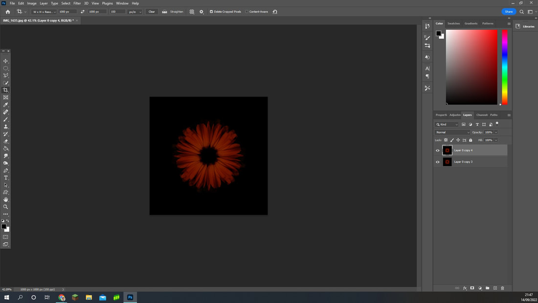
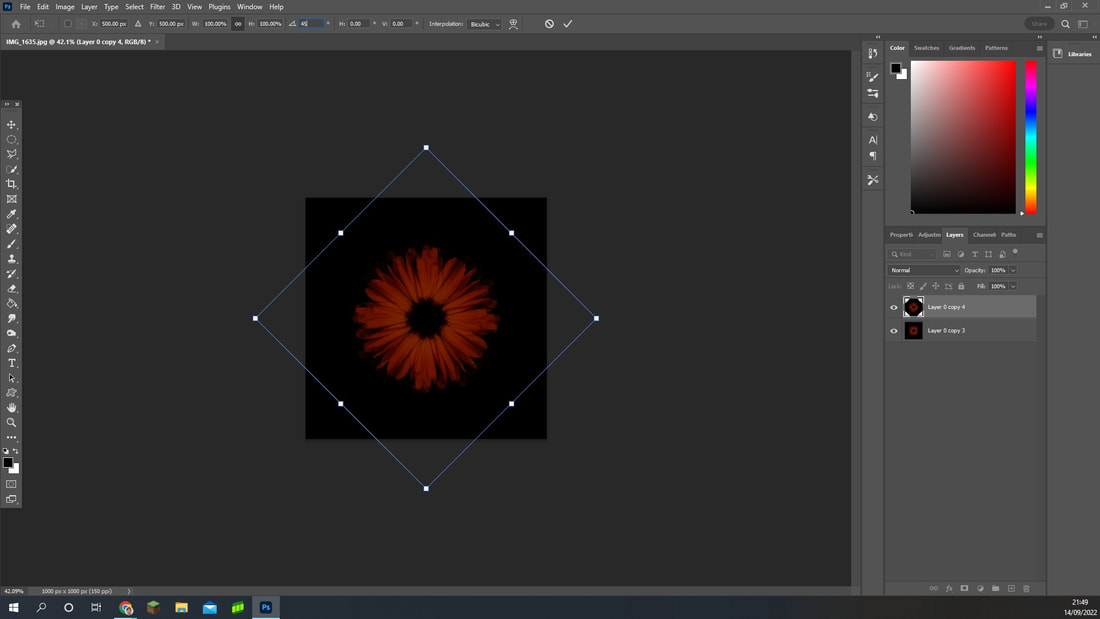
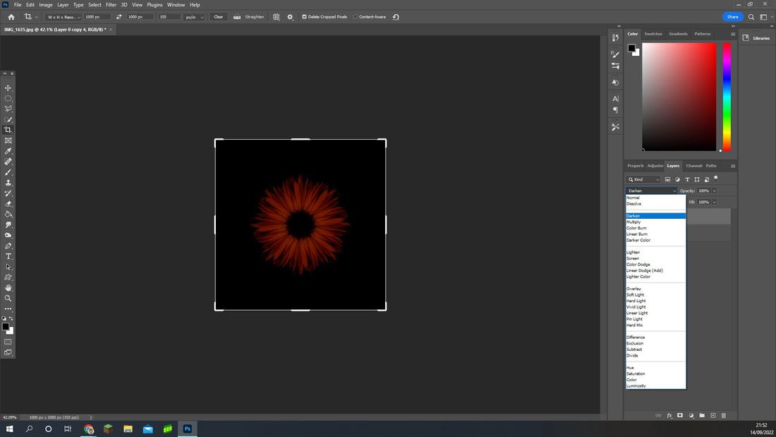
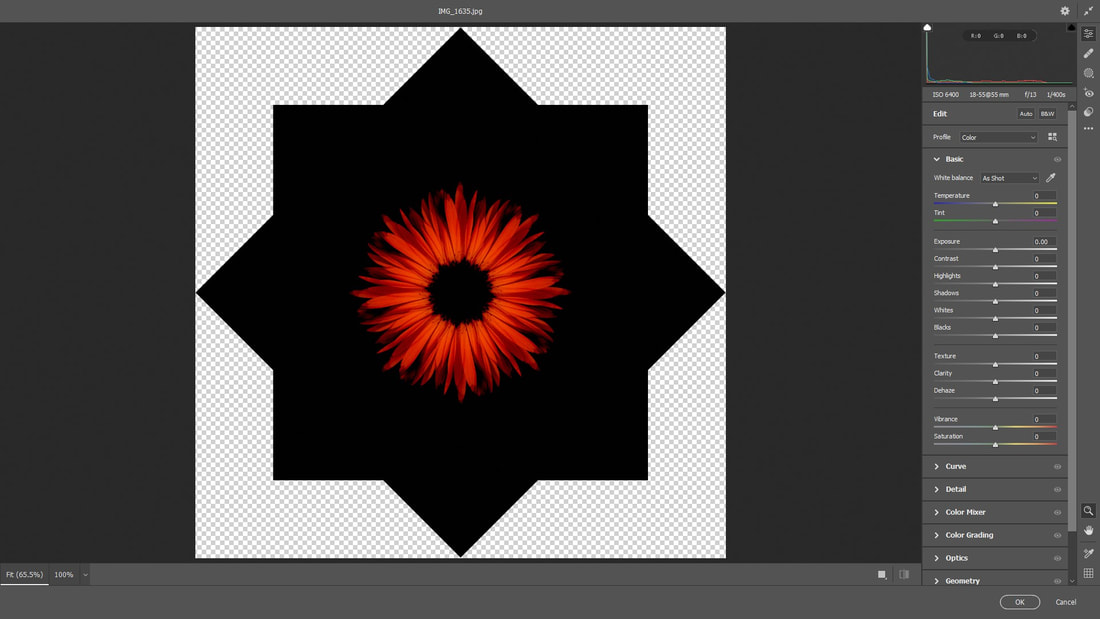
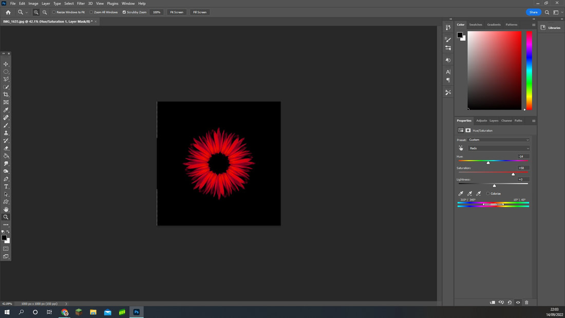
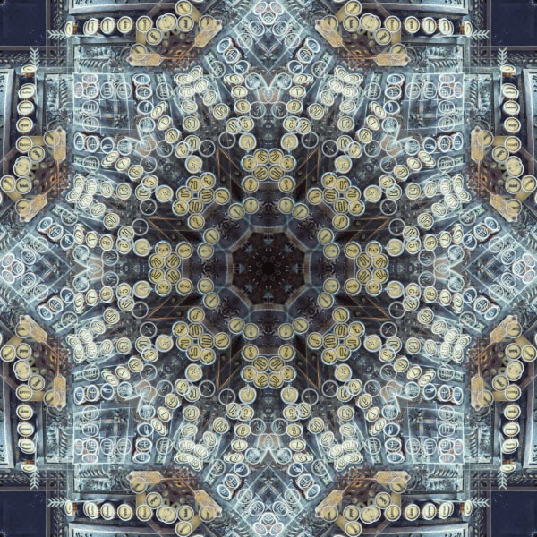
How I made these images:
|
1) Open your image into Adobe Photoshop, make sure you have a clear image of the flower from face on, you may wish to edit the lighting before hand with camera raw filter. |
|
|
2) Crop the image using the crop tool and select the option 1000px by 1000px at the top and a resolution of 150. Make sure the centre of the flower is at the centre of the image. Also, cover most of the image with the flower, as it is the main focus of this project. |
|
|
3) Copy and paste the cropped image 3 times. Then, I rotated each image by 90 degrees, use the shortcut (ctrl + J) to copy layers. Go to Edit > Transform > Then rotate either by 180 degrees, 90 degrees clockwise or 90 degrees anticlockwise. Rotate each image so that they have a different angle each time. |
|
|
4) Now select each layers by pressing ctrl and clicking each layer individually or pressing shift and clicking both top and bottom layers. After you select all of them, we are going to use an overlay. I chose to use multiply for most of them but it varies of preference. Then select that overlay. |
|
|
5) After that, Select all the layers and merge the layers by right clicking any layer and scrolling down until you see the tab. Then copy and paste the layer you just merged. |
|
|
6) Then, ctrl + T to select a layer so that you can move and rotate it. Do this on the top layer. Next, at the top, next to the triangle icon, type in the angle 45 to rotate the top image by 45 degrees. |
|
|
7) On the top layer, select another overlay that you most like, forget about the lighting as we will change that later, as well as the colour. I chose darken, I may have used a different one for this image previously. |
|
|
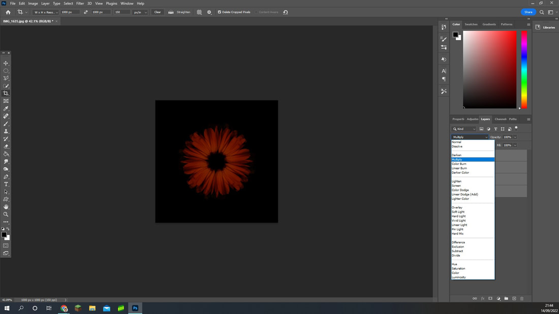
8) Merge both layers again and go to Filter > Camera Raw Filter, here we will change the lighting and later colour. You must merge the layers so that the editing is done on both layers rather than the one you have selected. |
|
|
9) Finally, use the Hue/Saturation option in the Adjustments panel on the top layer so that it applies to all layers. Then select the finger icon which looks almost like a cursor. and select the part of the flower where you would like to change the colour, saturation or lighting of. I went for a more darker red and slightly heightened the saturation of it. |
|
Comparison

|
In comparison to both of mine and Soden's work, we both have used the kaleidoscope effect in the same way. We have reflected them at the same angles as well. However, something very different is the colours and patters, Soden's work includes more colourful work, for example her background is a specific colour rather than my black background. I tend to use one colour and a flower as my base image. Whereas, Soden utilises architecture as her base image to create a lot more bigger image. There is a lot more to look at in her pictures. What is very different to my work is that you have one focus usually and one clean colour which strikes the viewer more. I wanted something less chaotic and more simplistic so that you can pay better attention to certain details.
|

|
Concluding Environments
In conclusion to the environments topic in GCSE Photography, I've really enjoyed this topic a lot more when comparing it to the others. I feel that my Photoshop skills have really brightened up this section and I love using Photoshop in my images. I also, think my photography skills have improved a lot, and I've taken pictures of many interesting things that you can find in our natural world whether this is man-made or genuinely natural. I think that environments has been a journey of lots of fun when it comes to my ability of photography and Photoshop combined. Most importantly, the last subtopic of reflections all contain very different and wide views of the word "reflections" but they all link very nicely with one another and I think I have proven well what my different capabilities are as a photographer.
