Ordinary to extraordinary
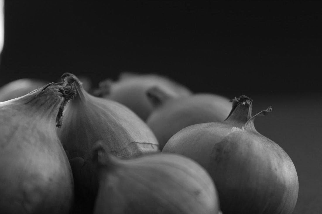
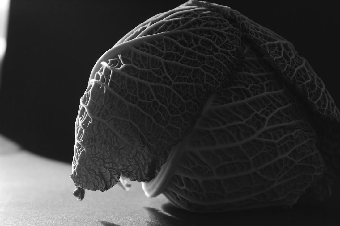
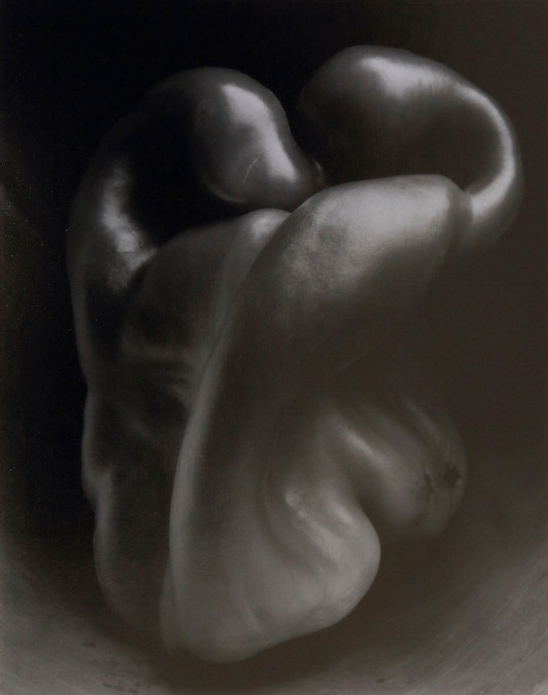
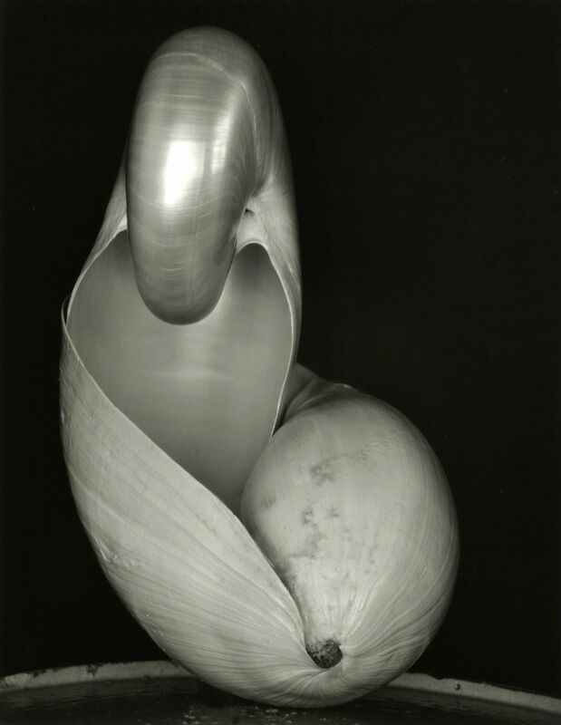
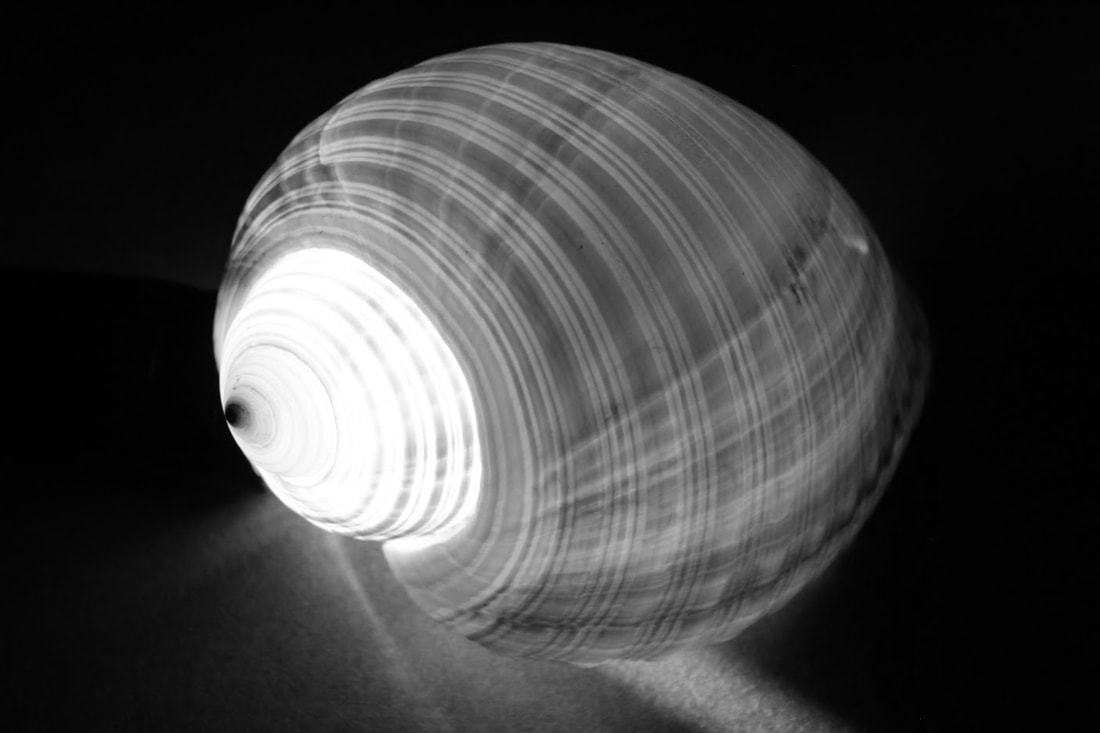
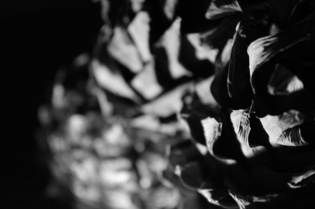
In this subtopic we used the work of Edward Weston as inspiration, we took a photograph of an interesting object, we used vegetables, shells and bones as it mirrored more of Weston's work. We focused mainly on the light, aperture and the shape. And we took the photos against a black background with the lots of sunlight. I changed the images to black and white by selecting the black and white icon on the adjustments tab in Photoshop.
|
the photo shoot: |
|
My 3 favourite
|
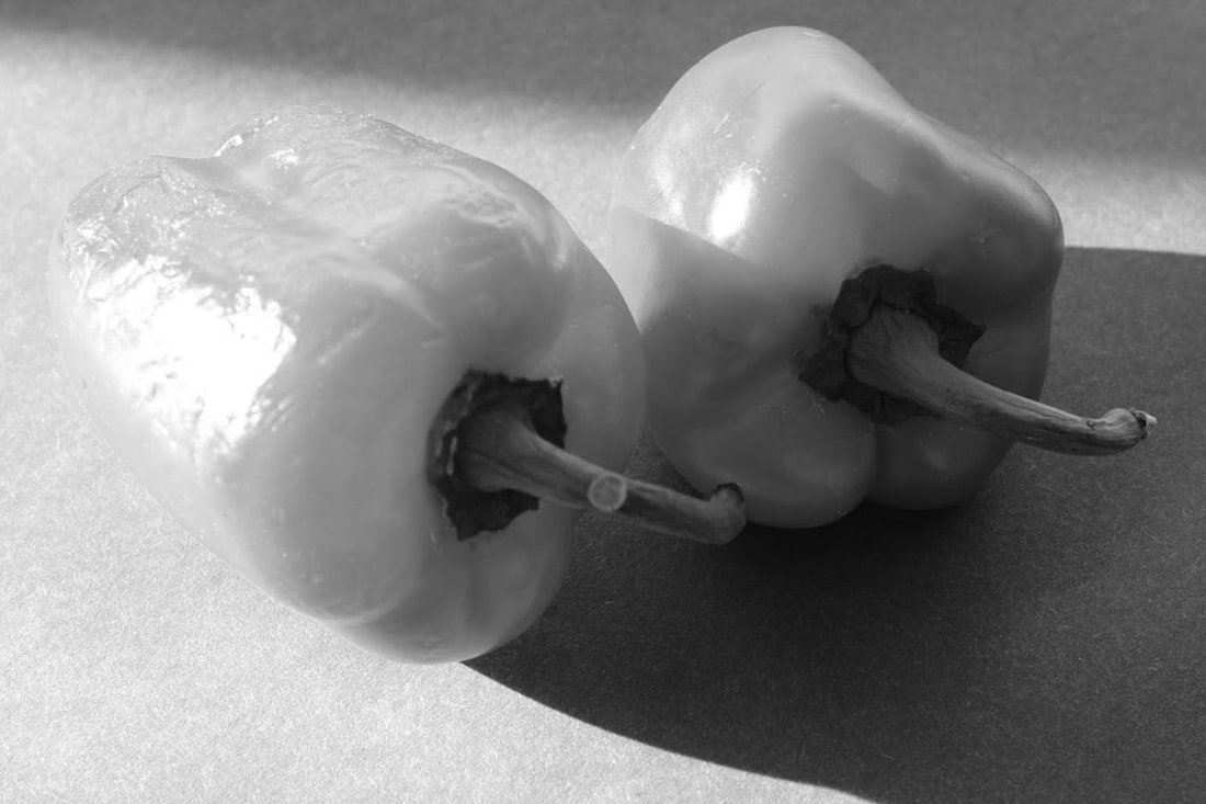
WWW: I really like how I used aperture in this shoot, especially with the lettuce and onions. I also really like how I used the light in the bell peppers. I felt this photo shoot was well put together in that i used the light well and different textures of objects. EBI: I had spots in the images that weren't filled with a black background, i should've payed more attention to that aspect. |
Edward Weston
Edward Weston (1886-1958) was a 20th century photographer who has been called one of the most innovative and influential of all American photographers and a master of photography. His career spanned 40 years and he photographed an expansive set of subjects, including landscapes, still-life, nudes, portraits, and genre scenes.
|
|
|
Some of Edward Weston's most famous work is close ups of vegetables and fruit. By August 1930, Weston turned his attention to photographing the “livingness” of a pepper and “exposing its quintessence.” While arranging a pepper one day, he finally solved a considerable problem: he no longer balanced it against a muslin backdrop or a piece of white cardboard, but instead he ingeniously used a tin funnel to hold the pepper which added reflecting light to important contours of the pepper. He shot the pepper by setting the lens to a small aperture of f/64 to secure maximum sharpness for minute details and for sculptural forms.
Ordinary to extraordinary 2nd response
In the second response of ordinary to extraordinary, instead of using natural light we used light from a torch to create different effects. I thought that when using natural light it was better for pictures which were saturated however black and white images worked well with the light from the torch.
|
The photo shoot: |
|
|
I used this option in Photoshop to edit my images black and white: |
|
My 3 favourite
|
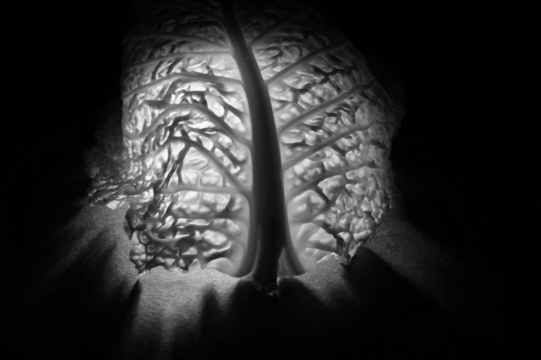
WWW: I think I utilised the torch really well in that i created a glowing effect, with lots of shadows contrasting with the light. The reason for this was because i could place the torch wherever i wanted which i think were the perks of using a torch. All the textures were really nicely placed with the shadows, which is where turning these pictures into black and white helped the images bring more interest and quality. I also highly like the close up of the pineapple, with the bottom half not in focus. I feel i can appreciate the beauty of a pineapple more by focusing on specific parts, even if its just a pineapple.
EBI: i could've used a better angle for the cabbage as i think it had the potential to be even better, maybe an angle from the bottom left of even a close up of the textures. |
Lockdown sculpture 2nd response
For the second response of Lockdown sculptures, we used a very similar technique but we used a wider variety of objects. Here are my shots:
|
The photo shoot: |
|
My 3 favourite

|

WWW: I used more vibrant colours and a wider range of objects to explore the different unique sculptures i could make. EBI: I could've used the lighting a lot better to create a more similar image of Sharon Radisch, also i could've used a smaller objects so that they don't go out of frame when taking shots. |
Simplified still life
In this subtopic we took an image we more recently took and transformed it into something similar Michael Craig Martin has produced, i put a little spin to my work, i lowered the opacity on the objects so you can see some texture and shadows. I also made the background a solid colour and edited some other stuff out that i thought weren't needed. I did this by : opening an image i took, then selecting a certain area with the polygon selection tool. Then, went to Edit > fill, and selected the colour i wanted. Then repeated for every object. Also i made the opacity 50 for the objects.
|
The process: |
|
Before: After:

|

|

|
WWW: i like the colours i chose and really think they symbolised something Michael Craig Martin would do, i also enjoy how i changed the opacity to 50 instead of 100, that's what makes this piece unique for me. I also successfully removed the stick on top of one of the paint bottle, and it still looks realistic. EBI: i could've went over some of the edges better, for example the wire was quite challenging and has some edges that are still the original photograph |
Michael Craig Martin
Micheal Craig Martin is an Irish Artist and Painter, he is a principal figure of British conceptual art, Michael Craig Martin probes the relationship between objects and images, harnessing the human capacity to imagine absent forms through symbols and pictures. He now lives and works in London, here is some of his work:
|
|
|
Michael Craig Martin, takes an object or objects and simplifies it with simple colouring, patterns and textures. This is what we call British conceptual art. In the 1990's he developed this style, by using vibrant colouring and he using composition to explore spatial relationships by juxtaposing and layering color. We can see colour is a big part of his art to create something so simple yet "pleasing to the eye".
Different views of the body
With this subtopic of different views of the body, we took nine photos of someones different body parts and made one full photo in Photoshop using Lauren Marek as inspiration - we didn't merge the images like we did previously. I used a fast shutter at 1/60 and an iso of 1600.


WWW: At first i wasn't sure weather the contrast in light and dark with some of the images would work, but i think that it adds to the difference in body parts and makes the piece more unique in my own way as a photographer. I also think i got a wide variety of shots from the model, again making some good contrasts but similarities with Lauren Marek.
EBI: Some images weren't in focus i could've tried to focus them more maybe by using manual focus instead of auto focus.
EBI: Some images weren't in focus i could've tried to focus them more maybe by using manual focus instead of auto focus.
Lauren Marek
Lauren Marek in her series "Pieces" focuses close to the person and creates an abstract representation of the figure.

|

|

|
Inspired by Picasso and his cubism portraits she uses 9 images alongside each other to create her abstract representations of a person. She uses a white background and close ups on body parts. Also she doesn't merge the images together but leaves it to the imagination.
Different views of the body home response
For this assignment, we took pictures of a model and then put 9 images together to make one image, the white spacing in between is important to visualise the different parts of the picture and what to focus on.


WWW: I really like the lighting in these images and I also like how i incorporated accessories such as earrings and glasses. But the main reason i like this piece is because of the reflection in the glasses and how i just captured parts of the models hair. I think this sets me apart from Lauren Marek and me as a photographer.
EBI: Choose a whiter background and make sure no texture is in the background just to bring the focus to the model.
EBI: Choose a whiter background and make sure no texture is in the background just to bring the focus to the model.
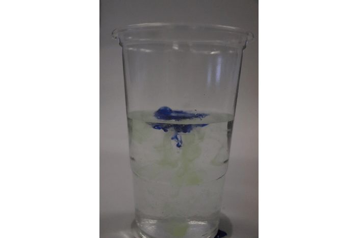
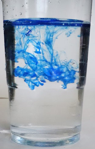
Fireworks in a jar
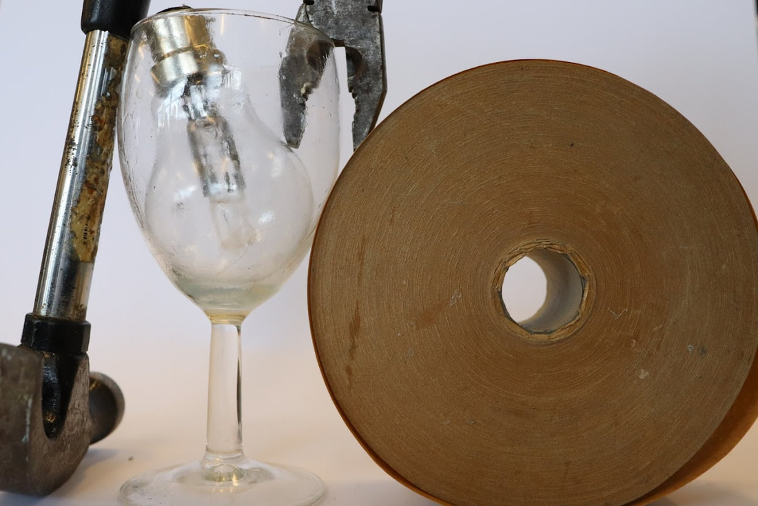
Firstly, in this photoshoot we used these items - food colouring, warm water and oil - and took images of the reaction that took place. Creating a fireworks affect, which is where the name comes from. Here are the steps:
Step one: fill a glass/jar 3/4 with warm water
Step two: In a separate glass add a few table spoons of oil and add 4 drops of food colouring – of differing colour
Step three: Using a fork, give the oil and food colouring mixture a good mix to break up the ‘colour beads’ into smaller ones
Step four: Carefully pour the oil & food colouring mixture into the glass of warm water then take your photos at the perfect moment
|
The photo shoot: |
|
My 3 favourite


|

WWW: I like how the ink spread and flowed around the cup and how i captured it. Also I like the vibrant blue and the yellowish green I used to add to the "fireworks" aspect of this topic.
EBI: The bottle could be moved out of the way and i turned the ISO up so the images are brighter. I also did struggle to focus some pictures which is something to work on in my second response. |
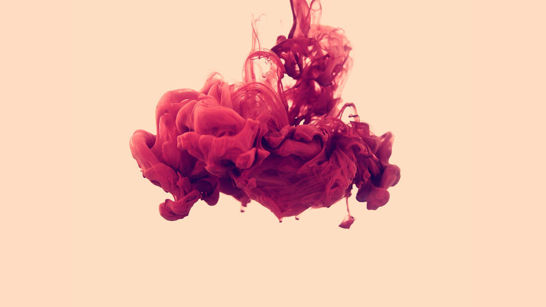
Alberto Seveso
Alberto Sevesco is a self-taught Italian graphic artist and illustrator, his work is mainly inspired by skateboard decks and music album covers. His unique pieces have been featured all around the world in magazines and CD covers and collaborated with many big names.
|

|

|
His aesthetics visit an exciting technique of using ink water work, which constantly evolves in a truly mesmerizing and beautiful way. Some methods feature the experimentation with high-speed photography by imprisoning ink in floating water and digitally operating his subjects in post-production. He uses a simple background to bring focus to the beauty of the ink's shape.
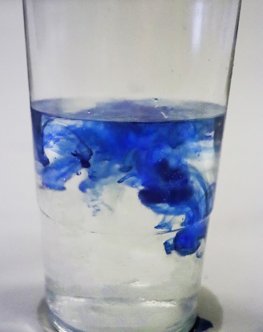
Second response on fireworks in a jar
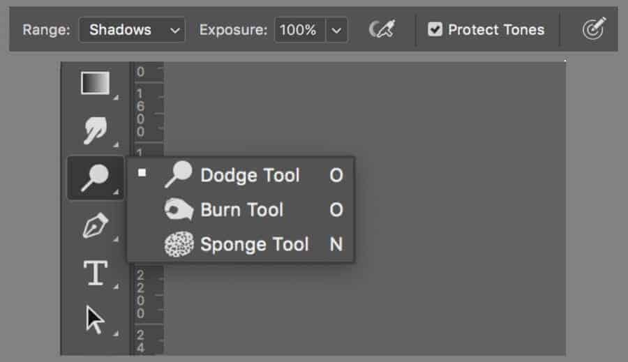
With our second response of Fireworks in a jar we roughly used the same idea but i found it easier to not use oil as the result simply looked better. Also, we used different ink which was nicer and flowed better in the water. I also used Adobe Photoshop's burn and dodge tool to lighten and darken certain areas as did Alberto Seveso does. I tried to focus the ink by putting a straw in then using manual focus to focus it at that and not move my camera from that point onward.
|
Focusing technique: |
|

|
|
The tools: |
|
|
The Photo shoot: |
|
My 3 favourite


|

WWW: this response was definitely an improvement to the first which I'm very happy about, I used a straw so that the bottle wasn't in the way and dropped it at a far distance. I also focused it very easily and paid more attention to that. This was something i said i would improve on before. And i used even better colours and mixed them together to make work closer to Alberto Seveso. i used the dodge tool to essentially heighten the ISO and it really improved the colouring of the image.
EBI: Wipe the cups so the oil doesn't grease the clarity of the image. Also i could add more shadows around the cup. |
Before: After: For comparison:

|
|

|
As a gif:
WWW: I really love how smooth the gif is and how it goes back really smoothly. It was definitely a good idea to use continuous shooting as it really helped my gif look good and you can really see the detail of the ink moving from frame to frame.
EBI: the background stayed one colour so that it could be even smoother.
EBI: the background stayed one colour so that it could be even smoother.
Final response at fireworks in a jar
With the final response I used the same series of rules as my last response but i paid more attention to the EBI of my second response. We used photoshop to crop and we used the burnt tool to darken certain areas and the dodge tool to lighten the areas.
|
The photo shoot: |
|
My 3 favourite

WWW: I love the vibrancy of this photo shoot, especially when I edited them with the dodge and burn tool, there are lots of contrasts in dark and light as well. In addition, the ink flows nicely down and I think I caught the picture at a good moment. Also, I edited and cropped the plastic cups so that the cups looked like glass, i did this by adding more shine and reflection by using the dodge tool and more shading below the cups.
EBI: there are some black spots on the edges of the cup which was because the white background wasn't big enough i could've edited this out. |

|
As a gif:

WWW: I really like the vibrancy and the way the ink flows down in every frame. The cup was well cleaned and the background colour was white in all frames.
EBI: i could learn how to crop each image the same sizes so the gif is smoother.
EBI: i could learn how to crop each image the same sizes so the gif is smoother.
Sequences
In this topic we took a picture from above of a biscuit, we then chipped off small pieces and took a photo each time we did this. We then sequenced it on photoshop like Stephenson. A challenge i think ill come across is taking a photo of the biscuit at the same angle and height.
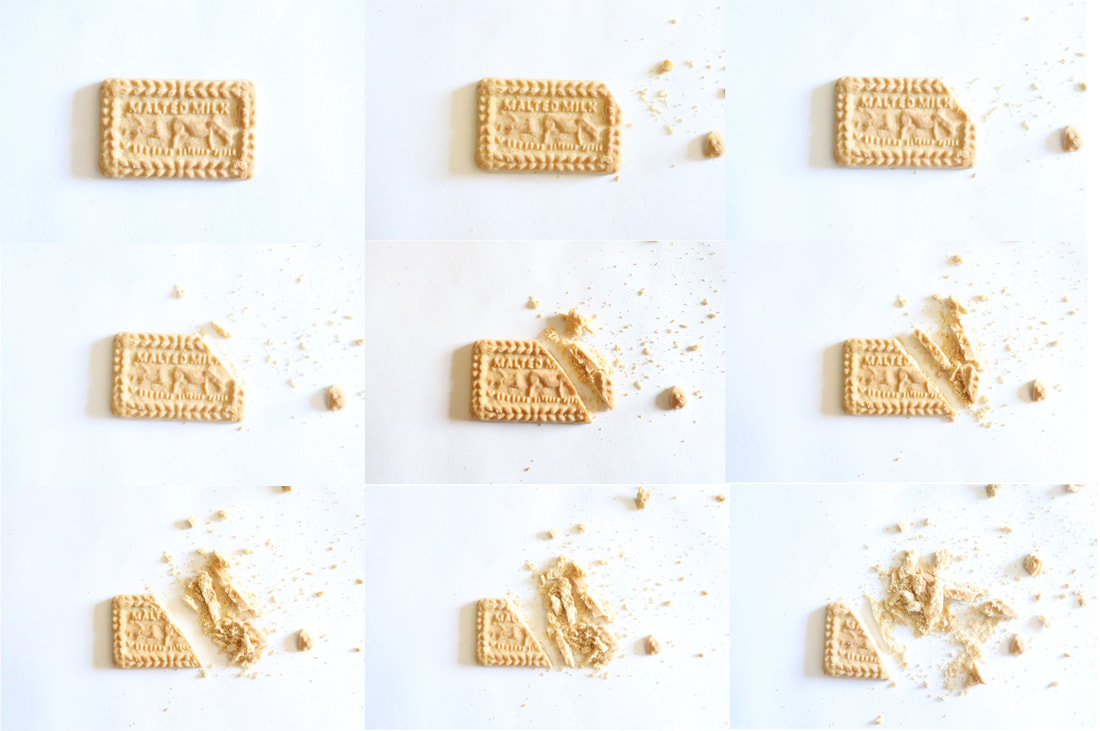
WWW: I think that this well portrays the style of Stephenson's work with the sequences he uses. The lighting is nice and even for every individual picture and i like how i added the crumbs to make this a significant piece.
EBI: I fit all the photos i took on the canvas, by using a bigger canvas in Photoshop.
EBI: I fit all the photos i took on the canvas, by using a bigger canvas in Photoshop.
As a gif:

WWW: I think that the movement of the camera angle imitates the mess of the crumbs. I also think that the light was very similar through each frame. In addition i like how i used a biscuit and not a fruit as it adds a difference between me and Stephenson.
EBI: I could've cut smaller slices so it looks smoother.
EBI: I could've cut smaller slices so it looks smoother.
Luke Stephenson
Luke Stephenson is a Photographer of Birds, Ice Cream vans, Clown Eggs, Beards and other things. Based in London. He is mainly known for his humorous and quirky take on vernacular life.

|

|

|
He said “I like to collect things and have done so since I was a child, and I think photographers generally are collectors – they amass images from their work. I guess I just like things and enjoy the little differences in things that are basically the same.” This is a strong quote in my opinion because it would inspire other photographers to essentially find their own style.
Sequences second response
In the second response, I used 2 different biscuits to add variety and create a more interesting image. I tried to hold the camera still so the images as a gif weren't too different apart from breaking the biscuit.
|
The levels tool i used to brighten my photos: |
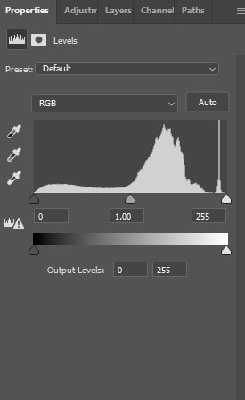
|
Before: After:
|
|

|


WWW: I think that the levels tool really helped brighten my images which was definitely a success for this take. The biscuit seems to crumble clearly and the camera looks like its in the same spot every time. I really like how i kept the crumbs as it made the piece seems as if it was getting destroying rather than cleanly being swept away.
EBI: I used a tripod to stabilise the camera for the sequences and the last image is darker than the rest, i could've waited for the sunlight to come back or changed it in Photoshop.
EBI: I used a tripod to stabilise the camera for the sequences and the last image is darker than the rest, i could've waited for the sunlight to come back or changed it in Photoshop.
As a gif:

WWW: I like how fast i made the gif because it makes the biscuit look more realistic - breaking apart like its naturally breaking down. Also i like the crumbling effect because it evokes the destruction of the biscuit.
EBI: I could use a tripod if i wanted the gif to look smoother, but i'm not so sure if it would be a great idea because i partially do like the destruction effect.
EBI: I could use a tripod if i wanted the gif to look smoother, but i'm not so sure if it would be a great idea because i partially do like the destruction effect.
Jesse Draxler
Jesse Draxler is an American visual artist, illustrator and art director. Everything is abstracted just slightly, just enough to unnerve and entrance.

|

|

|
Jesse Draxler is a mixed media and multidisciplinary artist, and his pieces combine painting, photography, collage, typography and digital painting. Among their characteristics are distorting the human form, working in grayscale, and abstract landscapes. Some of his works are : misophonia and reigning cement.
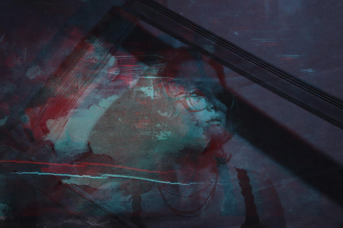
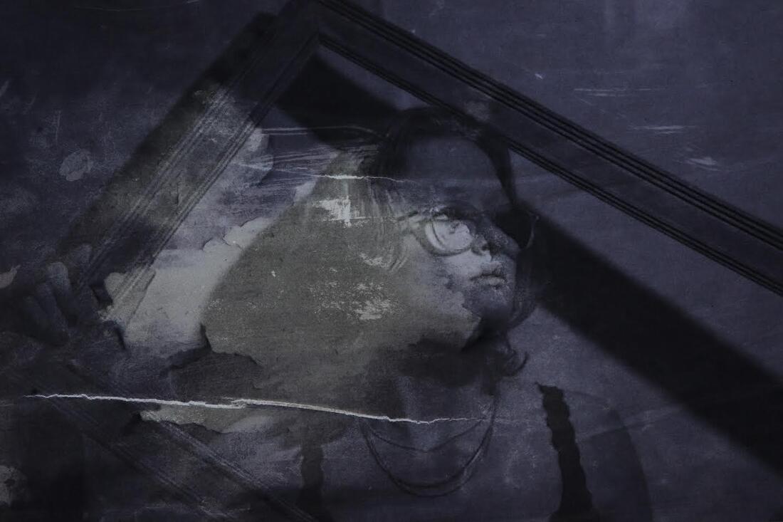
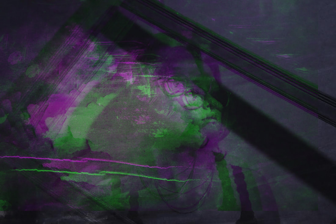
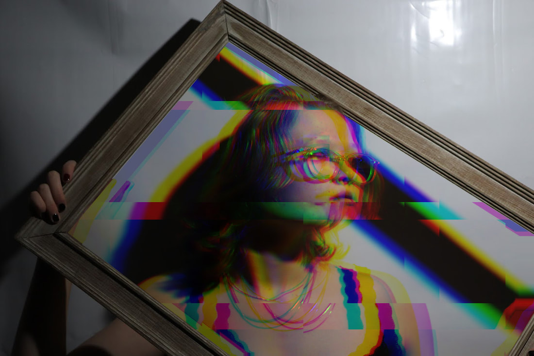
Face distortion
In this assignment I was asked to choose two tasks to develop on that i've previously had involvement in. I decided to choose Jesse Draxler because i enjoyed Lauren Marek's work a lot even though the images weren't my best shots, i think it has the most potential. I used the layers tab in photoshop and the lasso tool to cut out different parts of the images and place them behind/in front of each other.
|
The photo shoot: |
|

|
WWW: I think i utilised the stylise tool very well, i went to filter>stylise>wind. I duplicated the layer then made one layer "melted" and cut out the mirror part. I think this is a really nice affect to have especially for a photo like this with a mirror
EBI: there are a couple reflections in the glasses, i could've edited those out or taken a photo where they weren't involved. |

|
WWW: i successfully took two images, one of my own and one of Draxler, and cut out the silhouette of Draxler's photo and added my model as the face. I then used the black and white option in Adobe Photoshop. I think that it was a good idea using the silhouette of Draxler's model because as a viewer you can clearly see features such as the ears and jawline, whereas you would just see the models hair in her silhouette. I also used the burn tool to create shadows under her eyes.
EBI: i could've had the model look at the camera so it mirrored Draxler's work more. |

|
WWW: i really like the crack in the glasses that i added in Photoshop and i like the frame that i used and think the moment that the position the model was in is really "dreamy". In addition i think that i payed a lot of attention to detail with the crack in the glasses for example the shadow onto her skin, i used the darken panel to blend the images together.
EBI: I could've taken it one step further with Photoshop for example distort her face. |
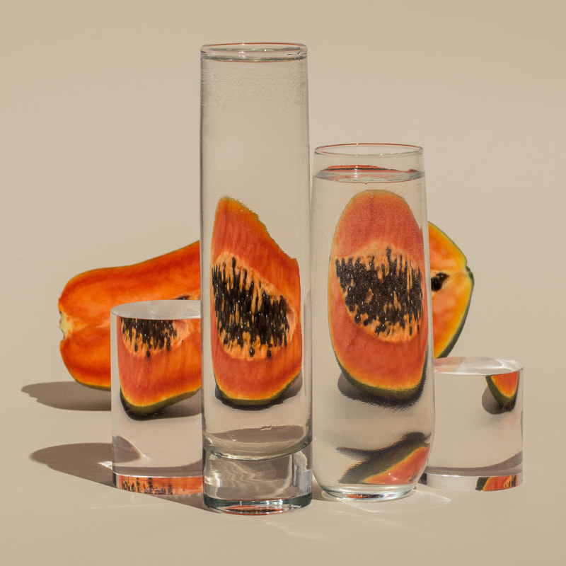
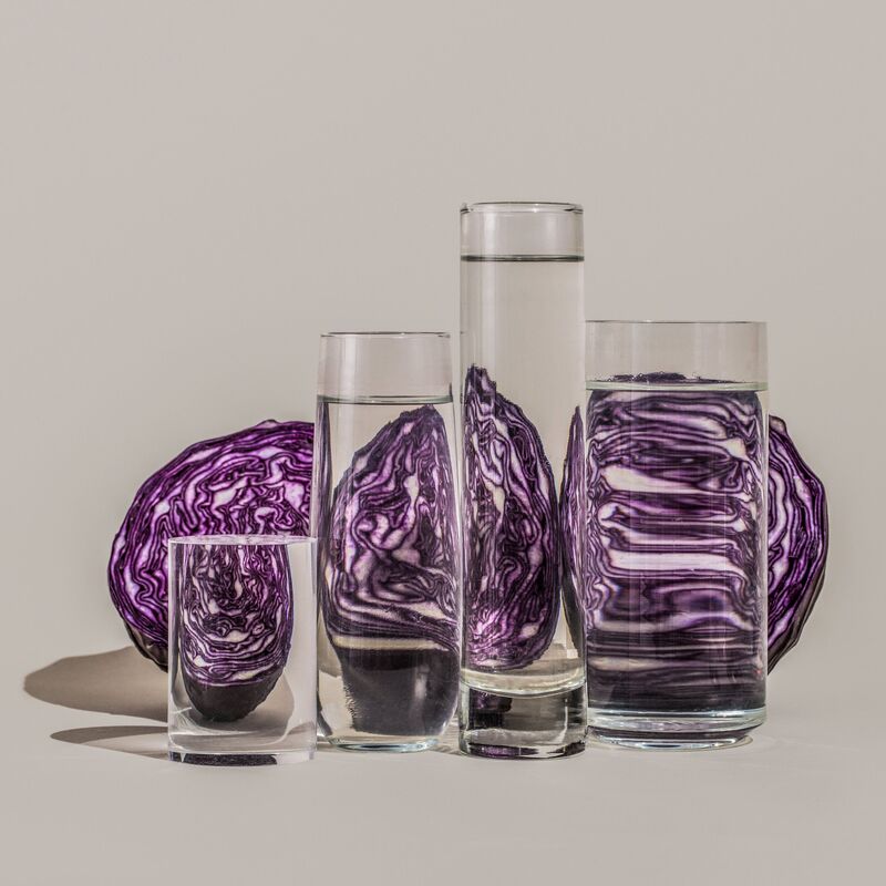
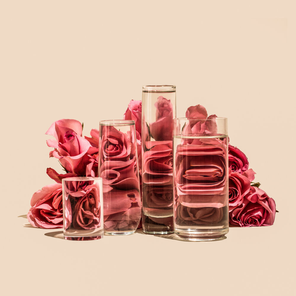
Suzanne Saroff
In her series of photographs named "perspectives", Saroff creates fractured images of common foods as seen through vessels filled with water and glass objects.The images play with concepts of light and shadow resulting in distorted still life.
|
|
|
With tools and techniques such as refraction, directional light, and bold colours, my photographs give everyday items alternate visual avenues of expression,” shares Saroff. “Taking shape via shadows or fragmentations, my subjects often become more than the singular and expected version of themselves.”. This was all inspired by a single orange sitting on her kitchen counter behind a glass of water.
Distortion
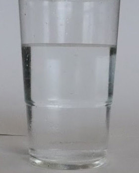
In this subtopic, i used different glasses of water to distort the image of a normal fruit or vegetable on a white background to bring the focus to the distortion of the object.
|
The photo shoot: |
|
Final three:

|

|

|
WWW: The fruit, cups and lighting that i used was a generally done well, i like the vibrancy of the fruits and vegetables as most of the cups that i chose. I specifically like the banana attempts because the cup is "filled" with yellow which makes the banana distorted like Suzanne Saroff. Furthermore, i blended the background well as there was a line from the paper, and i got rid of that to make the images look more professional. EBI: In Photoshop i could've used the dodge tool a bit better by having a lighter brush so that you cannot see big differences in terms of lighting. |
Second response face distortion
In this independent topic i took the work of a previous photo i had taken and lay it out into Photoshop. I used various techniques including using the layer style tab, and using the advanced blending and unchecking the red and then green boxes on the first layer. Also to get the "Francesca Woodman" effect i washed parts of the models face of and laid tape on one side to create an old, vintage atmosphere.
|
The process: |
|
|
|
WWW: I think that the physical process was very effective at creating a broken down, or vintage look of the photo, i really like the colours I used when taking the image further in Photoshop. Overall, i really think that this take was very good and brought something unique to the table. I also printed the image in black and white and took the photo in front of a bright light which gave it a wide contrast in colours to the other images.
EBI: I could've used the dodge or burn tool to brighten/darken some parts of the photograph.
EBI: I could've used the dodge or burn tool to brighten/darken some parts of the photograph.

|
WWW: i really like how well i have shaded using the burn tool to create the effect that the models face has leapt of her head. I also think the idea of very unique and specific to my style. In addition, i used lots of layers well so that i could go back on any mistakes that i made using layer masks to not be destructive. EBI: if i removed the glasses so it looks more realistic or make them look 3D as if had been cut. |
|
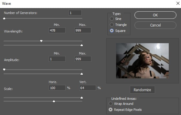
WWW: i really like how i only used the glitch effect in the frame. This makes the frame have a use as if inside is a painting or something to look at. It brings the the focus to the inside of the frame. I used filter > distort > wave > square and did this with green and red colours in channels. This was a fast and easy way to do all this. Below is the tab i used : EBI: add extra effects, like in the filter gallery to add to the glitch effect |
|