Pinterest Board
I decided to create a Pinterest board so that I could occasionally jump back to this tab and have a look at some photography ideas just in case I get a little stuck on some inspiration. I think that the Pinterest Board is a great way too search for new inspiration because of the shear amount of new images you see every second.
Strand One
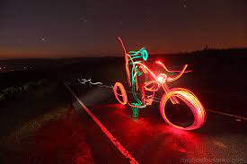
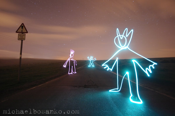
Michael Bosanko
Michael Bosanko is a light painting photographer Michael Bosanko has been capturing light since 2004. He discovered light painting on accident, Michael says this of his moment of discovery, “the moon formed part of the scene, but the camera shake caused the moon to make a streak.
|

|
|
Welsh artist Michael Bosanko transforms landscapes such as the Brecon Beacons and desolate city scenes by using coloured torches like a paintbrush to create images. He then snaps the moving lights with a long-exposure camera and covers the lens with coloured acetate to produce different shades. He utilises rural areas and then brings life to them through his light paintings. His clever use of light paintings and steady hand help him create these amazing cartoonish images. He utilises the rural landscapes and brings them to life with his simple yet extremely technical light paintings.
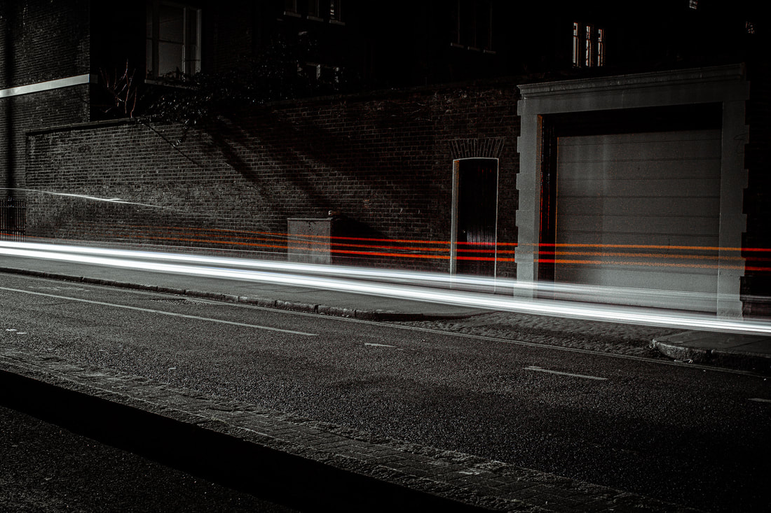
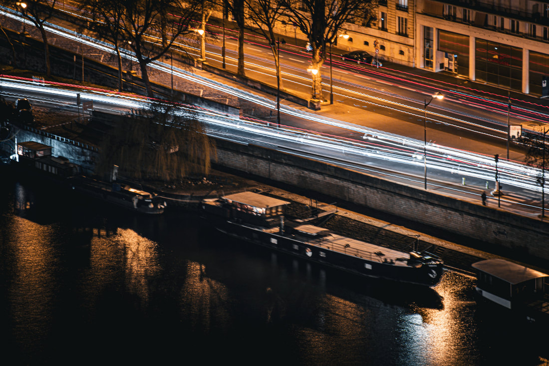
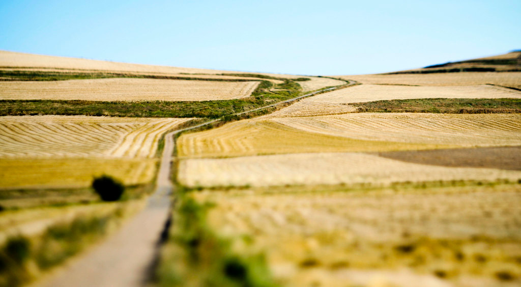
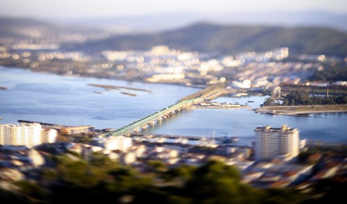
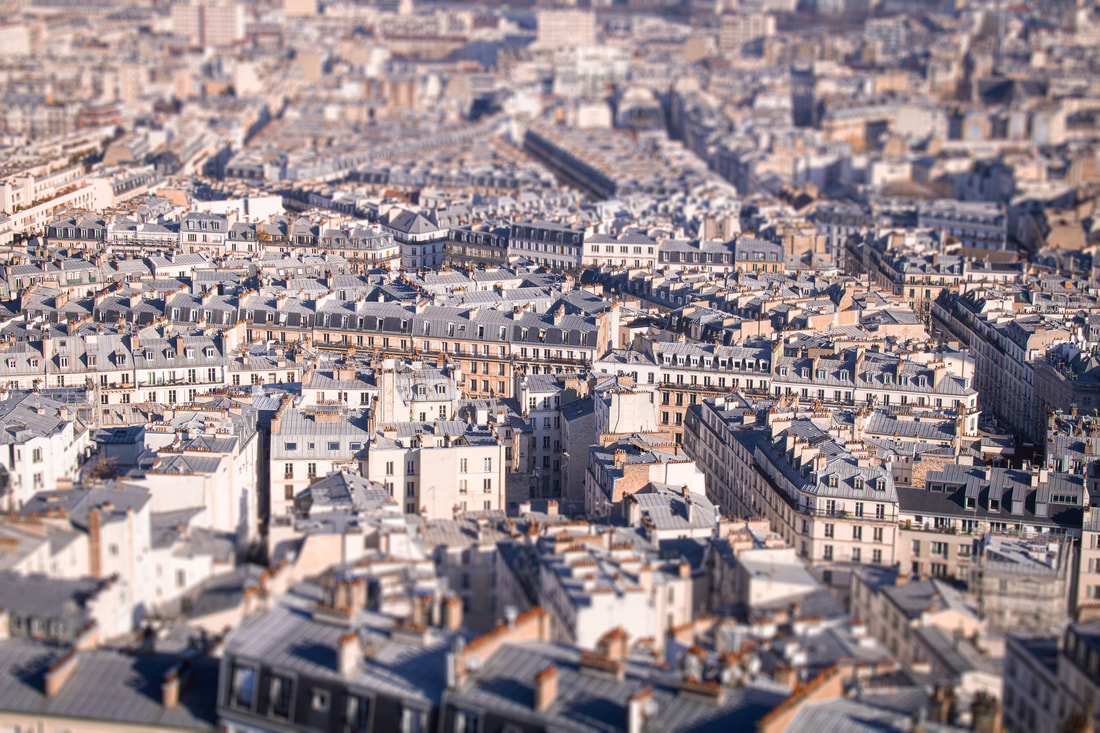
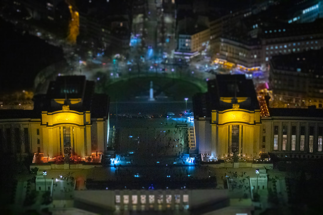
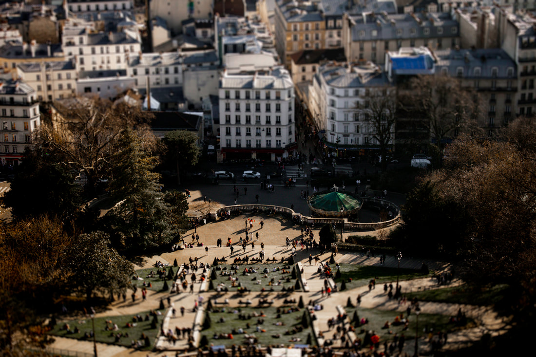
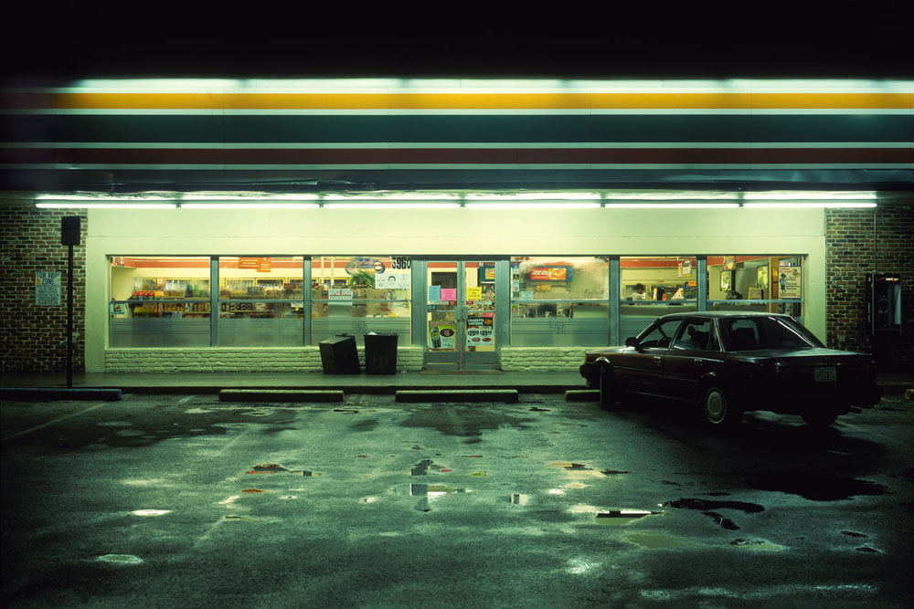
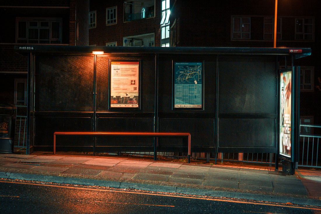
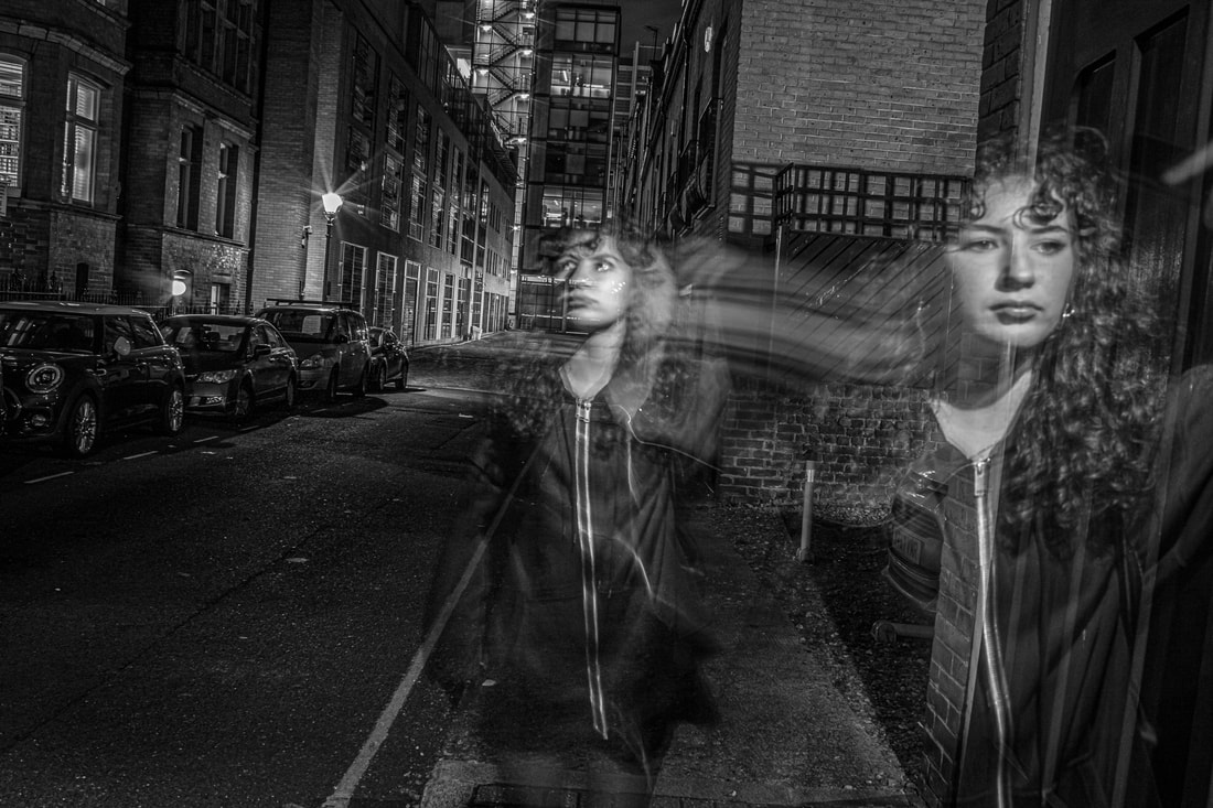
Car Lights - Bosanko
During this response, I decided to take joint inspiration from both Michael Bosanko and the Pinterest Board. Combined I realised that car lights would be a great first strand to introduce some technicality as I would need to use a tripod and use a long shutter speed. I also was currently in Paris and would travel up the Eiffel tower to take images of the city landscape. I thought that a lower angle of images would be easier and cover more light. I also would bring my zoom lens as I could capture more intricate moments in the city structure.
|
The Photoshoot: |
|
The Process:
For this response I decided to travel up towards higher places and decided to take advantage of the fact I was in Paris. So I used the height of the Eiffel Tower to take images from high up with a zoom lens and a tripod. The tripod was necessary, and It was a good idea to just get one trail of cars as too many would pack an image full. After the first set of images, I still wanted more variation for my final three images. So i decided to go to Goodge street at night with my tripod and 18-55 mm lens for a more closer and personal take of the car lights. The closer up images catch more detail from within the trail of light.
The Final Three:
|
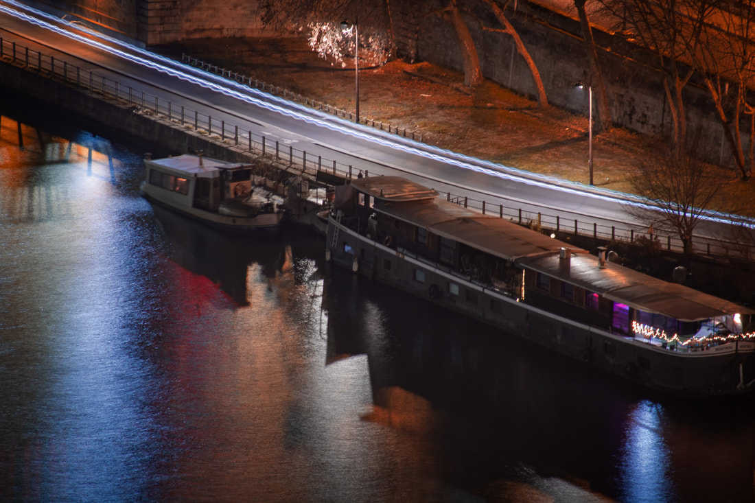
WWW: I really like the location I went to to take these images - in Paris - and the view over the top of the city worked really nicely as I zoomed into smaller details. I think that the colours of the lights are also extremely effective as I have introduced a variety of them. I also love the rivers that I have photographed next to the light paintings as they help bring the image to life and create a contrast between the city and nature. It also aids he image to look more natural rather than long exposure. Furthermore, the light paintings themselves are very straight and closely mirror the typical car lights trail. The tripod I used really helped this effect work .
EBI: Originally I used bulb mode, but the camera still picked up the slight shake of my hand and there is still a tiny shake from when I used 30 second shutter, so I should've decreases the time the shutter was open because i still would've captured a long line of car lights with half the second with less shake on the camera. I could also hold the bottom of the tripod to reduce the shake. |
Strand Two
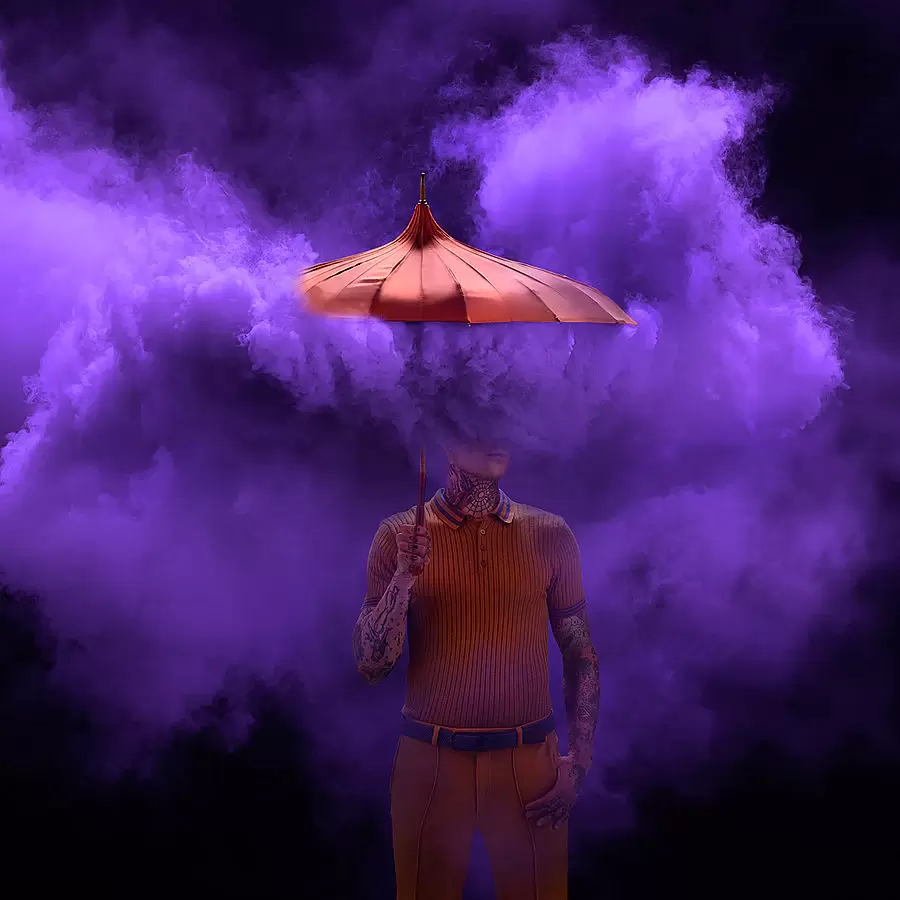
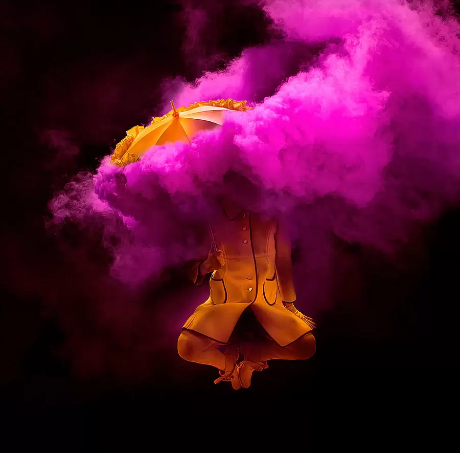
Tim Tadder
Tim Tadder is an internationally acclaimed artist, photographer, and director. His powerful and graphic fine art photography employs bold colours and striking compositions to explore the value of truth, unity, and free-thinking in our current socio-political landscape. In addition, Tadder specialises in creating dramatic photographs of people, sports, action and concepts. Tadder uses location photograph combined with lighting effects to create truly unique images.
|
|
|
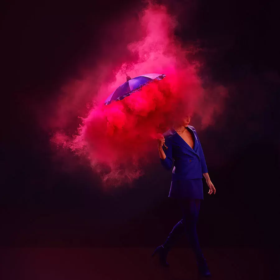
Furthermore, I decided to look at the powder effect that Tadder has used because I enjoy the fluid like movement it extenuates from below the umbrella. Which is ironically not what the umbrella's purpose is for. I also really appreciate the variety of punchy colours that Tadder has utilised to extrapolate a wide range of emotions. However the constant use of brighter colours, which compliment each other, emphasise much stronger emotions like a sort of love or perplexity. Lastly, I think that the powder/dust is extremely powerful and creating a sort of coverage of the face to almost distort it and what it represents.
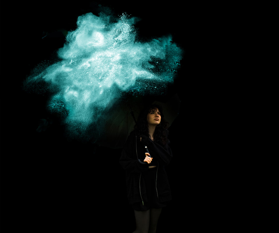
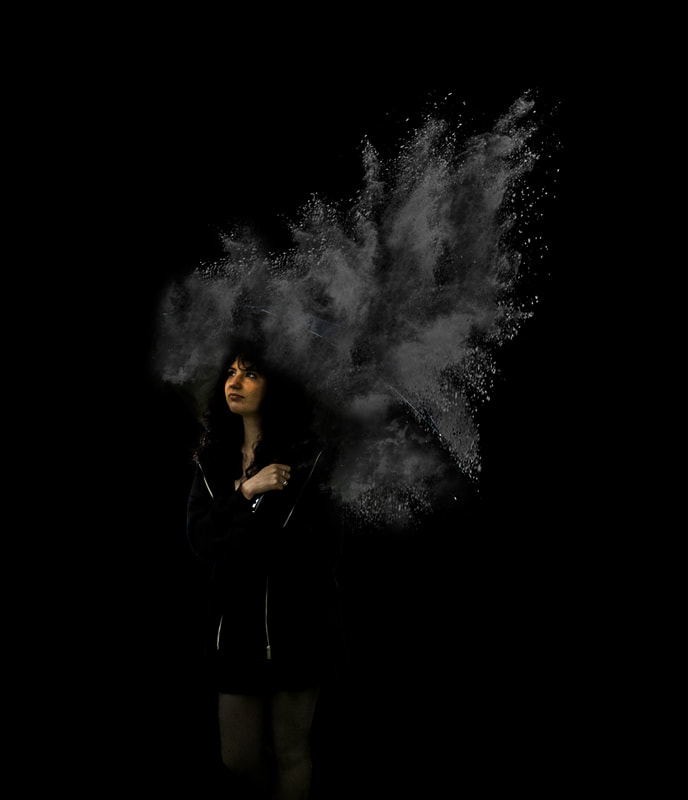
Dust Explosion - Tadder
During this photoshoot, I firstly had the idea of using actual powder like flower and spraying it above the model, but it would leave a lot of mess for both the landscape ad the model that i wanted to avoid. So i resorted into finding images online of some sort of "dust explosions" to very similarly mirror those of Tadder's work. I also used an old fashioned umbrella with lots of curves and unusual shapes to bring myself closer to the effect Tim Tadder has used. In addition to this, I had a white sheet behind the model and umbrella so tha cutting the model out would be a lot easier in Photoshop.
|
The Photoshoot: |
|
The Process:
For the process of this photoshoot, I tried to take the Photoshoot when it was sunny so there was lots of light fro different directions. I also had a fan to blow the models hair a bit if there was no natural wind. this would help the image look more natural. Moreover, the white sheet in the background was highly helpful to cut out the model and resize her so that the powder can be larger and more impressive. The clone stamp tool was also very helpful with creating more unique shapes and colour grading was helpful in camera raw to change the colours of the powder.
The Final Three:
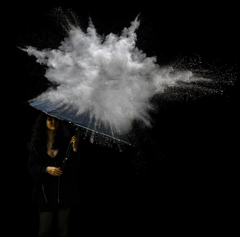
WWW: The lighting was very accurate with camera raw filter helping me achieve that. And the shapes of the powder are really interesting and mesmerising to look at as they have many different levels in the images. They also cover part of the umbrella making the umbrella almost seem like some form of protection against the dust ; I also preferred utilising blander colours as I felt it brought focus towards the face of the model which is what I wanted and what I did differently to Tadder. The most important thing for me was definitely the natural pose/position of the model which I felt I strongly achieved. Finally, I think that the clothing of the model mostly matched the colours of the dust which can reciprocate the bland and fatiguing feeling. This can also leave me a load of options if I decide to develop this strand in the future.
EBi:I could possibly add a weaker dust effect across the top of the heavier dust effect to help the dust fade away into the darkness and make the whole image look smoother. Furthermore, I can use more of the dodge tool or layer masks to create lighter areas in the image. Perhaps some overlays may help the powder pop more. |
|
Strand Three
Ronaldo Fonseca
Ronaldo Fonesca utilises the tilt shift lens to create smaller figurines of architecture, landscapes and people. He also uses lighting to highlight certain areas of the image, and blur to highlight certain areas of the image and emphasise the tilt shift effect. Also, the different perspectives, especially from higher up, which creates an increased effect of the tilt shift effect. Fonesca also the "fake"/ lego features of the images make everything look miniature and almsot like toys in a gigantic world.
|
|

|
Secondly, the use of composition in these images are very strong for example the rule of thirds is very powerful as you can see clear lines created by the images. Layering is also very powerful especially when combined with the technical aspect of layering. The layers help create levels, texture and different forms of perspectives.
Tilt Shift - Fonseca
For this strand I traveled to the Sacre coeur and the Eiffel Tower in Paris and utilised the tilt Shift effect in Photoshop to to create a fake/ lego effect which looks miniature, but in reality it's normal sized. Also I thought I should develop on Fonesco's strand because Paris has really nice landscapes, architecture and different levels to utilise different perspectives. From this response I learnt that taking from higher up really helps create and use the tilt shift effect, especially from the centre of the page across similar surfaces.
|
The Photoshoot: |
|
The Process:
For the process I used a high aperture so that I could select which part of the image later I want the viewer to focus onto. This was helpful because I could choose which parts of the image are important for the viewer. For images caught at daytime I did not use a tripod but used 1/200 seconds shutter speed. However during the night I used a tripod because i needed to use a longer shutter speed because there was no light caught in the images. I made the tilt shift effect by going into Filter > Blur gallery > Tilt Shift and used the sliders to concentrate the blurs in some part of the images.
The Final Three:
|
WWW: The images use composition very well, landscapes of architecture, to heavily deploy the miniature effect over Paris. I think that using people within the images further brings the effect to life. Also I like that I used day time and night time as my final three images because it adds variety which is useful when using the same effect over and over again. Also I tried to mainly focus on city landscapes for this response because it the effect is more impactful. In addition to this, the colours are all very different in each image as different hues are exposed to create different emotions which I highly enjoy.
EBI: Some of the framing could be slightly better, which could be fixed using cropping in Lightroom. I could also use some colour grading to perfect the colouring on the buildings and create more of a central focus with colouring. |
Development 1
Tilt Shift 2 - Fonseca
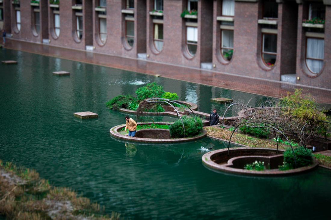
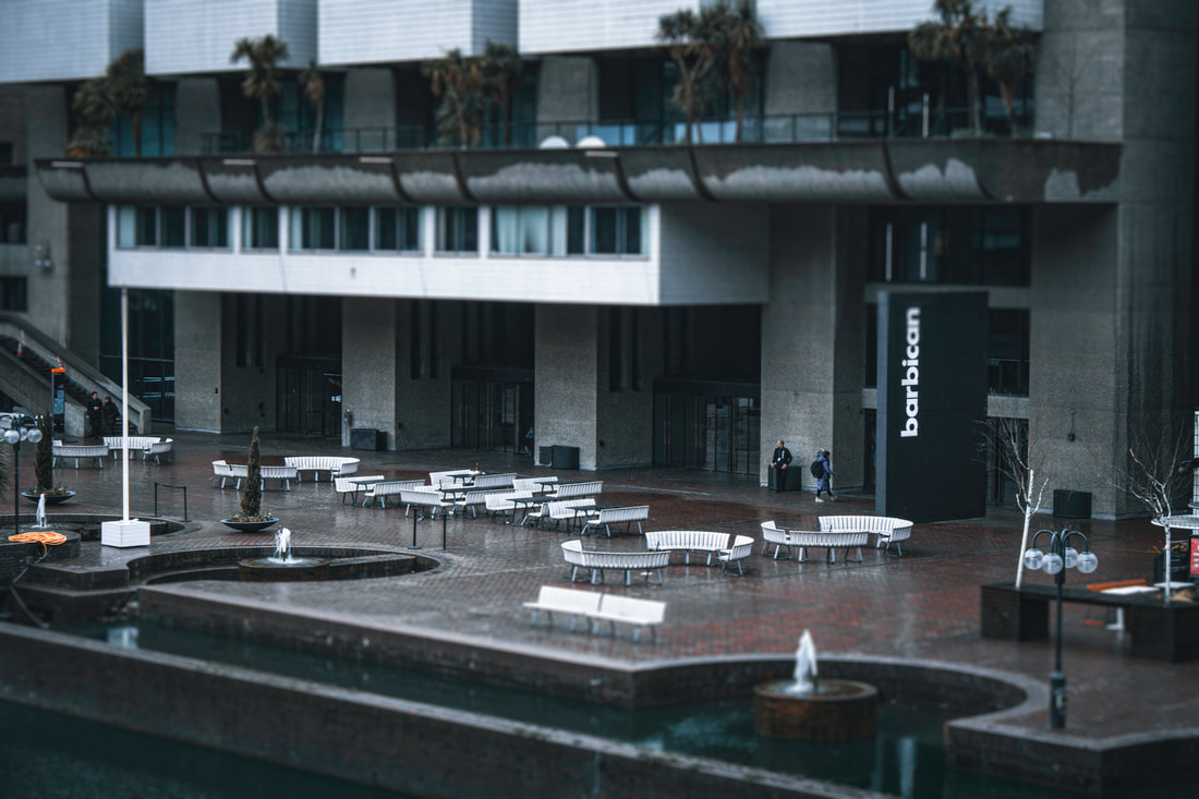
For the first development I wanted to go to the Barbican and take pictures of mostly people and larger objects such as benches, plants and lamp posts in order to create versatility. The Barbican was a great spot to experiment with different levels and perspectives whilst using the Tilt Shift effect. In addition to this, I used weather - the rain - to purposely evoke certain emotions and focus on smaller symbol and areas when using tilt shift during a darker day.
|
The Photoshoot: |
|
The Process:
This time I didn't use a tripod unlike last time because I wanted capture some movement of the rain and more specifically people and try and make the Tilt Shift effect. Again, I made the tilt shift effect by going into Filter > Blur gallery > Tilt Shift and used the sliders to concentrate the blurs in some part of the images. I tried to focus people as my main part of the image but not over crowd the areas of people. I used a fast shutter speed at 1/200 to sharply capture the motion of the people.
The Final Three:
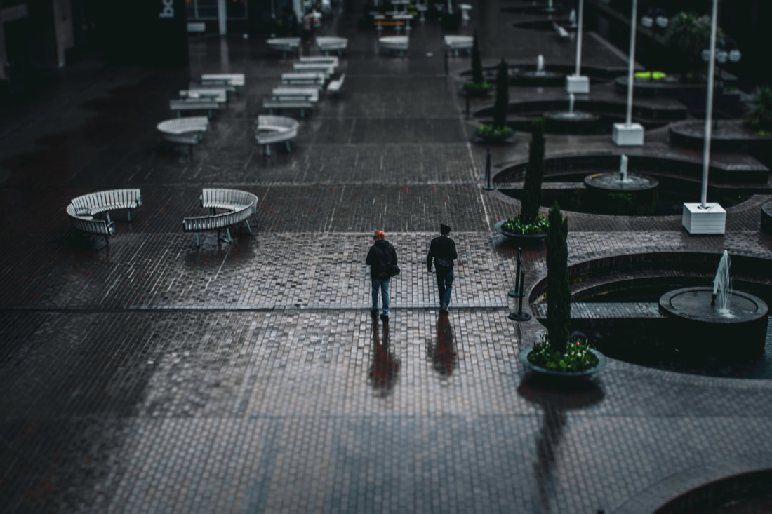
WWW: The way I used the weather to create a glittery look on the floor was executed very well. More specifically, the Tilt Shift effect was also completed very well taking advantage of the "toy-like" effect it creates to create distortions of reality. Furthermore, the distinct blurs from top and bottom of the images also help the viewer picture and concentrate on the centre of the image and which small details are simplified into a playful sequence. Subsequently, I liked zooming into the motion of people and how they interact with the world to evoke different emotions and how the Tilt Shift effect can make them seem innocent and powerless in a "fake" reality. Lastly, colours can also extremely help the images pop in both quality and perspective to help extrapolate numerous emotions.
EBI: For a lot of my Photo-shoot the images were quite blurry, I could use a tripod to help stop camera shake, and also use protection on the lens so rain does not distort the images. Moreover, I could focus slightly more on the nature side of Tilt-shift and how it can transform many green symbols into playful sculptures. Link: This links with my chosen strand because instead of using higher cliffs and edges to shoot architecture of France, I used smaller views to focus more on people and their movement and motion with the Tilt Shift effect placed upon both shoots. |
|
Development 2
Liam Wong
Liam Wong is a Scottish photographer and games designer. He was Artistic Director of Ubisoft Montreal and was involved in the design of game series like Crysis and Far Cry. He is known for his cyberpunk, sci-fi style of photography. His style can be shadowed in the city of Tokyo where many neon lights are born here.
|
|
|
Wong's work has an ominous tone with slight glances of intense light throughout his pieces. Throughout each image there is a slight hue of a certain bright colour to achieve a certain emotion. I notice he typically utilises rain to make the lights glow as the rain reflects the light at different angles. Furthermore, Wong typically uses urban locations such as Tokyo, New York which have a lot of bill board signs and ally-ways with neon light signs for shops. Ultimately, his photography explores the urban landscapes from all different directions, from various angles during the night to create a certain atmosphere for the viewer.
Light in Night Photography - Wong
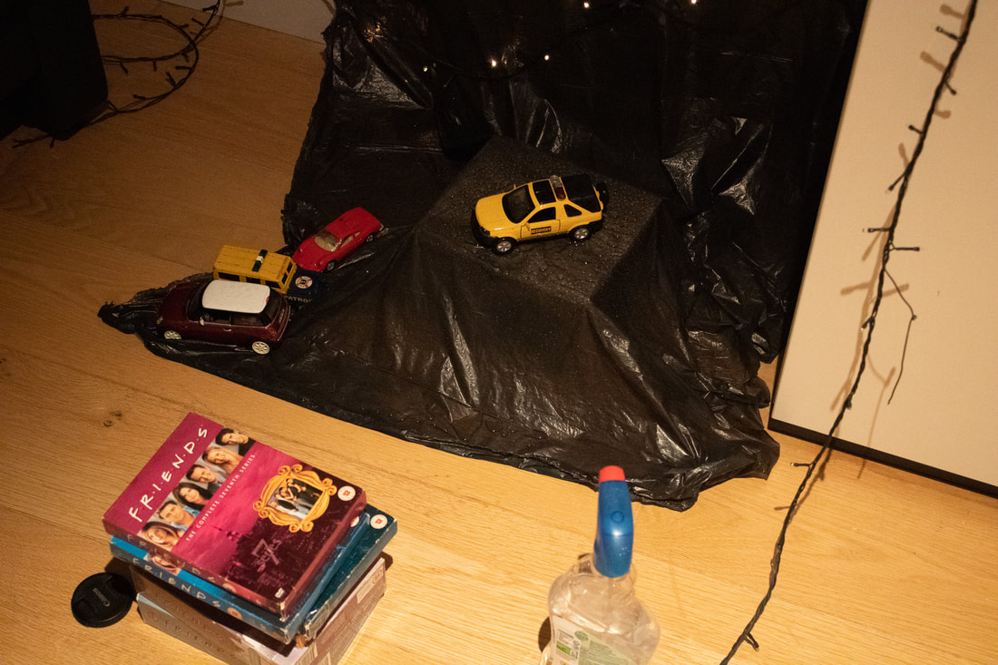
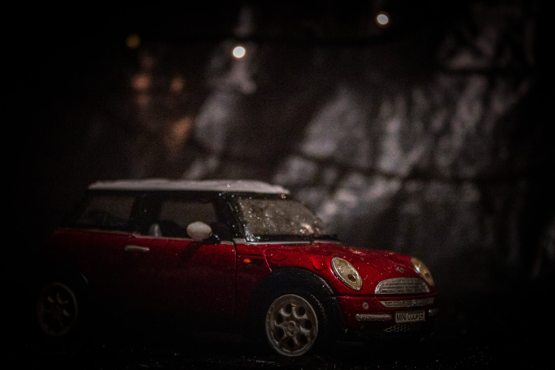
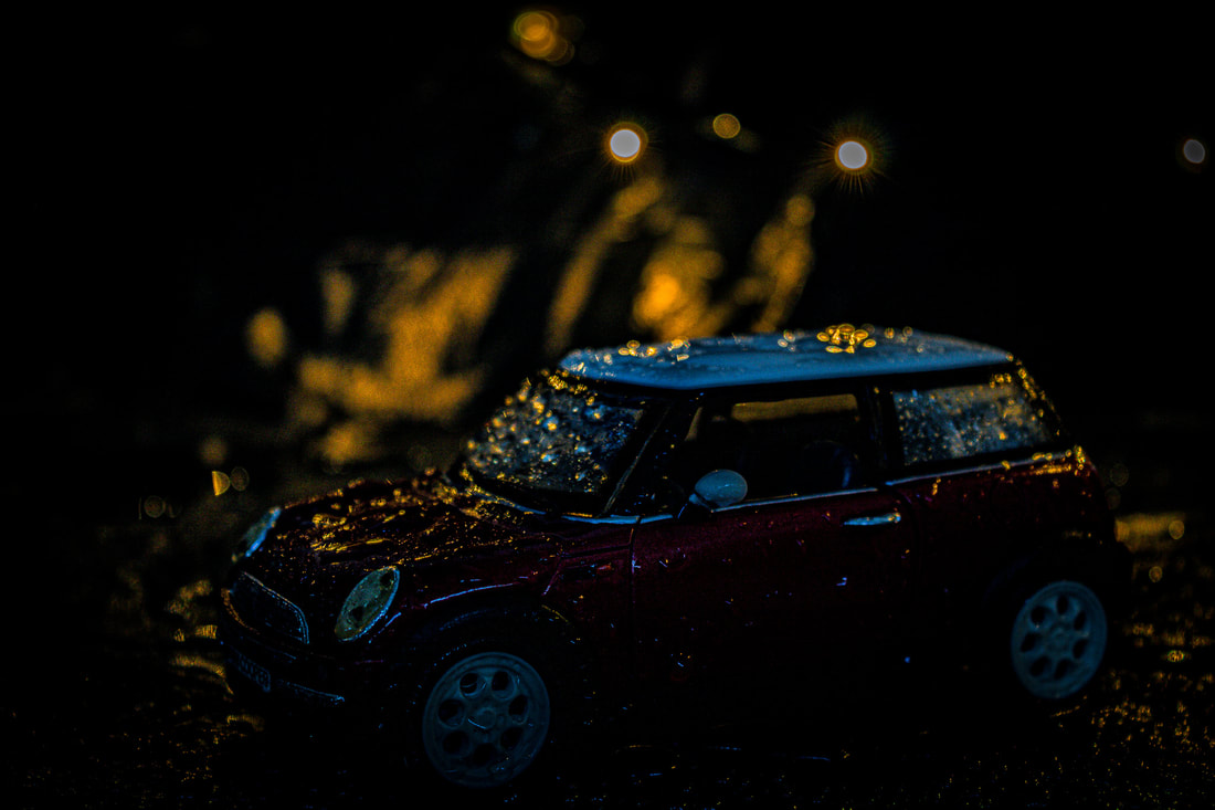
For the second development I wanted to go completely in the opposite direction of Tilt Shift and zoom into smaller more miniature items such as toy cars themselves and making them appear like a real-life car. I think that the toy car was going to be the easiest object to to create realism out of. I've also seen many people use spray bottles of water to create rain or add some moisture to evoke different effects in images. I think that this feature would create a heavy sense of realism especially when thinking about weather. Lighting was also another factor that I would have to consider in order to create a realistic image. So I would use : a small light behind the camera and alternate between fairy lights behind the camera to create different lighting effects.
|
The Photoshoot: |
|
The Process:
|
The process for this development was quite chaotic as there were a lot of small objects and materials that I had to use which were quite fiddly and I had to be quite exact with the angles of the camera as I was dealing with smaller objects such as the toy cars. I used a black rubbish bag in order to create a night effect, and I used water to create the a scene as if it was outside with puddles. And finally I used fairy lights to create street lamps that glimmered off into the background to create a real atmosphere of parked cars and I put some CD's beneath my camera to act as a smaller tripod to get exact levels of the cars.
|
|
The Final Three:
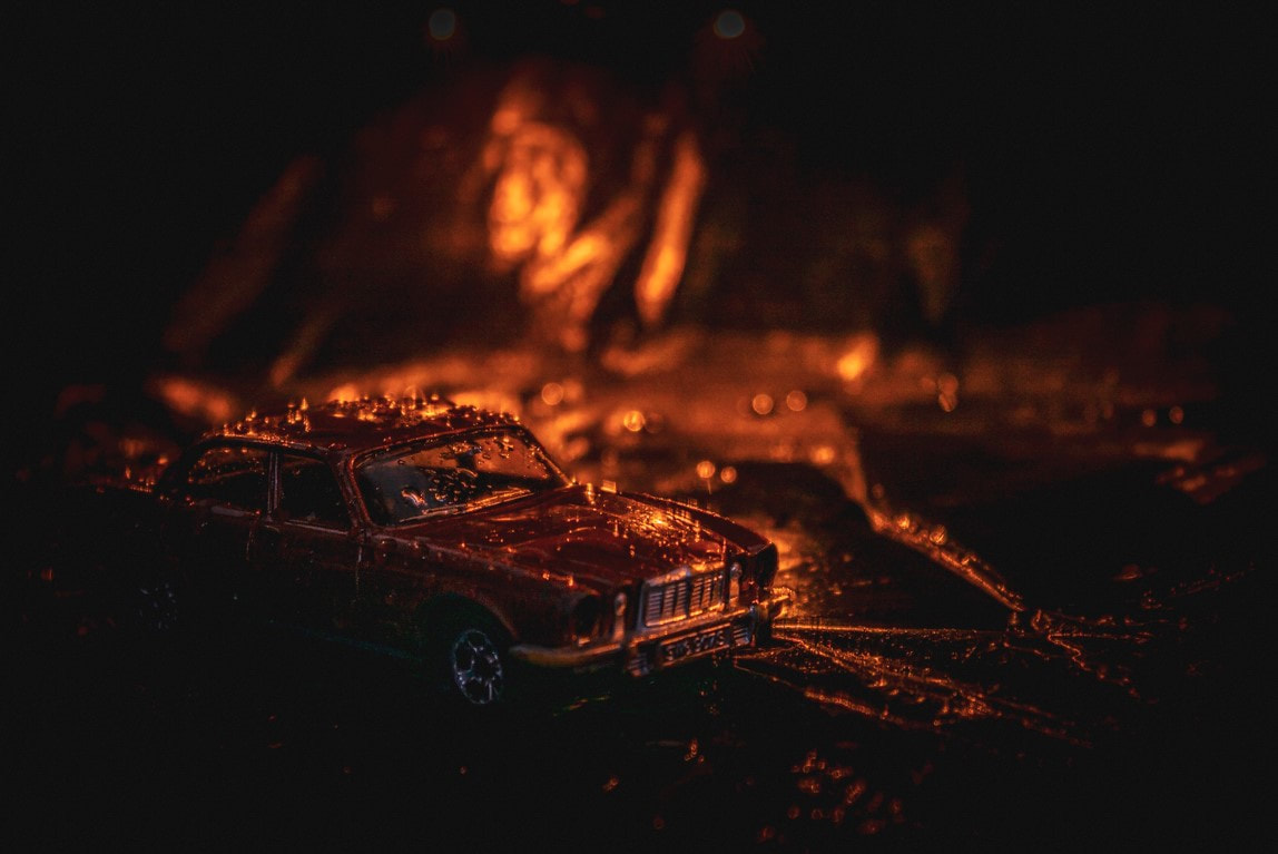
WWW: The cars look natural and look like they've been taken from an abandoned car park. I have also used different colours of; Black, blue, yellow, red, grey and orange to create different effects of lighting and used different levels to view more of the "road" with puddles. The road almost looks as if they contain pot-holes and the fairy lights as street lamps help evoke a certain city-like atmosphere for the viewer. In addition to this, the black tarp behind the cars and the use of levels aid the image to look more realistic because this piece was all about capturing the appearance rather then the reality of the image, which attempts to fool the viewer. Lastly, the reflection of the fairy lights and the water was completely unintentional but it was extremely effective in creating more realism in the piece.
EBI: I could have took this into Photoshop and tried editing some lights on the front of the car to increase the realism, as if they were turning on, possibly even some realistic people inside, but this would've had to be very precise. Furthermore, I could use a bigger aperture to capture more of the car in focus as not the whole car is focused. Link: this links with the previous response because they are the antithesis of one another and they try to create the opposite effect but still play with the theme of appearance versus reality. |
|
Development 3
Harlan Erskine
Erskine lives in Brooklyn where he teaches at the Fashion Institute of Technology, shoots editorial, commercial and other projects. Harlan Erskine’s photography has been exhibited at the Photographic Resource Center, the Miami Art Museum and Ambrosino Gallery, which showed his photography at the PalmBeach3, Art Basel Miami Beach, and Pulse art fairs. In 2008, Erskine exhibited a one-person show, Black Sun Project at the Bas Fisher Invitational.
|
|
|
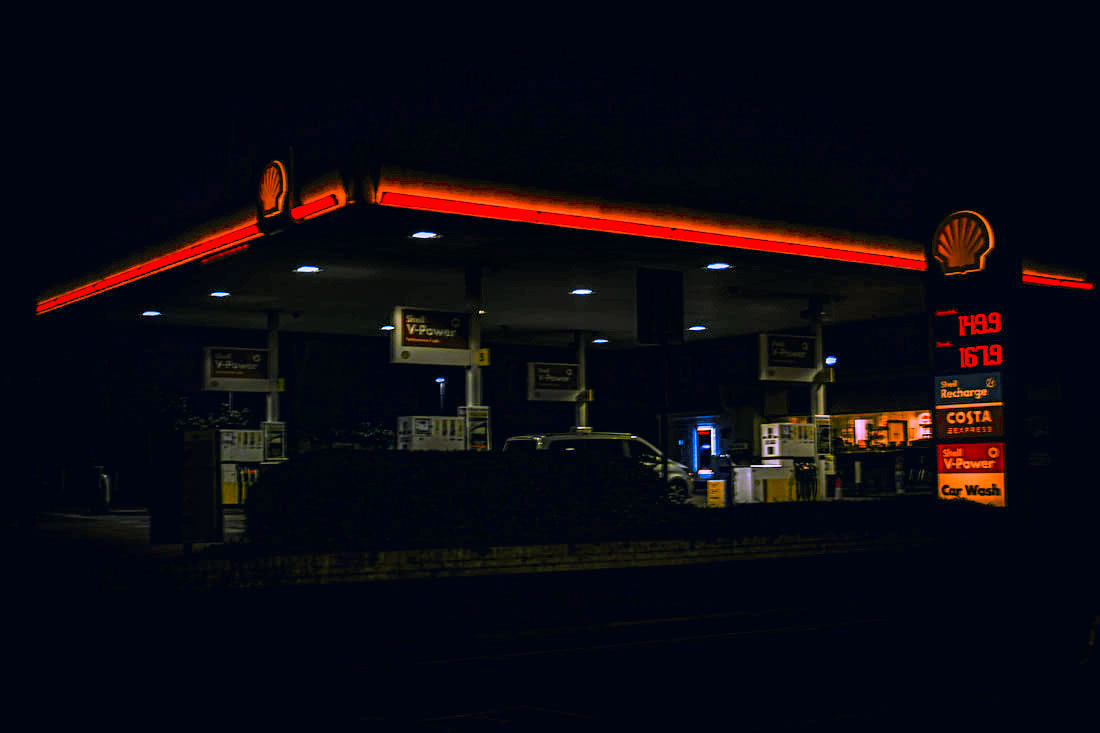
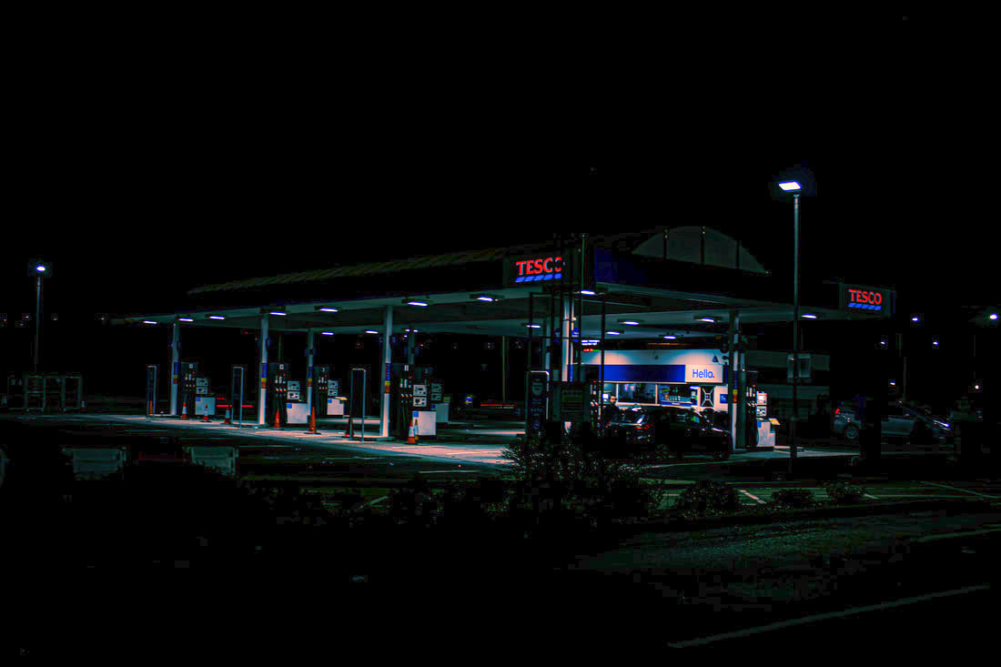
Here Erskine has used the very atmospheric theme of petrol stations and the yellow lights they produce to evoke strong feelings of confusion and fatigue due to the light hues of colours and reflections of the puddles below. Erskine highlights the strong yellowish hue that the not natural lighting places in the image. The dark surroundings also engulf the rest of the image and make the petrol stations seem more isolated and lonely. This is further increased with the absence of people.
Gas Station - Erskine
For this development I planned to travel to different petrol stations in the car in order to create variety in the Photos that I shoot. I would try to prioritise neon lights in order to closely mirror the lights Erskine used. Also I will head out late at night where there are very few people and cars, but all the smaller shops will still be open and lights will still be on which adds to the effect. In addition to this, I would go to some places that aren't petrol stations but instead smaller sized restaurants enclosed in a parking space so that the darkness can fully control the outskirts of the images.
|
The Photoshoot: |
|
The process:
For this process, it was relatively simple in terms of the equipment, all I needed was a tripod to stabalise the images and get the perfect amount of light for my images. I generally wanted a darker image so that you could focus on the lighter parts like in Erskine's images. The tripod was set at a medium height at a medium angle to create a similar perspective of Erskine however I took some different approach with positioning the tripod. I also used a low ISO of 100 but a three second shutter to get the perfect balance of light and darkness for me
The Final Three:
|

WWW: The different colours of neon lights worked very well with this image. I also took the images into Lightroom to tweak some of the lights a make them pop out more of the image and make them more distinct to add a central focus as I did not experiment with aperture. I really enjoy some of the flood lights which help add some extra spots of light to the image and add some pathway of light to pay attention to. My favourite details about these images are definitely the signs of Tesco, Shell Subway and Costa which aid the images to be more urbanised like in Erskine's set of images. Furthermore, I played with levels to play with different atmospheres they can evoke and extrapolate different attitudes from the viewer. Lastly, the shapes and dirt of the petrol stations really provoke the idea of the urbanised world within these set of images.
EBI: I could've explored more petrol stations around me because most of them were too big to capture the sort of images I had in mind of a smaller more unpopular rural yet urbanised petrol station. I should've taken into account the size of the stations as it drew more people in and caused some waiting and it meant that I had to tamper with the lighting more in some areas which was harder. Link: This links with development 2 because I am now focusing on the atmospheric value of the images rather than the effect of Tilt Shift. The effects are meant to be eerie and mysterious which could hopefully lead me onto some different styles of night Photography. This was a clean transition to night Photography. |
Development 4
Richard Hooker
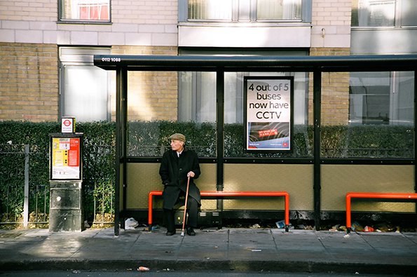
Between 2001 and 2005, photographer Richard Hooker visited various bus stops across London and shot film photographs of the people waiting for their rides to arrive. The 136 photographs he captured show the city’s incredible cultural diversity, explore how people relate to one another in confined spaces, and offer small peeks into personal lives.
|
|
|
Hooker uses the film camera to capture the realism and urbanised atmosphere that London carries. He invites the viewer to associate with his work in this daily errand. I think that the diverse culture of London helps Hooker capture shots of the natural side of people. For me the red seat of the bus stop sticks out to me the most, and almost plays as a symbol of that moment of waiting for a bus to arrive.
Bus Stops - Hooker
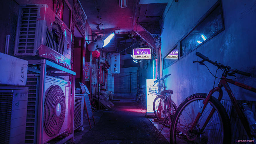
My aim for this response was to capture images of the reds and and the silence of night and use light of the bust stop combined with reflections of the windows and wet floors. I think that the idea of concentrated lighting in these images would be very key to capture a mysterious atmosphere. Instead of capturing diversity in London I would like to present the cold and quiet atmosphere that London also has during the night. Finally, I aim to use similar colourings in Photoshop in order to create a similar theme throughout my images, and create a repetitive feeling with the images.
|
The Photoshoot: |
|
The Process:
For these images I used a tripod because I had to use long exposure so that there was enough light within the Photo as I didn't want to edit the exposure in Photoshop and create lots of grain. Also I made sure to position the images face on from the Bus Stops like Hooker in order to centralise the theme around the mysteriousness of the Bus Stops. I then took these images into Lightroom and changed some of the colouring, specifically the reds and oranges to emphasise and highlight the distinct symbol of the benches.
The Final Three:
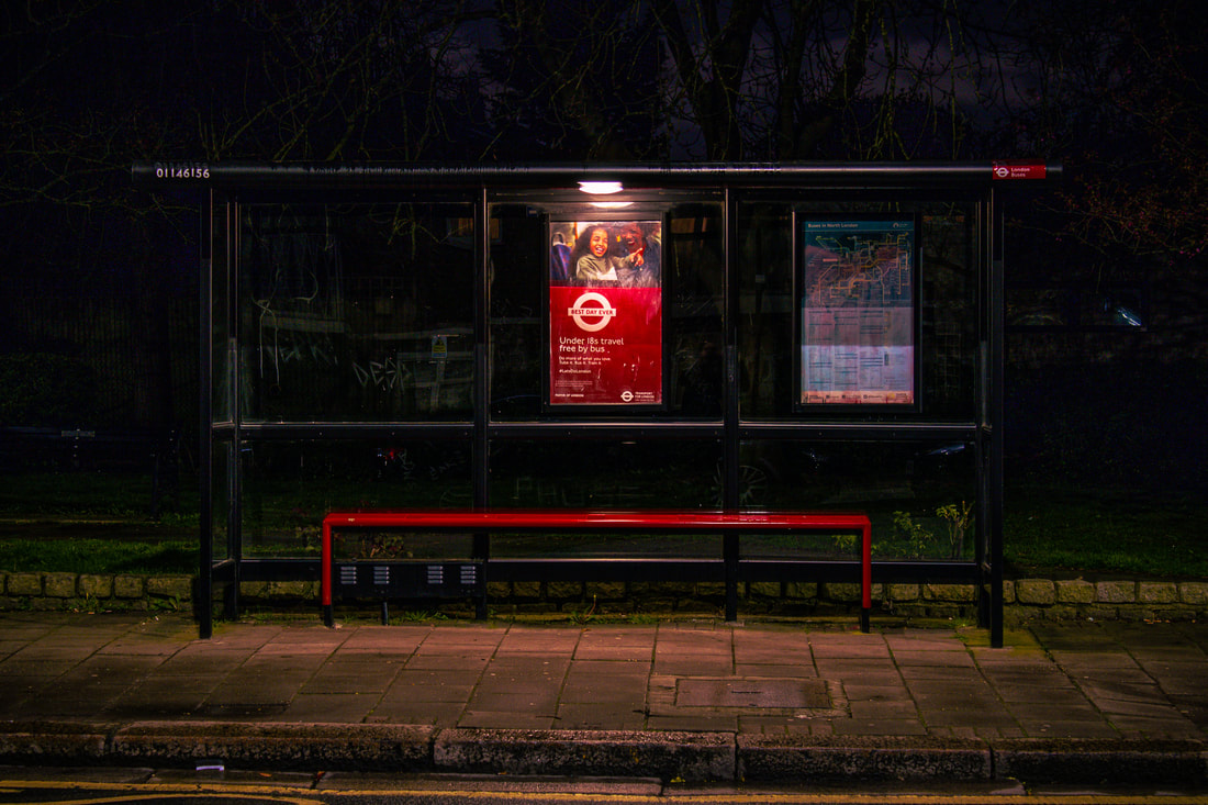
WWW: I really enjoy looking at the specific reds in these images as it really stands out compared to the darkness of the surroundings of the images. I used a small vignette to help aid the viewer to centralise their focus on the bus stops themselves. Also I really like the graffiti on the bus stops, despite them being small, I think it hints out the culture of London by drippy graffiti scattered around the bus stops. Finally, the adverts and some of their colourful images pull the viewer in with their intricate ideas, unlike the uniformity of the bus stops. The lights above the bus stops were also really helpful to aid this atmosphere that I want to create as it reflects with some of the wet floor, glass and benches.
EBI: I could've experimented with people in night photography to closer resemble the ideas of Hooker, I also think that experimenting with people and phones would be a really good fifth development but this would be slightly harder to link with this photography. Link:This links with the previous response because I highlighted the colours similarly like in the last response. Also, I used night photography to emphasise the mysteriousness of London and its urbanised atmosphere. |
|
Development 5
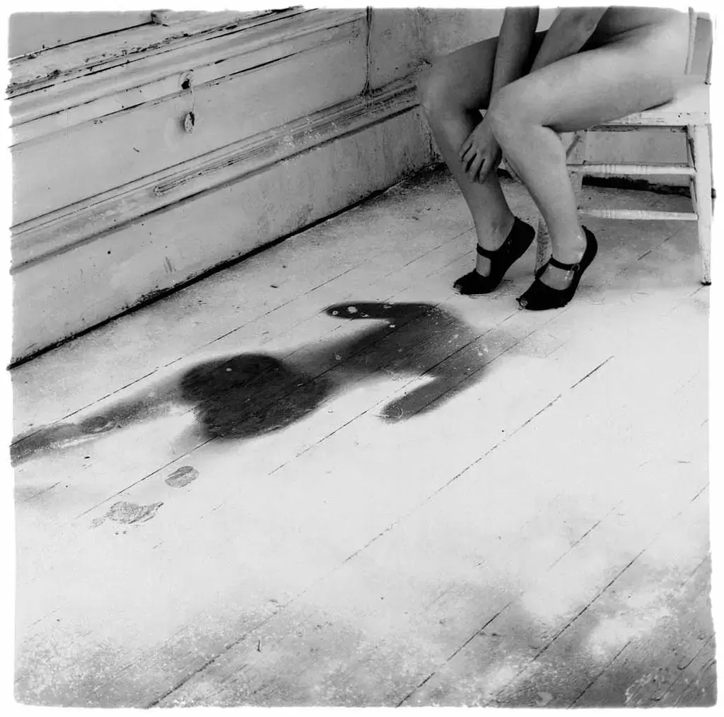
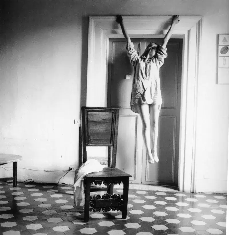
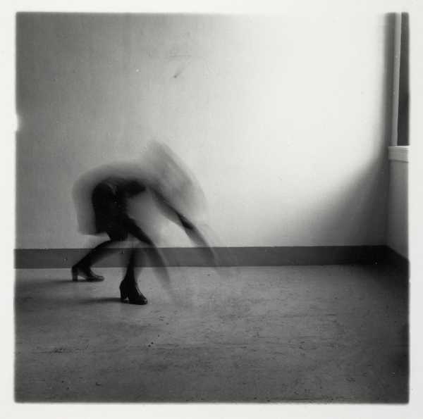
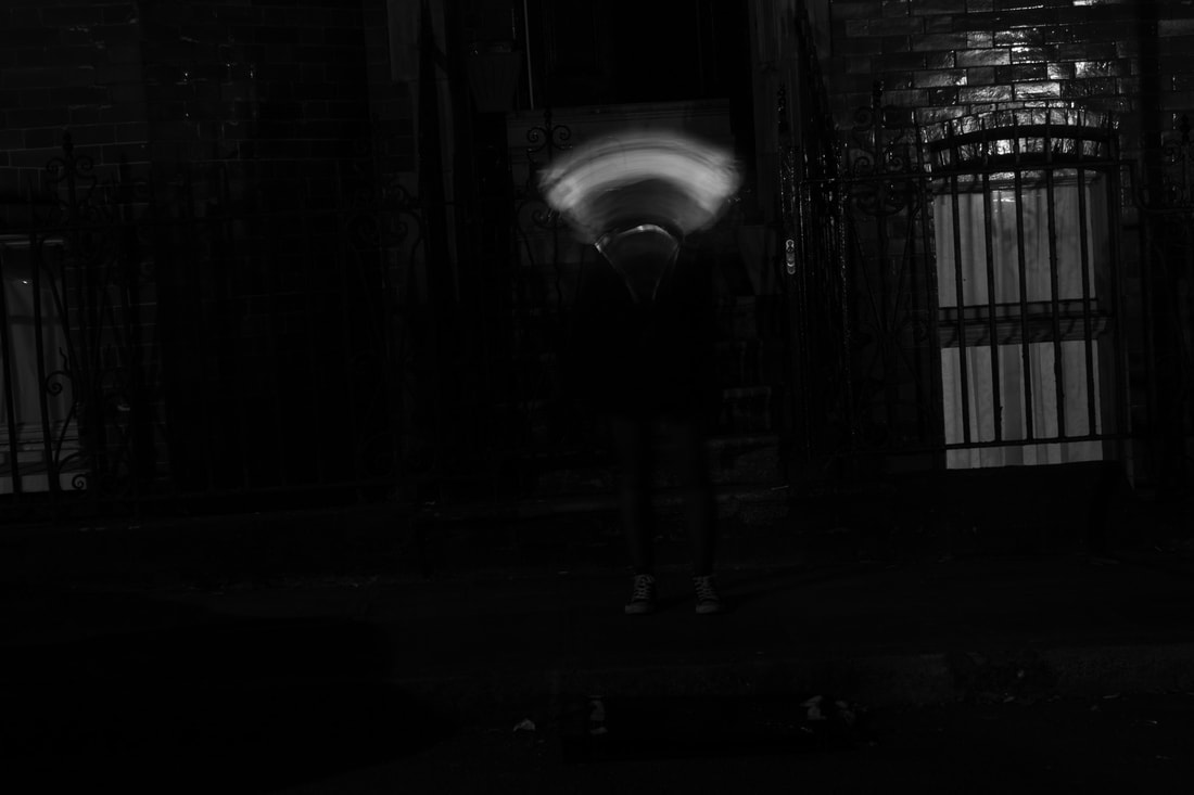
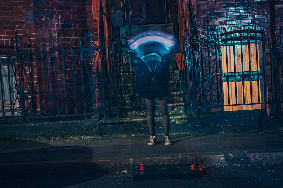
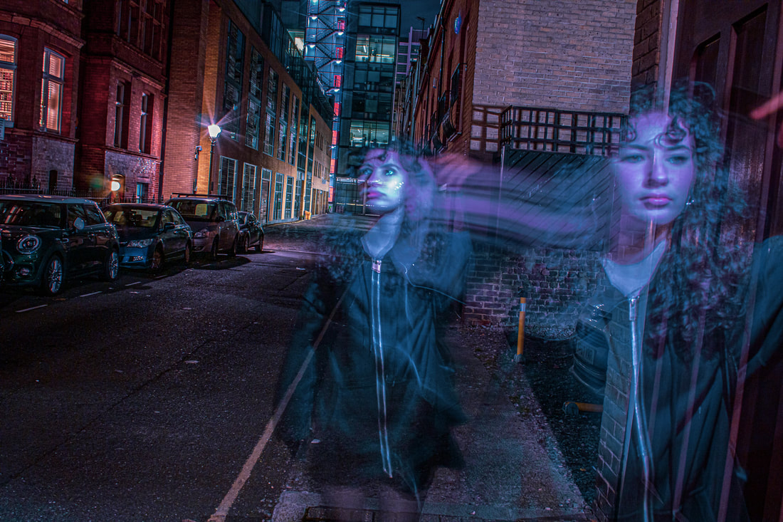
Francesca Woodman
Francesca Stern Woodman was an American photographer best known for her black and white pictures featuring either herself or female models. Many of her photographs show women, naked or clothed, blurred, merging with their surroundings, or whose faces are obscured. Although Woodman used different cameras and film formats during her career, most of her photographs were taken with medium format cameras producing 2+1⁄4 by 2+1⁄4-inch (6x6 cm) square negatives. Woodman created at least 10,000 negatives, which her parents now keep. Woodman's estate, which is managed by Woodman's parents, consists of over 800 prints, of which only around 120 images had been published or exhibited as of 2006.
|
|
|
Francesca plays with distorting reality into a surreal fantasy by squeezing herself behind mantelpieces or into small cupboards. She hides herself by creeping naked under a half upturned door, or pulling wallpaper over herself like a blanket. She often seems to be retreating into the material of the building. This makes her seem vulnerable, isolated and alienated. Woodman’s photographs are mostly very small in scale. This encourages us to look at them closely and deeply to work out what we are seeing and decipher their messages. When we find Francesca, she often appears naked or partially clothed, disguised or abstracted by photographic effects such as blurring caused by slow shutter speeds.
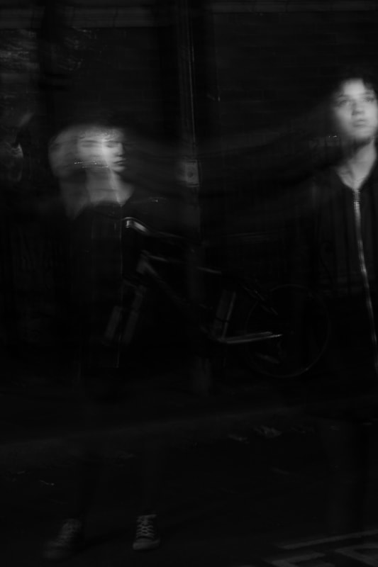
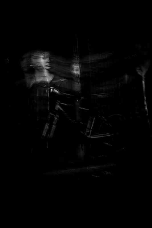
Ghost - Woodman
Woodman has used slow shutter speed to distort and alienate people to create a surreal photo that can be interpreted in many ways. It can symbolise many different feelings of: depression, secrecy, mystery and sensitivity. My aim for this development is to create a world similar to that of Woodman's using slow shutter speed, however in an urbanised environment to mirror the work of the previous response. I have the unique idea to add some neon and colourful lights to the images to also create a more lively image, but also mirror the work of Woodman, yet everyday life by featuring the model outside.
|
The Photoshoot: |
|
The Process:
For the process of these images I used a tripod again to help replicate the long exposure pictures of Francesca Woodman and stabilised it in an ally way in Goodge Street, which is an urban area but behind the main roads. I then went into Photoshop and fixed some of the perspectives with cropping and also used a lot of clarity to amplify the texture of the distortions of the face. Most importantly I used the burn tool to hide some features of the face and create more of a distortion so that the viewer had more room to interpret the image in their own way and I also used colouring in Lightroom to emphasise specific features and increase the movement of the model.
The Final Three:
WWW: I like taking a look at both versions of my work for this one because Woodman hasn't edited her photos to improve the distortions. Also she has used black and white images to decrease any sense of hope and happiness, however in my work In decided to use colouring to evoke a mystery of walking around in a city. I think that this helps bring emotional value to the model and prioritises her wondering around a city and almost adventuring through new landscapes.
|
|
|
WWW: The two pictures of the model was executed very well and I like how I used a phone to make her face drag along the across the image to add distortion like Woodman and also add facial expressions to evoke a more wondrous feeling unlike Woodman. Also the constant theme of these colours - blue on the model - aids the viewer to see the model as the central focus of her travelling through a city.
|
WWW: This image is mostly black which is what I like also white in parts of the face to specifically highlight the model's almost shameful expression. This evokes sadness and extrapolates a sense of hopelessness. Furthermore, the swaying and wave like effect of the slow shutter speed similarly mirrors Woodman's work and her ghost-like appearance makes her seem more supernatural and mysterious.
|
EBI: I wish that I had utilised some more composition in order to add more central recognition of the model. The rule of thirds, or even the golden rule to my pictures. I think that the colouring could be carried out on the final image as well to keep the same pattern of colour with Francesca Woodman.
Link: This links with my previous work because I have still kept the same atmosphere of night photography and using the theme of travel throughout my images. But I have included just people and focussed on their facial expressions which extends to a slightly different sense of mystery. |
Development 6
Martin Shank
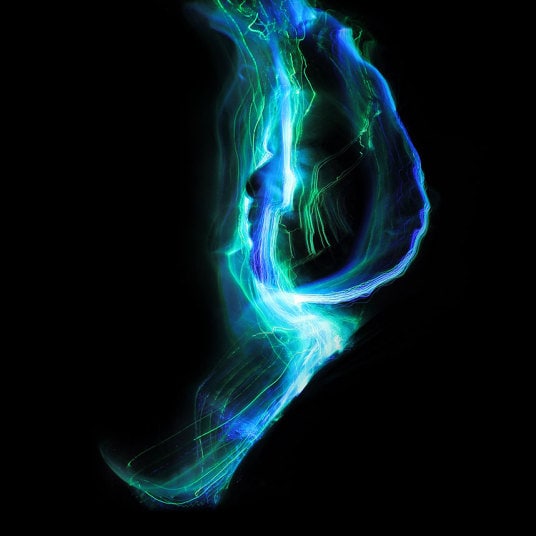
Throughout the course of these images by shank he has used lighting to especially highlight the facial features of the models. He has used similar colours of green and blue with the lights to evoke a sense of mystery. He has used the darkness around the image to amplify the focus of the images on the intricate styles of the faces. The light almost acts as paint which paints the model's faces in a flowing effect. This effect is done with small lights that wave around the models face. The lights create an effect as thought the model is drowning which is evocative of feelings such as fear and panic but also and undertone of peace.

|
|
|
I think that these images are extremely powerful in creating a sense of mystery which is what i've been developing on mostly. This is a very uniquer for of distortion which I highly enjoy watching and interpreting different emotions for myself. In addition, the water-like sequences of the lights interact with the smooth and emotional value of the piece, and how it can provoke numerous feelings, which contribute to the mystery of distortion.
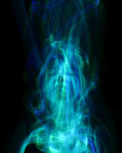
Light Splash - Shank
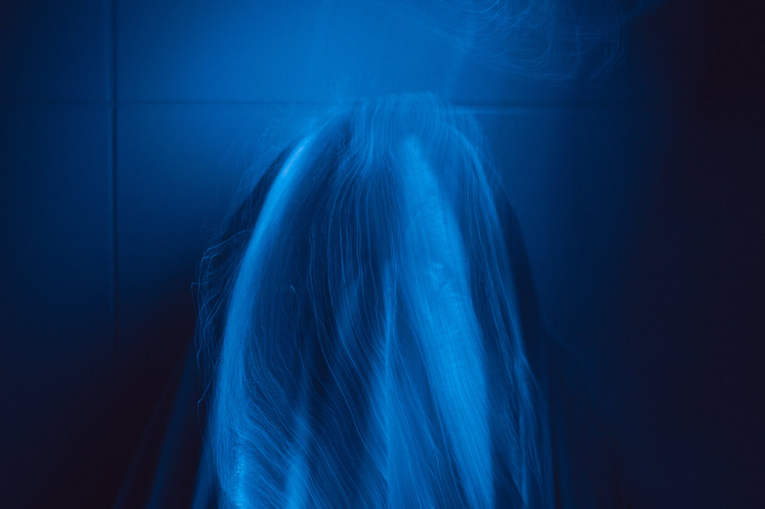
The aim for the sixth development is to create a wavy effect like Shank using some materials such as a cloth over the models face to clearly experiment with the effect and really evoke mystery. However I also wanted to experiment with the facial expressions of the model as I think that would be really interesting for the viewer to watch it outline the intricacy of the model's face. Also I bought this light off this amazon in hope that it has thew similar effect of Shank's work.
|
The Photoshoot: |
|
The Process:
The process of these images were tough because it needed a lot of exact angles and stability which was hard to do in a tight dark space. I decided to use the bathroom as it was really dark and you can see reflections of the lights which I found be quite interesting. I used a tripod again to capture the wavy effect of the lights as they crawled down the model face like water flowing. This was key to use because it meant that I had freedom to create very still images like Shank. However the angle the model was at was quite awkward and we constantly had to reposition the camera. Finally I slightly changed the hues and colours of the light
The Final Three:
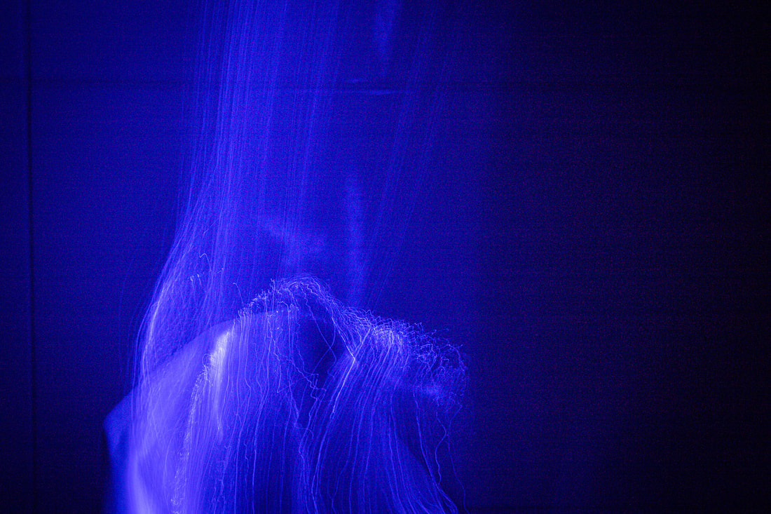
WWW: I really like the sheet I used in these images and the how I edited the lights to be slightly different hues so the lights looked like different lights. One of the images above looks like a face from the lights which I thought was really creative and it acts almost like a soul floating out of the sheet. This work is particularly mysterious and aids the viewer to focus their ideas on the strong colours and repetitive patterns of the lights. In addition I think that it not only can be interpreted as water flowing down the face, but also like paint, painting over the features of the model. Ultimately, the light contains many properties that act like a fluid cleanly outlining the models face.
EBI: I should keep angling the camera and use composition to perfectly position the face of the mode at the centre of the image. I wish I took more photos of the model as well as acting more natural. Finally, I think that the similar hues of blue was very effective, however I could experiment with some reds, greens and yellow. Link: This links with the previous response as I attempted to focus more on the models face and more specifically particular facial features, and also using lighting to clearly amplify the model. This lighting is more focussed on the face similarly in Woodman, when I used a phone light. |
|
Development 7
Shadow - Woodman
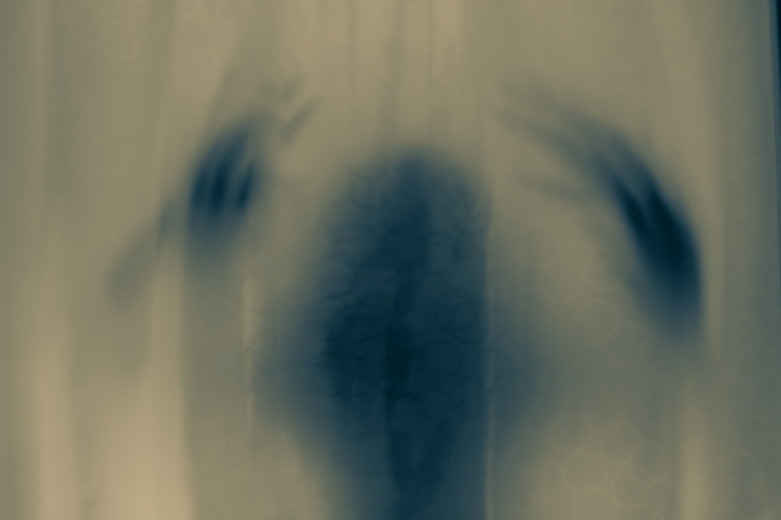
For this development I aimed to use the shower curtain and the glass door to cover up certain features of the face, but highlight features of the body and movement along the side of Woodman to emphasise a sense of fear and panic. The slow shutter speed also similarly reflects the work of Woodman, especially with the distortion of hands. I think that i will try to make this piece function as a statement that will take the interests into the viewers hands. In addition, I think I will stick to one hue in order to make the pattern of the whole development stand out.
|
The Photoshoot: |
|
The process:
For the process of the seventh development I had used the bathroom with the shower curtain to to emphasise the blurry and foggy idea of the model. I think using slow shutter speed was extremely helpful with creating these cryptic images. Of course, I had to use a tripod to easily stabilise the camera when shooting in long exposure. I used a low ISO of around 100 and shot 7 seconds in order to create this ghost-like pictures. Furthermore, I tried to use a small light behind the shower to highlight the shadows of the model and create a more defined figure.
The Final Three:
|
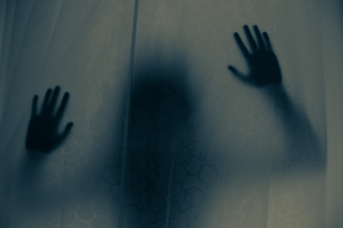
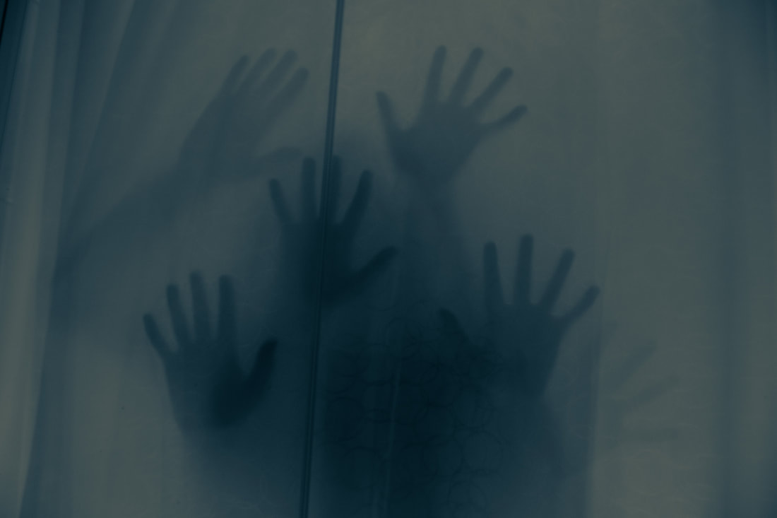
WWW: I really like how the model looks like she is trying to escape. This suggests the idea that escapism is limited in a world with limits and problems. I think that the hands specifically in this development are very symbolic to present ideas about capabilities and opportunities that can be crushed by small barriers. I think that the physical barrier of the glass and fog, portrays interpretations of fear and panic like my previous responses, which is a constant theme in Change. Lastly, the long exposure really helps emphasise the many and multiple different struggles that can approach you, I think that this figure is one that represents high amounts of shame as she is trapped in a small box that she cannot escape. The colouring of these images are also very nice of blue and yellow. This adds to the eerie effect.
EBI: I should have Photoshopped the connection between the two glass doors so that the images looked increasingly more realistic and also straightened out the curtain so that there were no creases and the "fog" was constant across the whole image. Link: This links with my previous response because I wanted to increase the volume of mystery in the piece which was hinted in my previous response. I wanted to also keep the idea of creating a figure and using ideas such as light and shadows to highlight some features of the image. |
Development 8
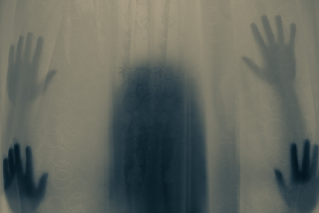
Shadows - Woodman
For this development I wanted to create a similar idea as the previous images but include longer exposure and use the curtain as almost a membrane around the model. I also think that the same X-ray effect should be achieved with the same colours and use shadows correctly to create a figure with a mysterious atmosphere. Finally I hope to remove the metal rod in Photoshop between the two glass doors to create more realism.
|
The Photoshoot: |
|
The process:
For the process of this development it was very similar to the previous however I used the clone stamp tool to remove the metal rod, however I forgot to remove it for one of the images. In addition I used the curtain to gently go around my model to create a small box for the model in order to apply more fear for the viewer. Also I used a slightly brighter light in these images so that there was more yellow that featured in these images which add an increasingly eerie effect.
The Final Three:
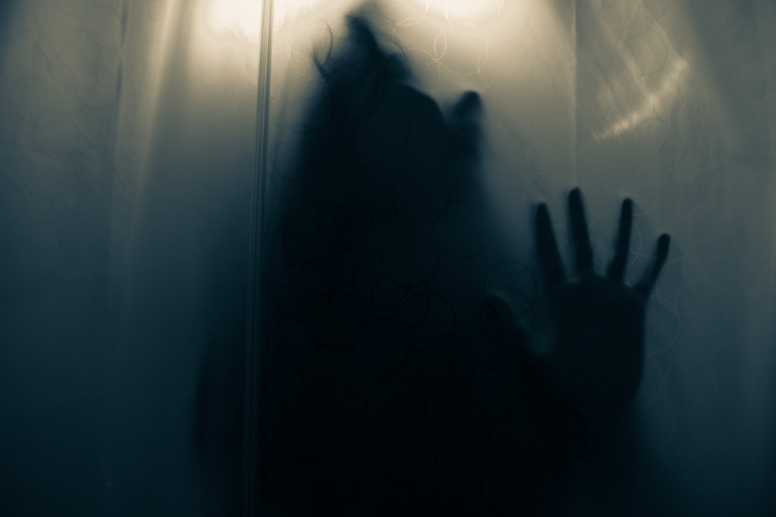
WWW: This image represents the mental struggle we all sometimes experience. The colours evoke an "X-ray" feel which makes the image amplify the human almost enclosed within the membrane of the shower curtain. And finally the transparent wall acts as a barrier to escaping the sickening inside reality. I think that the colours definitely set the tone and atmospheric image as the enclosed human mind all trapped in a mindless body. These images represent the mindlessness of that body, and how they could feel various different emotions. Through shadows and gestures and playing with exposure, I try to create an emotional atmosphere through gesturing certain powerful emotional values.
EBI: I could utilise a different colour scheme to further provide for the powerful nature of each image. I could also use longer exposure to allow the viewer to interpret the emotions in a variety of ways, in which they can consider it themselves. Link: This links to the previous development as we almost dive into the dual state of the mind and body through using long shutter speed. This immediate disjunctive shift in atmosphere also helps me explore more photography styles. |
|
Development 9
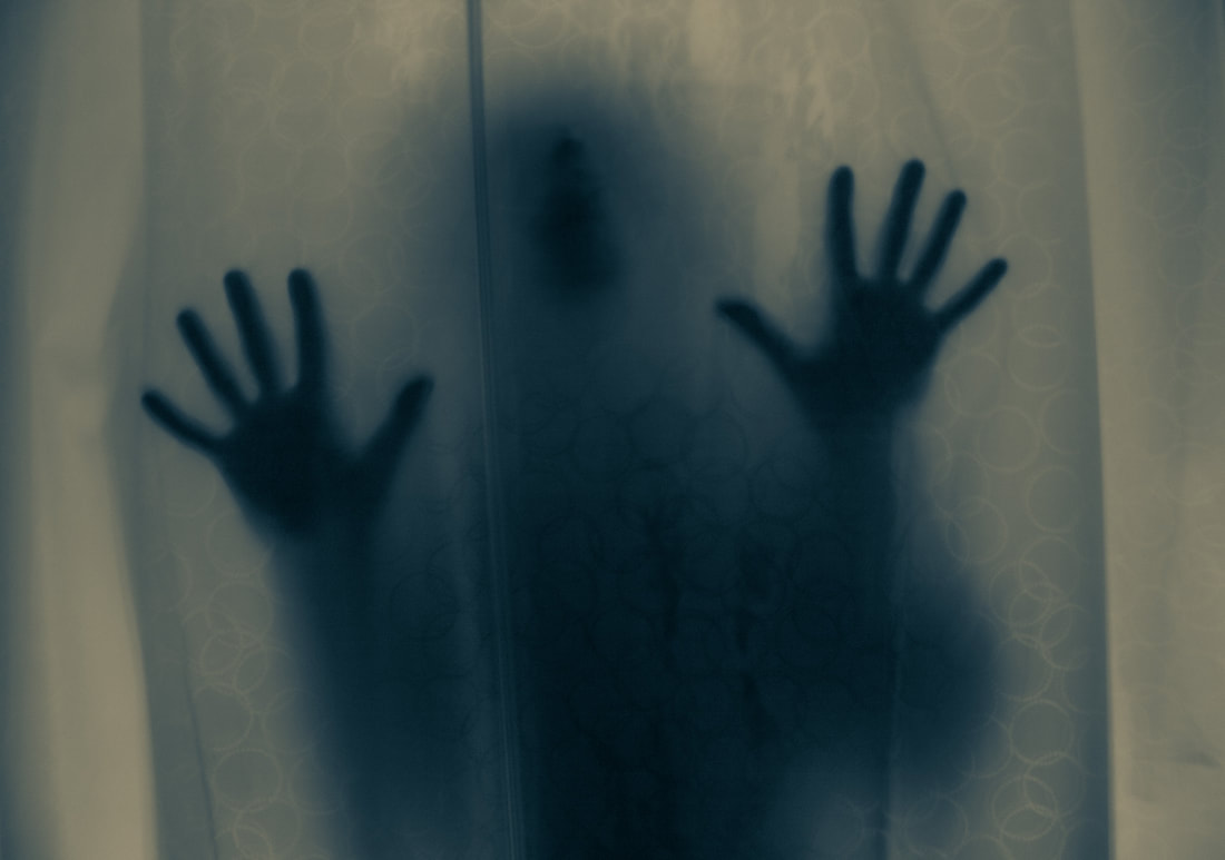
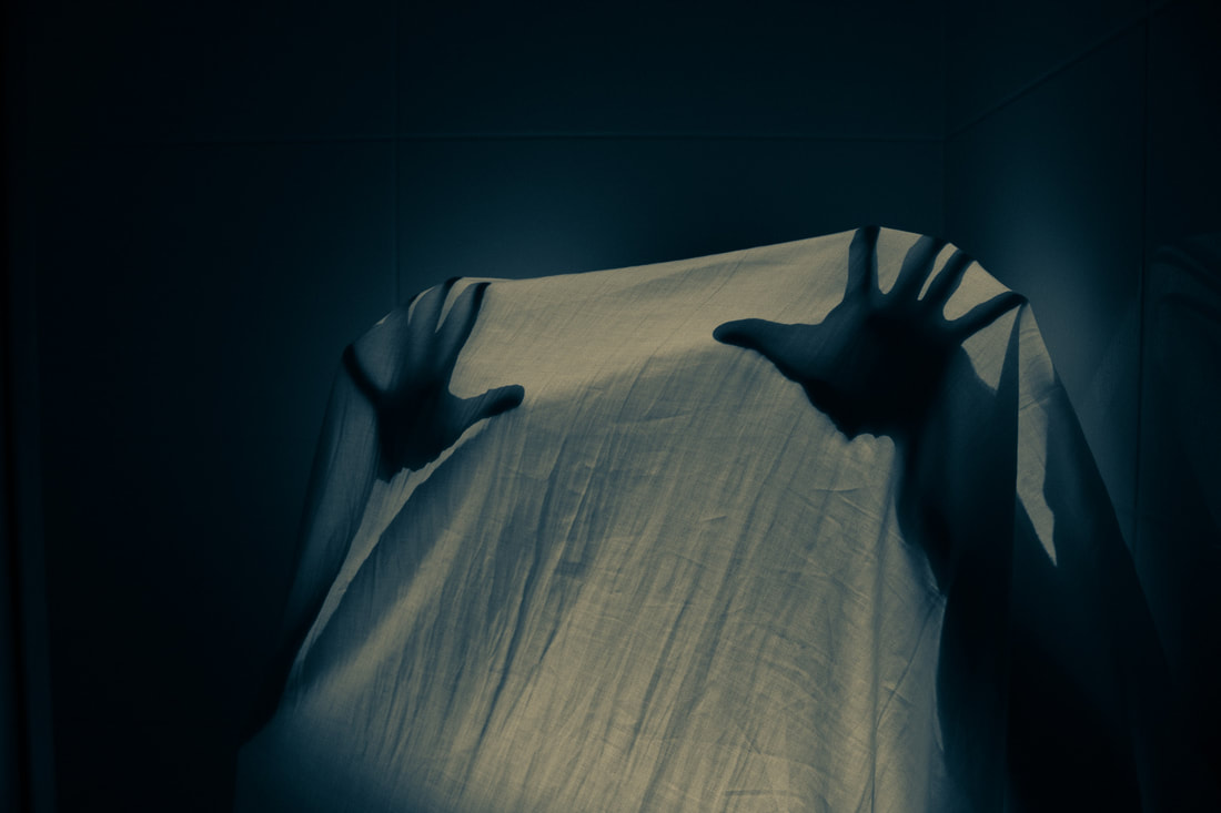
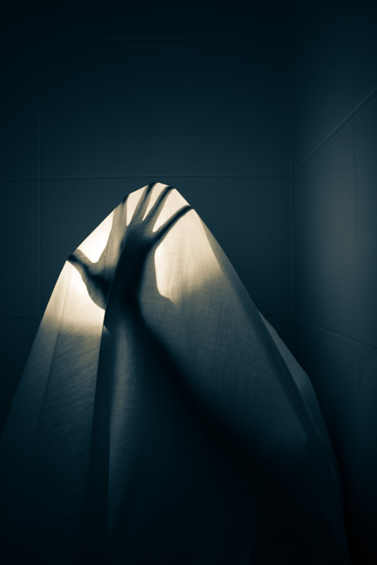
Sheet - Woodman
For this development I aimed to merge the two ideas of the sheet that I used in Shank's development, whilst also incorporating the shadows, movement and symbolism of hands from Woodman's work. I think that using a sheet would simply add an increasing effect on the idea that escapism is limited and there is always a barrier covering your dreams. I also think that amplifying the shadows of the hands can show this limited effect of escapism. In addition I will use the same dark room in order to create a greater mysterious atmosphere and build fear.
|
The Photoshoot: |
|
The process:
For this process I used a bed sheet with lots of creases to evoke a fearful, eerie and confined atmosphere. I then also used a torch inside the sheet so that the shadows of the hands are highly exaggerated and create a boxed up feeling. In addition I also used grain in Photoshop and increased exposure in Lightroom to prioritise the eerie atmosphere. I also used a shutter speed of 1 second to include a slight blur which connects this response and Woodman.
The Final Three:
|
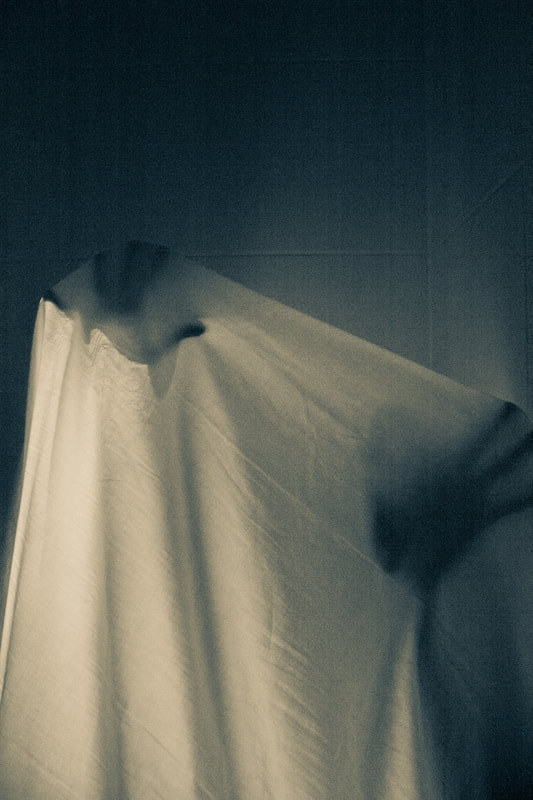
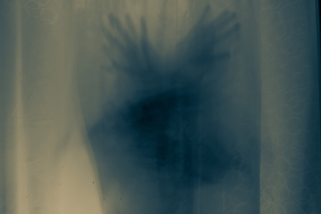
WWW: I really enjoy the difference in lighting in these sets of images. I think that the same colour combinations as the previous responses helps smoothly link them together and gives the same X-ray effect as the previous images. This effect is translucent and aids the viewer to interpret different ideas of the shadows of hands. I wanted to focus on the key features of hands in this Photoshoot in order to focus on the theme of entrapment. I wanted to really feature the idea of change by force as the viewer watch the hand attempting to emerge from its barrier. These images are more 3D than the others and include more perspective rather than the other response, which is something I enjoy because it allows the sheet or barrier to knowingly fully cover the model.
EBI: I could have not concentrated the light on very specific areas of the sheet in order to make the images seem more natural. I could also darken the areas around the images so that the central focus is more clear on the sheet and hands. Link: This links with the eighth response as the colours and hues are very similar and the idea of shadows creating a known figure is carried out between the two Photoshoots. |
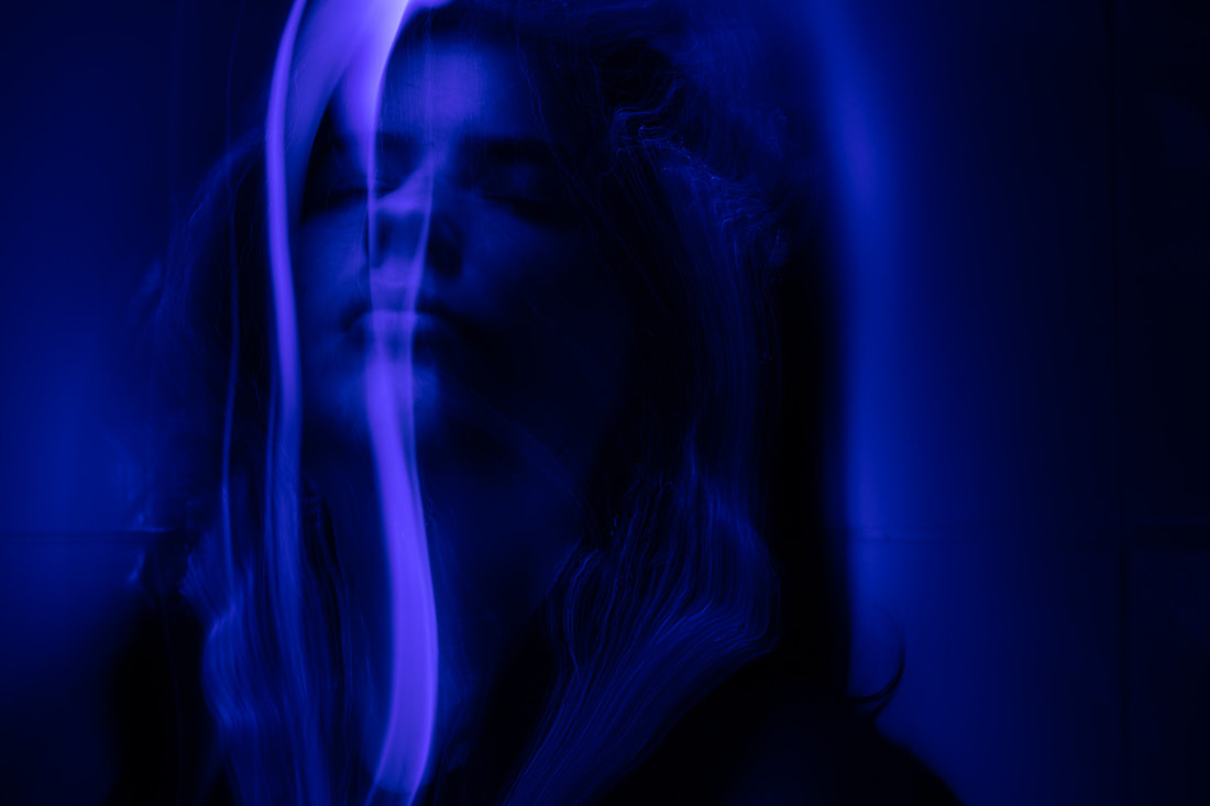
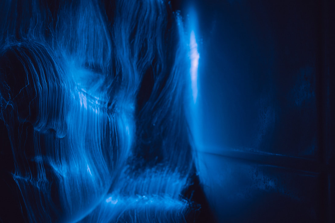
Final Development - 10
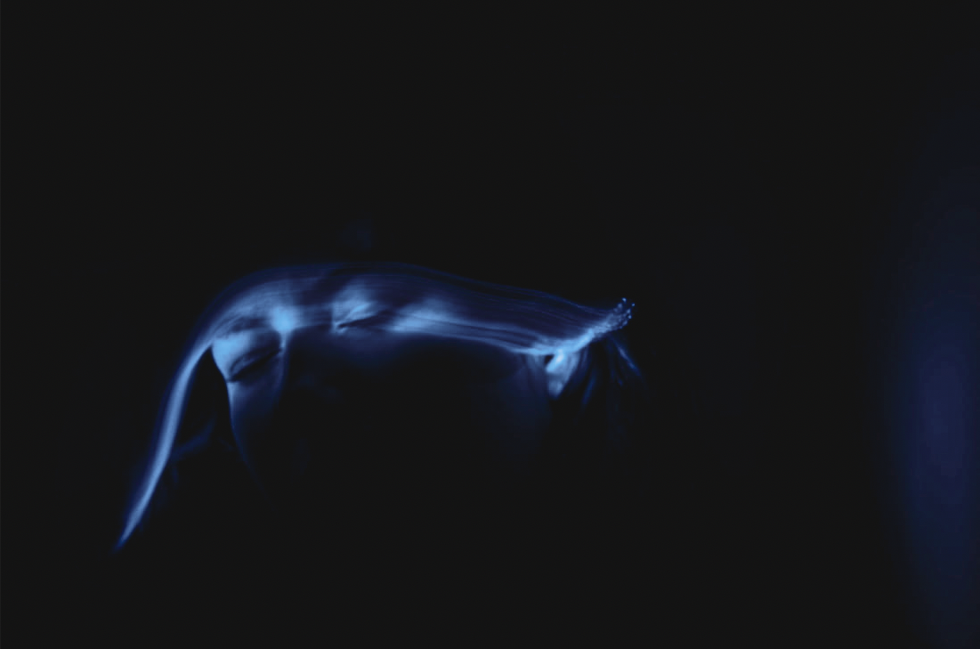
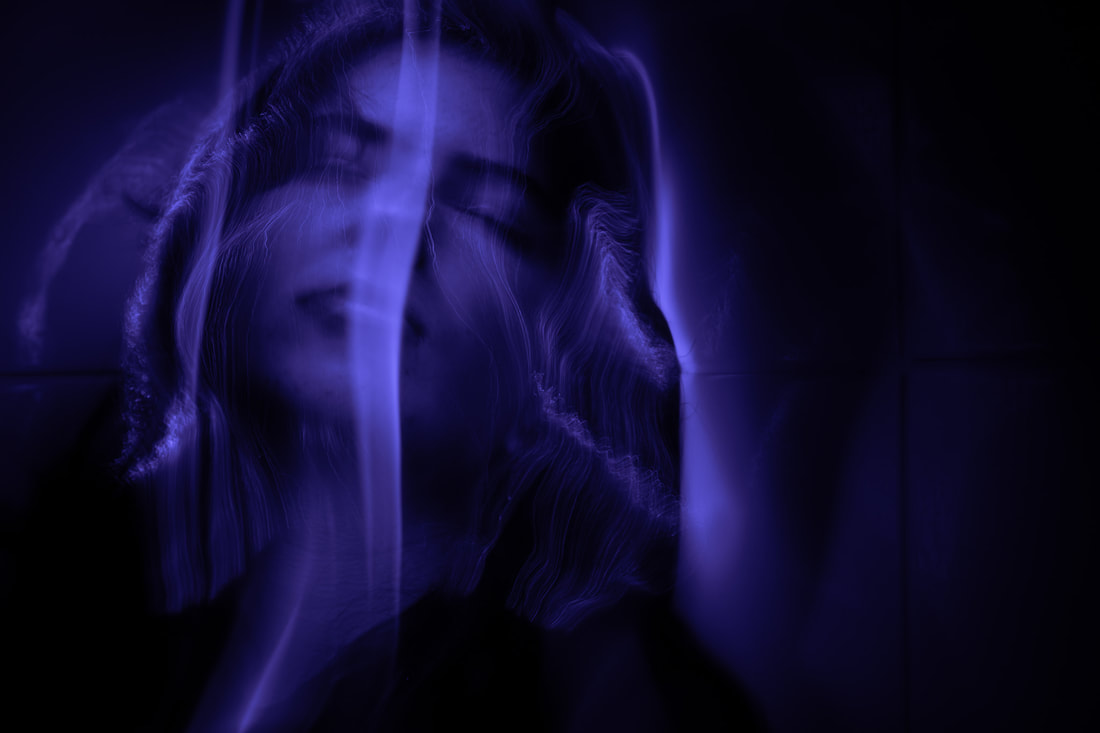
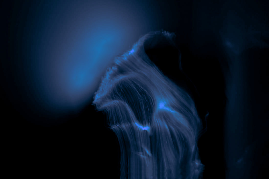
Light Splash - Shank
For the Light Splash final development I aim to look closer at Shank and the facial structure of the model. I think that this is really important to portray change in lifestyle through peoples facial expressions and they way they move. The main idea here is to use light to mimic emotions and also colouring to exaggerate those emotions. I want the final piece to clearly present a struggle and a sense of sadness. Hope is meant to be completely lost and this is meant to be a moment of reflection.
|
The Photoshoot: |
|
The Process:
The process for this response was very similar to my sixth development because I used the model's face more rather than a sheet. Again, I used a tripod to help communicate the movement of the light and the expressions of the model's facial features. I used the light of the light itself to not overcrowd the images in lighting and then go into Lightroom and use the exposure function to fix any small incorrections of lighting. Also, I chose to use different hues of blue again because of the emotion of sadness where everything seems deeper, and darker. It suggests hopelessness.
The Final Three:
|
|
WWW: I really like looking at the water effects for these images. I decided to make the sheets from the previous response into light and use the light as the box which limits your potential. I think that this final piece is extremely symbolic and links very well with all my previous developments and clearly evokes a mysterious atmosphere like in my previous work. The colours are very bright so that the viewer can concentrate on specific parts of the face. Also, the fact that there is a texture that the light makes, makes the images pop and they create a clear definition of water streaming. This can also be interpreted as tears from the models face. The light helps clearly enclose the model and trap her in her own thoughts. The longer and brighter streaks of light are also in the images which create a central control of movement. This makes it easier for the viewer to follow the course and direction of the movement. The change in movement is the main focus of the final piece as I find it very interesting to interpret and create a central focus of the main features of the model's face.
EBI: Some of the lines on the models face aren't clear enough and can eliminate the focus on the face, as it can get over exposed. I would fix this in concentrating those areas in Photoshop and reducing the exposure. I would also like to zoom out and use the light to highlight features of the body like the hands in my previous response to help it link between the two images.
Link: This links with the ninth development as I kept the theme of entrapment but instead of using a physical barrier I used light to symbolise as physically weaker, but mentally a more challenging opposition. I kept the blue effect as I thought it added a sort of sadness, but removed the yellow as I wanted to remove the fear and panic. I wanted to idolise the sadness and reflection of self-image.
Concluding Change
Concluding Change I have used a wide variety of features that change involve. This all involves change in: lighting, movement, force, perspective and time. I have explored all of these changes in daily life, and I have attempted to maximise the ideas and stretch and interpret these ideas in numerous ways many others may not. I think that I was swayed close to change in movement and light because it proves and presents and reflects change in life a whole. In addition, I chose change at the beginning of the term because I thought that change was constant in out daily lives, but I learnt that change is not only constant but constantly taking place to change everyones lives for better and worse. I think that changing the shape and distorting objects and people, can help people also reflect on themselves and help people learn for the better of each other.
